Garage Magazine
Our look at the art direction behind Dasha Zhukova’s creatively uncompromising publication


Now in its second issue, GARAGE magazine is the brainchild of Russia’s most fashionable philanthropist and edgy art aficionado Dasha Zhukova. The industrious young entrepreneur perpetually proves that pushing the envelope doesn’t have to take an in-your-face approach, and the magazine is the latest example of her ability to seamlessly combine elegance with grit.
Issue No.1’s ink-focused theme featured three different covers, and the Hedi Slimane image of a sexy Damien Hirst-designed butterfly tattoo had the magazine banned in bookshops, which art director Mike Meiré says actually worked in their favor. Curious about the controversial cover, people were desperately seeking out the magazine. The current issue—illustrated by Cologne-based street artist David Jäger, a.k.a. 1,99—may appear to have taken things down a notch with its whimsical illustration of fairytale figures, but further scrutiny reveals a “very modern tale” in which a pregnant Harry the Hare is about to marry his beau, Frederick the Fox.
We checked in with Meiré—who also art directs the German culture magazine 032c—to learn more about the bi-annual publication’s ability to tackle gay marriage and other societal matters with artistic grace. Issue No.2 launches today at international news stands and Colette.
Where does the name “GARAGE” come from?
In 2008, Dasha founded the IRIS Foundation, a non-profit organization dedicated to promoting contemporary culture. It is housed in one of Russia’s architectural masterpieces, the former Bakhmetevsky Bus Garage, designed in 1926 by the Constructivist architect, Konstanin Melnikov. Actually the place itself has given its name GARAGE. And Dasha called the magazine consequently the same thing, which makes complete sense because the magazine works on the edge of art as well.

What role did you play, if any, in forming the issue’s theme of Homosexual Wedding?
The “Homosexual Wedding” theme was already set up when I met Dasha, Becky Poostchi and Joan Juliet Buck during summer 2011 in Nice. The first issue was pretty much a success. We had an incredible line-up with maybe some of the most influential artists of our time, like Damien Hirst, Richard Prince, John Baldessari, Jeff Koons, Raymond Pettibon, Dinos Chapman and Nick Knight. With the second issue we wanted to focus on one specific theme. We were all thinking about relationships, dating and sex. How the Internet is changing our society…but I guess the main inspiration came from Asian artist Yayoi Kusama‘s “Homosexual Wedding” performance she had staged in New York in 1968. Kusama’s artistic relevance was recently rediscovered by the art world. Her dots have inspired the fashion landscape big time. The Tate Modern in London has a big show on her now. In general, for GARAGE it’s inspiration through the interplay of art and fashion.
There are a lot of rainbow-hued overlays on many of the fashion spreads, does this have to do with the magazine’s theme in any way?
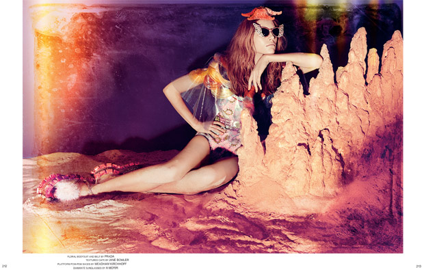
I think it’s just in the air. Flooded everyday with crisis here and there people start longing for optimism. A rainbow is as well always a symbol of freedom and day dreaming. A meta sign of ideality and new potential. Using this typical color code within several images we try to remember ourselves that we need to dream a better reality from time to time.
What do you feel makes a magazine visually compelling?
It’s visual identity. The overall feel. It’s attitude. The way it communicates with its readers. I like it when a magazine doesn’t try to sell me something. I just wanna be inspired and feel the energy of our times. The fact that I started my own magazine APART already in the early ’80s shows I am really into magazines. I look at magazines like the manifest of a certain group of people. I am rather interested in designing attitudes than styles.
What are some of the artistic differences between 032c and Garage?
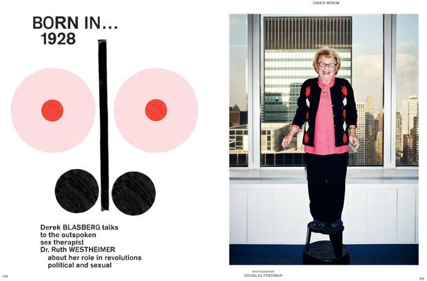
Obviously the size of 032c is much smaller than GARAGE. This demands a completely different design concept. GARAGE to me is a strong visual experimental journey. Every double spread leaves its marks and stains from the working process. Everything is handmade, scanned, manipulated and composed. Even the typography is based on a software we have programmed where the letters appear randomly. Just to get back this kind of Letraset effect from the pre-desktop decade. An endless search for the right balance between control and coincidence.
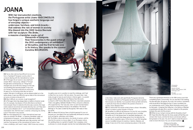
GARAGE works without any grid. Normally every magazine these days is based on a grid. Which makes it easier for the designer. Maybe for the reader too. But at the same time it feels much too corporate to me. And more and more people are looking for an alternatives nowadays. Since we had our first wave of digital e-papers for the iPad, we realize the staying beauty and radical force of paper again. With GARAGE I want to bring back the excitement of creating magazines with no boundaries in our heads.
032c works like a manual. Every area of each page is packed with content. Barely empty space. The color code is based around aggressive complementary red and green. An elegance pushed towards brutality. Some stretched fonts, demolished typography. This is how the redesign started in 2007. With the recent one we have started to change the atmosphere again. Let’s see where we go from here…
Is the editorial content inside something you concern yourself with when formatting either magazine’s aesthetic?
When I redesigned 032c five years ago people hated me. They were so angry at me because of the stretched fonts. People came up with this label called “New Ugly”. Which I never had in mind be honest. I was just looking for a rougher and darker beauty. I got tired of these good-looking-but-no-meaning magazines. Anyway I am not interested in a particular style. I am very much concerned about creating a unique personality for each magazine I am responsible for. Every magazine is run by a different board of people. I try to decode their desire to put out something they believe in, and shape it the way people will recognize it later. I am an art director and I have to make sure that each issue gets its lasting moment in our economy of attention.
What makes you artistically happy?
When people let me do. When they trust me. I am anyway my maximum critic.
I have been working on magazines already for more than 25 years. I guess I have learned my lessons by now. And I am still curious for the next issue to come…


