Studio Visit: Painter Dana James
Chaos, control and contradiction inform the artist’s practice in Queens, New York

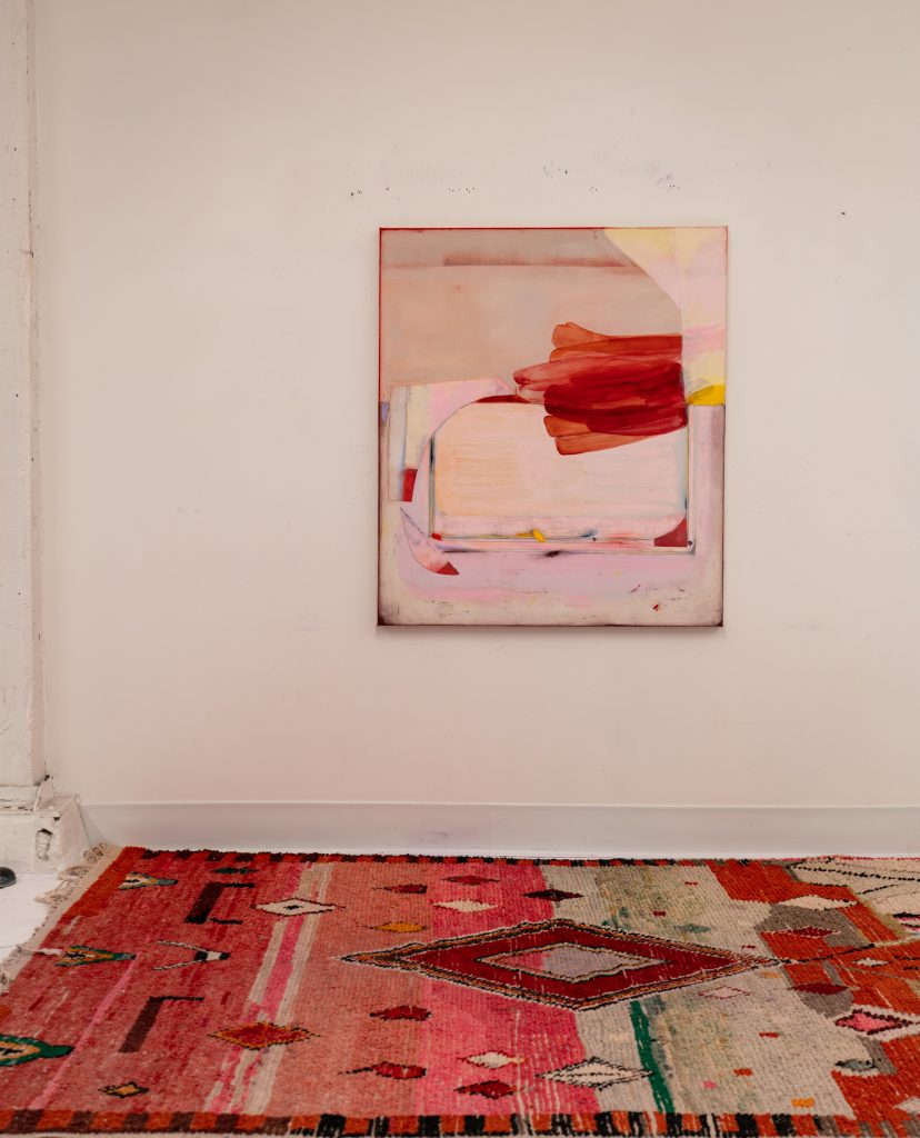
This February, Dana James moved into a new studio in Queens, New York and although she hasn’t been there long, the room already speaks to the artist’s work. The open-floor, white-walled space is clean and tidy, devoid of unnecessary clutter and scant in its decorative objects. But upon a closer look, a certain disorder prevails, from the faded purple stains on the floors to the pile of canvas scraps on the ground. Much like the space, James’ pastel-colored paintings feel cohesive and orderly until surprising dark splashes and nonconforming lines disrupt the neatness. In her work as well as studio, subtle juxtaposition captures the eye.

The process, James tells us, begins with size. “We [the artist and her two dogs] walk over here early in the morning and paint—all day, every day,” she says. “I usually have some sizes in mind and some color palettes in mind, but I sort of plan on them changing. So I usually kind of deliberately and accidentally plan something, knowing that it’s going to change. I will do one size but I end up usually cropping it or perpetuating it, like I might do a large painting and then crop out the best part which means you’ve got to stretch it, un-stretch it, cut it out and re-stretch it. Also, I am often adding different panels.”
From start to finish, James honors fluidity in her process. Perhaps this is why her work feels harmonious and balanced—despite the many contradictions concealed within. James, who has been featured on the future-forward art market Platform and is currently preparing pieces for this year’s EXPO Chicago, employs clean-cut ruler lines and geometry within her compositions alongside off-kilter strokes and surprising splashes.

“When I do the multi-panel pieces, it’s a lot about the dissonance in the edges, where everything’s sort of meeting and it’s off and there’s a dialogue happening. I think composition is really hard. If you don’t have a powerful composition, the painting’s just kind of unsuccessful. That’s also what often leads me to cut them up, collage them together, because I want it to be organic. I don’t want it to be an obvious choice, but I want it to flow. I want it to contradict and to flow at the same time and that’s a difficult path to follow,” says James. It’s an exercise in both chaos and control.

When it comes to color, James continues the through-line of opposition, positioning gentle, light hues against deep, dark pops. “I’m really interested in color,” she says. “That’s a primary theme for me. I want to get away with pushing really pretty colors but then offsetting them, and I want to see how many I can put on one piece but I also don’t like to overload color. They’re very colorful, but there’s usually three main colors in each piece.”
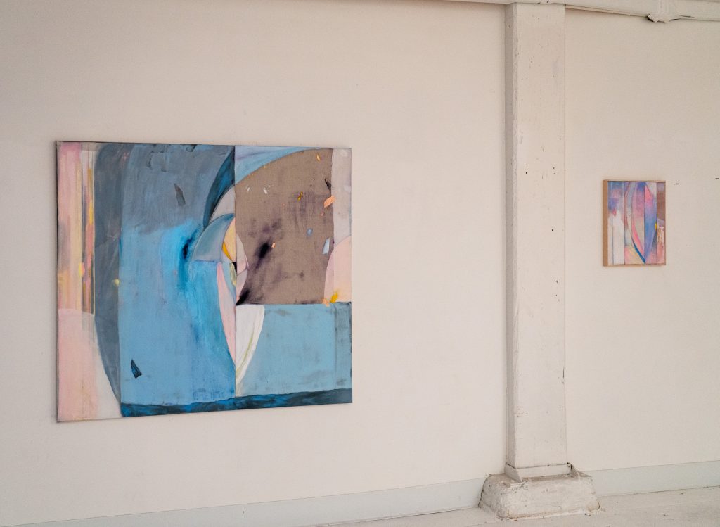
Walking around reveals another layer of James’ color palette as well as the magic of her work: an iridescence that shines from the canvas as sunlight makes certain strokes appear to change color. “The glow,” the artist explains, “I really liked because it was, first of all, autonomous and not always there and kind of popping up surprisingly. But it’s also sort of magical and kind of how nature is very vast as a child and magic-oriented. I also have a dragonfly theme. There are triangle wing shapes. I’ve always liked the dragonfly as a symbol of change.”

She continues, “I liked the idea of the phosphorescence that you’re in the essence of the dragonfly and fireflies and that kind of thing, but simultaneously the work is also supposed to be extremely feminine and beautiful and then offset by these dark, dirty explosions. In that way they’re a lot about contradiction and being female—and how it’s usually a contradiction to be female and it’s not one way. I’m into this almost garish like glowing pink and pastels and then juxtaposing those with this kind of matte dirty canvas.”
The effect is wondrous, adding another layer of complexity within the seemingly straightforward work. “They’re really not about one thing, but they kind of originate from memories and nature but also optics; how our memories can change and be autonomous. I wanted this nostalgic, fuzzy feeling around them, and some of them are somewhat landscape oriented. Sometimes I don’t even think of myself as a totally abstract painter,” says the artist. With the works’ tight, organic composition and profuse inspirations, it’s easy to see why.
Image courtesy of Dana James


