The Great GoogaMooga Posters
Illustrations revisit the Roaring Twenties

by Joanna Prisco
For the last six months, New Yorkers have been hotly anticipating The Great GoogaMooga, a free food and music festival to take place in Brooklyn’s Prospect Park this weekend, 19-20 May. Created by Superfly Presents—founders of Bonnaroo and Outside Lands—the GoogaMooga has sparked much dialogue among summer concertgoers for shifting the spotlight from the stage to the concessions. While food lies at the heart of the inaugural fest there’s a focus on design that sets it apart from its ubiquitous predecessors.
Superfly tapped the Rockwell Group to craft the aesthetic of the grounds, marrying a carnival atmosphere with 1960s-era spirit from which the festival takes its name. But at a handful of exclusive gatherings being held inside the Extra Mooga paid-ticketed area, guests will be transported even further back in time to a roaring, golden age.
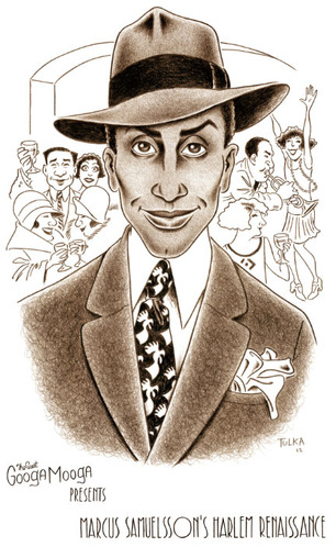
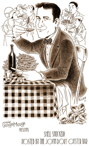
“There will be four parties inside of the Boathouse,” explains Superfly co-founder Jonathan Mayers. “And they will all have a 1920s vibe, with each hosting chefs such as Marcus Samuelsson, The John Dory Oyster Bar, Fedora or Monkey Bar pairing food and drinks to that time period.”
To further infuse the ambience with ’20s flair, Mayers commissioned Paris-based illustrator Rick Tulka to create posters featuring New Yorker-esque caricatures of the events.
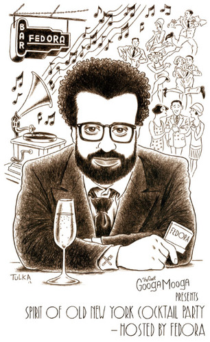
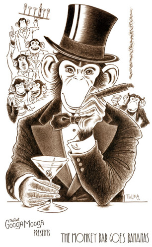
“I was introduced to Rick a few years ago by a mutual friend and I’m a huge fan of illustrations,” said Mayers. “So we sent him a bunch of images of Marcus, Gabe Stulman and imagery from the Monkey Bar and let him kind of run with it.” Having spent the past 36 years illustrating for publications ranging from MAD Magazine to The Wall Street Journal, Tulka’s creative process was uninhibited by the fact that his subjects were across the Atlantic.
“Since I am a humorous illustrator, it really helps when the client has a good sense of humor too,” said Tulka. “For me, the 1920s theme added a really nice touch to the feel of the images.” In keeping with the look of that decade, Tulka suggested the idea to print the posters in sepia. And since the illustrations were all caricatures with a main subject, he kept the backgrounds more line and less tone.
“I wanted the subjects to pop out,” said Tulka, who sprinkled various food-focused details throughout the posters with piles of shucked oysters on the floor here and knife-and-fork cufflinks there. The result is both charming and appetizing. “When the illustrator and the client are on the same page and work well together, it makes for a fun job,” said Tulka. “Oh, and listening to 1920s jazz while working didn’t hurt either!”


