100 Ideas That Changed Graphic Design
The most influential concepts in the history of the industry


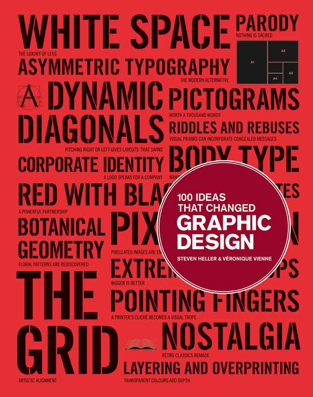
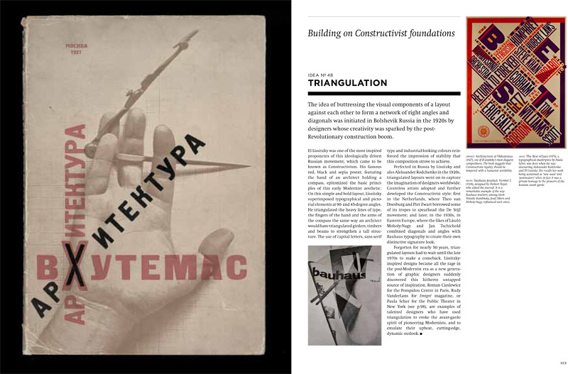
In the new chronologically ordered book “100 Ideas That Changed Graphic Design“, Steven Heller and Véronique Vienne explore the most important moments in an industry they themselves helped to define. Part of publisher Laurence King‘s popular “100 Ideas” series, the combination of symbols, techniques, archetypes, tropes and trends represents some of the major creative explosions that continue to inspire an array of visual mediums today. The scope is broad but intelligently refined, connecting all aspects of graphic design, from the age-old technique of text ornamentation to the relatively nascent appearance of pixelated images and digital type.
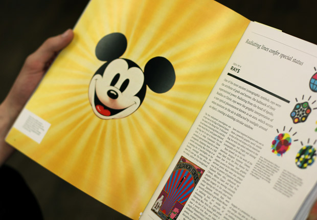
Heller, winner of the prestigious AIGA medal and former New York Times art director for 33 years, continues to write the “Visuals” column for the paper’s Book Review, as well as The Daily Heller for Imprint magazine. Vienne also comes from an art direction background and has published a number of books on the subject of graphic design. They draw enlightening and occasionally surprising connections, their observations identifying hidden meanings that inform images, such as the sun ray-inspired Mickey Mouse graphic created for his 80th birthday, which is actually a riff on Maoist propaganda posters.
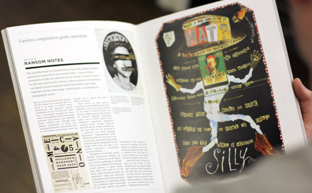
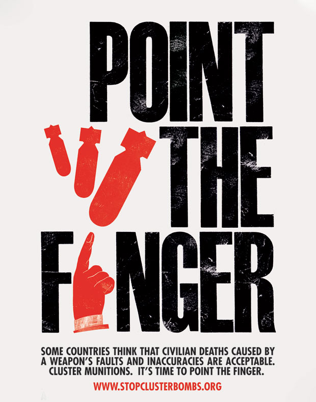
Analyzing the use of the human body in design, the book regards the pointed finger, the clenched fist and the provocative pose as the most iconic corporeal representations from the past century. While corporate and political influences remain the most common originators of new ideas in design, there are a fair amount of underground sources that influenced the field, such as the cut-out ransom note, which was first discovered by a careless printing staff in the 19th century.

Also accounted for are specific design topics like asymmetry, color blocks and the graphic artist’s never-ending battle with forming the perfectly proportioned rectangle. The duo tackle each idea by breaking down not only how it influences visual communication, but also how it came about, whether through advances in technology or new layout restrictions.
A complete overview of the field, the book’s clean layout—including a cover designed by Pentagram’s Angus Hyland—and wealth of historical context lend insight that is as interesting for designers as it is for any art enthusiast.
Pick up the book from Laurence King or Amazon, and see more images from within its pages in the slideshow below.