Andreas Scheiger
How one designer represents the antiquity of type in the digital age

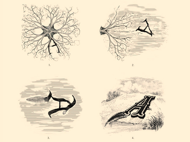
Austrian designer Andreas Scheiger celebrates the “craft of etching, engraving and letter design” with a nod to both science and the graphic design of the Victorian era. Scheiger believes that letters are “full of life” and, in an effort to explore “the means of communication by dissecting and rearranging its basic elements,” he delves into the heart of typography with his sculptural letter series, The Evolution of Type, inspired by Frederic W. Goudy’s tome, The Alphabet and Elements of Lettering (1918). Says Scheiger, “Goudy analyzes the denomination of letters as we know them today. For him, the birth of the alphabet is the most momentous achievement because with it, written communication is independent from pictograms like hieroglyphs.”
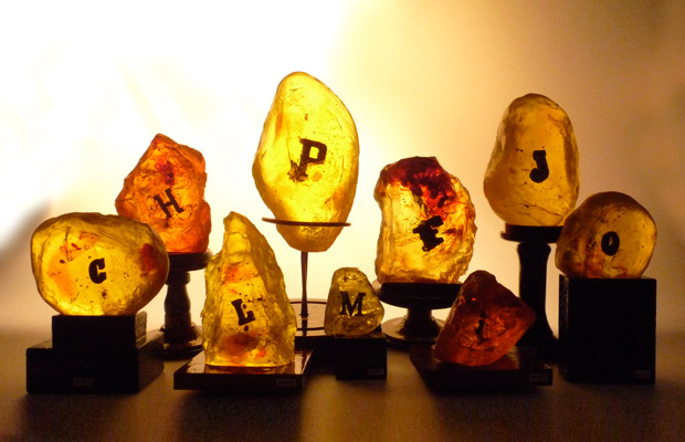
Turning typography into a metaphor for evolution, Scheiger depicts the immortal nature of the written word with his latest contribution to the Evolution of Type series, Exhibit 16/1-9. Reminiscent of fossilized specimens suspended in amber, Scheiger takes an anthropological look at the future of the craft. Casting solitary letters made of balsa wood into polyester glass resin, the designer spells out a cautionary tale that echoes the way of the extinct trilobite fossil group. Scheiger reflects, “With digital print processing, letterpress letters indeed become something like ancient species.”

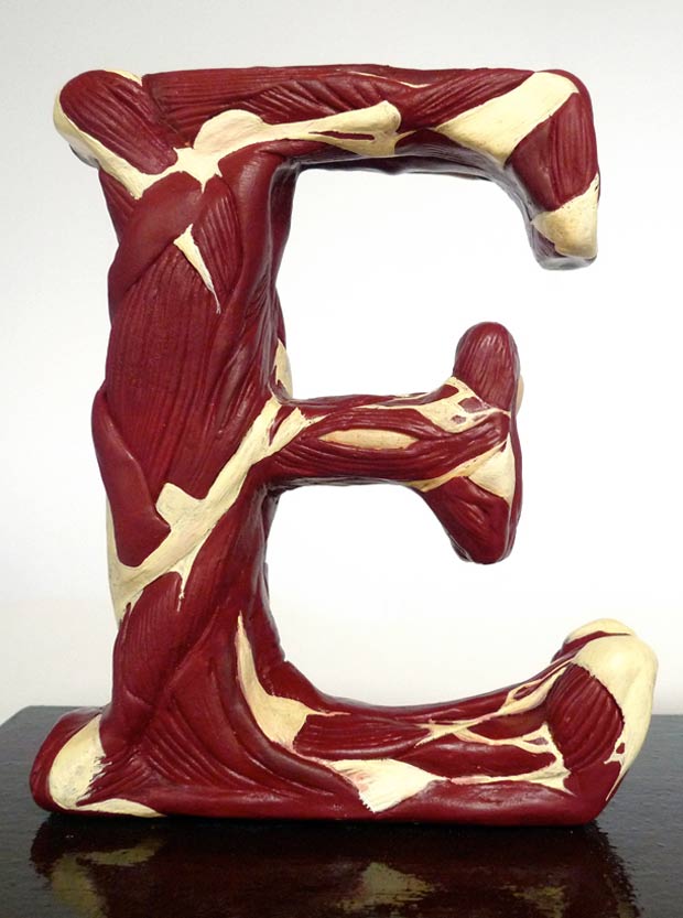
The seemingly petrified letter blocks follow in Scheiger’s alphabet, which also includes sculpted letters splayed in sections to reveal a realistic array of muscles and marrow. Using a combination of wood and carved chicken bones mixed with polymer clay, Scheiger’s Evolution of Type exhibits visually conjure up an anatomical riff on the children’s alphabet—S is for Spine, T is for Tendon and so on.
For Scheiger, “letters are organisms and typefaces are the species, all classified similar to biological taxonomy. Each letter displays the anatomical features and evolutionary characteristics shared by so many living creatures,” an idea harkening back to Goudy’s inspiration, which focuses on the notion that “a letter should possess an esthetic quality that is organic, an essential of the form itself and not the result of mere additions to its fundamental form nor to meaningless variations of it.” As a result, Scheiger becomes somewhat of a “font surgeon” of design-focused, dissected specimens.
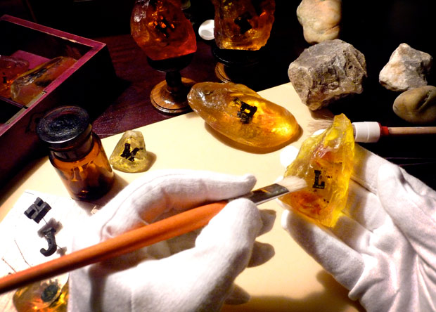
Items from The Evolution of Type series along with Scheiger’s graphic prints are available for purchase in his shop.


