Architectural Review Redesign
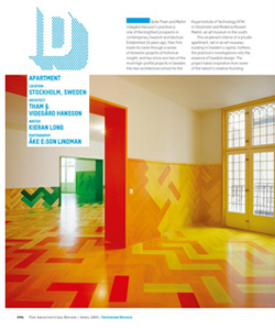
Architectural Review, the seminal publication founded in 1896, is receiving its first redesign in 20 years thanks to the people at Alexander Boxill. The project was executed by Violetta Boxill in collaboration with AR's art director Cecilia Lindgren.
Boxill notes in her statement of design, "In honor of the Architectural Review's tremendous legacy we decided to start our redesign journey by looking back through its archive. Visually, its graphic heyday was under the art direction of William Slack so we chose to re-draw/re-configure one of his original mastheads. Therefore embracing the past but introducing a contemporary slant by rendering the letterforms as a merged unit—[something that was] impossible in Slack's day as he used metal type."
The magazine's new editor, Kieran Long, keeps the idea of resurrecting ideas from AR's past going by introducing sections with names (skill, marginalia, id, outrage, etc.) culled from issues of the same era. Approaching these sections as "mini-brands," each will be based on one font but rendered in a variety of patterns and colors, which they plan to tweak throughout the year using different paper stock and spot treatments. The new design incorporates two fonts, Mercury and T-Star, a serif and sans serif in varying hierarchies and intensities throughout the publication.
via Dezeen