Aston Martin Updates Its Iconic Wing Logo
This is only the eighth major update in the luxury brand’s 109-year existence
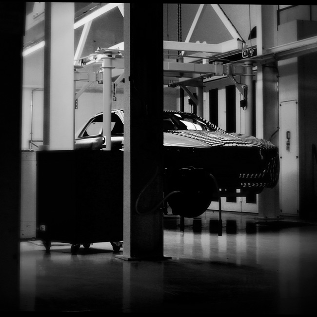
This week, luxury British carmaker Aston Martin unveils an updated version of its iconic wing logo along with an updated logotype and a new tag line. The sophisticated tuning of the logo may not be noticeable to some, but for CH readers it’s likely quite obvious—the wings have simpler, bolder lines and the logotype is both refined and more prominent. The livery will debut on the Aston Martin Aramco Cognizant F1 car at the 2022 French Grand Prix, and will roll on all new brand touch points in the coming months.
![]()
The new identity centers on the concept “Intensity. Driven.” combining Aston Martin’s alignment with performance, luxury and sophistication. Both a refresh and a slight tuning to better attract and connect with younger customers, it’s the first major update since 2003, and only the eighth time since Lionel Martin and Robert Bamford founded the company in 1913. The new wings, designed in collaboration with renowned British designer Peter Saville, are handcrafted by Birmingham-based artisans who typically work with jewelry, adding a special touch to every new Aston.
We spoke with Marek Reichman (Executive Vice President and Chief Creative Officer at Aston Martin Lagonda) and Renato Bisignani (Head of Global Marketing and Communications at Aston Martin Lagonda) to find out more about developing the new logo, and why it was time for a change.
![]()
How does the new logo and identify fit into all of the other components of the brand’s design and make it whole and complete?
Marek Reichman: The team—in terms of sales, marketing and design—have all worked together on this reinvention. It’s not been a singular action; it’s been a very collaborative move, because every touch point is affected, even down to the color of green used or the typeface. It’s not an easy task either. The journey to today has been a long journey; especially when you consider everything involved. From retail to manufactured parts to print materials to websites to wherever our logos are embedded; you must look, search and change these things. This required a huge team effort, and without the team we couldn’t have done it.
Obviously, you only do this when you can affect all areas of the business at once. One of the core areas of luxury is consistency, and you only do something like this if you can be consistent. The message has to be consistent, and we have to look at how things must change overnight to roll something out like this.
![]()
What were some of the challenges you faced given the range of applications it needs to support?
MR: The challenge is to make sure we’re meeting the expectation of the redefinition of the brand; the “Intensity. Driven.” part of it, and with that comes clarity. It’s all about clarity. For example—in a most explicit sense—Formula One cars are fast-moving objects and they need to be recognized instantly. Clarity was, and has always been, a challenge. We needed to make sure we could have the complex nature of our wing remain, but there needed to be a greater clarity to the graphic language of that wing. Everything we attempted to do we achieved. More clarity. More saliency. Matching the visual language to the marketing language. We ticked all the boxes.
![]()
What was it like working with Peter Saville and his team?
MR: It was an intense process in the best way possible… Obviously, we have the capability to develop and design internally but we wanted to make sure we were working with the best—as you would with anything. And so, we desired to work with one of the world’s best graphic designers who is recognized for doing this. Peter has worked with Burberry and their repositioning. Peter is first and foremost a graphic designer. He has incredible clarity of vision.
From a personal perspective Peter is someone who—when I was a young designer—inspired me greatly from his work and someone for whom I’ve wanted to work with for a long time. It goes back to his clarity of vision and messaging.
We didn’t get to meet each day, so when we had our sessions, we met to pick and decide on this and that. They were quite intense—and you must be that way if you’re a graphic designer, because what you’re working with is something where fractions of a millimeter make all the difference in the world. And, well, he’s one of the world’s foremost experts. It was great.
![]()
Why did it feel like it was time to update the brand’s positioning and identity?
Renato Bisignani: Aston Martin has entered a new area and we’re accelerating hard into a new era… With that come several very important strategic business decisions as well as a very clear direction for the brand. These decisions can be summed up as “fast.”
There are the improvements specifically regarding our product portfolio. The performance and technology of our core products is expanding and the extent to which we’re diversifying our portfolio is amazing. We’ve expanded beyond simply being producers of our well-known sports cars and GTs to [just 24 months ago] launching our first-ever SUV, and now we’ve launched the fastest, quickest and most powerful luxury SUV in the segment with DBX707, alongside an ever-expanding portfolio of rear mid-engine performance cars like Valkyrie and Valhalla. On top of this, we’ve begun repositioning the brand within the ultra-luxury space. We’re leaning into exclusivity and scarcity, by building one less car than the market demands.
![]()
These decisions in this new era have given us a clear direction, and we really want to align the brand and its positioning with the direction the business has taken. In doing so, we needed to ensure we build more meaningfulness (a better connection with our customers) and differentiation (a distinctive way of communicating and marketing our brand) and of course, make sure we’re more salient.
Obviously, it requires a significant but authentic shift. We are very lucky Aston Martin has some strong key attributes which we want to nurture, attributes we want to cherish and attributes we want to maintain. The brand is really well-known for its elegance, for its sophistication and its design. These are all great things but under the surface there were more attributes we want to ladder up to. Sure, we want to imbue more performance, but we also want to have a bold, more edgy and more confident, tone of voice. All of this is designed to assure we can build a stronger image association for the brand; not only with existing customers but also to open the door to new customers who may have not previously considered us.
Images courtesy of Aston Martin