Best of CH 2010: Top Five Color Stories
From a Maserati bike to a neighborhood revival project and Yves Klein’s retrospective, the year in color

Color, perhaps the most powerful, immediate and accessible element in a designer or artist’s repertoire, blessed 2010 in abundance from all quarters. With products, fashion, art and social projects all proving that color is a key to unlocking human emotion on a multitude of levels, here are five offerings which had us more than tickled pink this year.
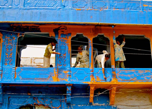
Let’s Colour
One of the most fantastic things about color is its ability to change the feeling of a place or even a viewer—often without anything more than a bucket and paint brush. Dulux’s Let’s Colour project typifies the simple power of a splash of color. Throughout the year volunteers have taken the Let’s Colour project to all corners of the world, helping to brighten up neighborhoods and locations which needed a little lick of paint. Working in collaboration with the locals, Dulux has been able to not only breathe some life into the downtrodden locations but also empower the inhabitants in the process for a truly inspirational venture.
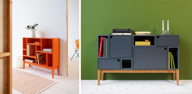
Zweed
Arming the consumer with a little creative power, Zweed produces bespoke furniture which the buyer can spec out themselves, choosing color, shape, material and form. As we enter 2011, Zweed is truly showing how times of economic strife can lead the increased customer satisfaction, product longevity and beautiful pieces of handmade design which carry with them narrative and meaning in their coloring.
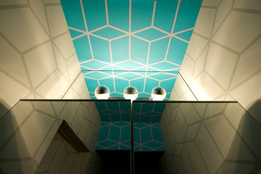
Evolving Image
Color can produce a dizzying array of effects and illusions in an architectural space, shown this year in the renovation of the compact CH HQ bathroom. Designed by Evolving Image, two tones of gray, a geometric pattern and a complimentary aqua accent draw the viewer’s attention to the paint job while elongating the small space. The blue-green hue is also a color which will remain fresh and contemporary for a long time, while gray always acts better as a base tone than a purer white if you want to pop an accent.
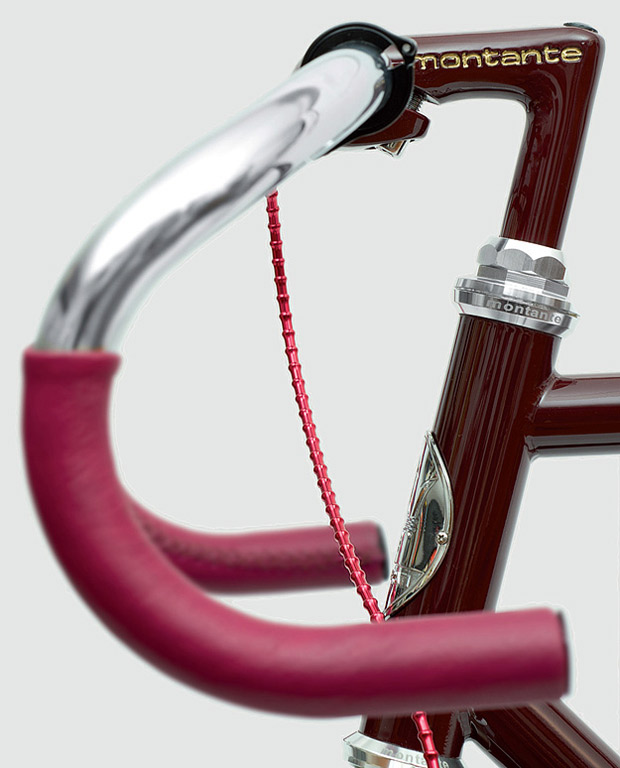
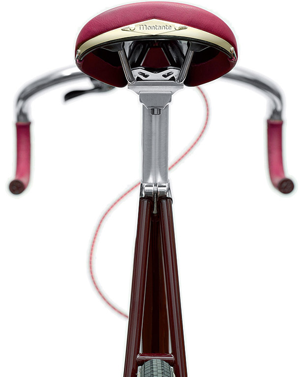
Montante Maserati 8CTF
This year the cycling world has enthralled and inspired in terms of color use, but it’s hard to find a pursuit which has a better grip on color combinations and selection than the Montante Maserati 8CTF. If you think about the physical constraints of a bicycle, in terms of the actual surface area one has to color, it makes the achievement of creating a mind-blowing color combination—one which is staggering to even the most skilled colorist. Examples of quality coloring on bikes this year are endless but this piece—produced in honor of the Maserati 8CTF winner of the Indy 500—demonstrates a great subtlety of tone played out with gold accents. Deep, luxurious, completely desirable and proof that you don’t have to go chromatic to make a statement.
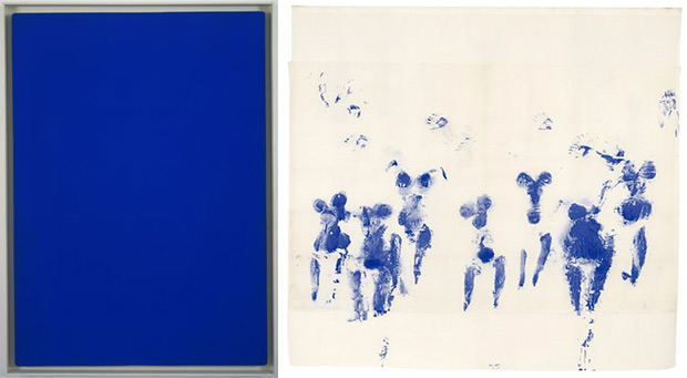
With the Void, Full Power
No top five of color would be complete without finding some way of mentioning the retrospective of Yves Klein, whose famed International Klein Blue pigment remains the most acute colors seen with the human eye. With the Void, Full Power is still showing and is an absolute must-see. In fact, we recommend everyone at some stage in life gaze in awe at even the smallest pile of the powdery IKB. The glow of this color brings out such a gloriously base emotion that the very thought of it makes me want to weep joyfully in a corner.


