Echoes of the Future
Young designers turn back the clock on design


As food, clothing and home goods have skewed toward an old-timey vibe with a focus on handmade, locally crafted wares, so too has graphic design turned back the clock to the pre-digital age. Gestalten‘s latest release, Echoes of the Future, profiles emerging designers that mix current technology with letterpress printing, vintage imagery, dated photographic processes and hand-lettered type—or at the least the illusion of it. There are nods to modernism, abstract expressionism, futurism, retro color palettes and the birth of the gridded layout.
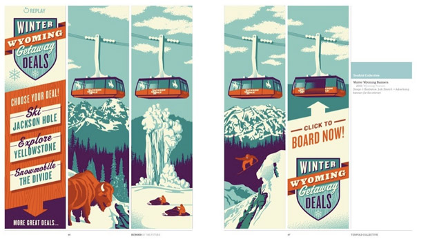
As you page through one muted, mid-century color palette to the next, the influence of past designers can start to feel a little heavy-handed, begging the question, how much style can you assimilate without sacrificing your own voice? But they don’t borrow as much as you might think. Tenfold Collective‘s illustration for a “Winter Wyoming Getaway” comes off as kitsch until it is compared to a true example from a 1950s travel brochure. The side-by-side comparisons showcase just how original these new designers are.
The book also makes the interesting assertion that the draw towards time-honored design work indicates an “aspiration to visual longevity”. The introduction continues, “In these times of visual uncertainty more and more brands, products and businesses are using designs that promote the impression of stability.” Take the new Hertz campaign, illustrated by Chris Gray for DDB. The bold, three-color palette, the shading technique and heavy typeface are clearly inspired by the European and Russian futurist movement—and it’s great. We can’t help wondering if this is a way to make a statement or to play it safe, something only time will tell.
Echoes of the Future is now for sale from Gestalten and on Amazon.


