Engaging Beer Can and Bottle Design
Six interesting approaches to branding from Japanese cat brew to limited edition Guinness

While the following beers were vetted by taste first, something continued to please the team here at CH: the way they were presented. Whether it’s curious art, exquisite fonts or just clean, classic branding, the following six beer companies struck our collective fancy. Even though one shouldn’t judge a book by its cover, the packaging of these brews definitely offers insight on what you’ll find inside.
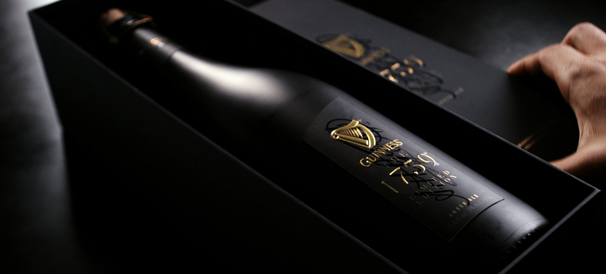
Guinness the 1759
Throw out any preconceived notions you may have of Guinness. The exquisite, near-champagne-like construct of their bottle design and branding for Guinness the 1759 accurately reflects the superior product within. Released back in October 2014, as part of the Guinness Signature Series, this limited edition, ultra-premium beer incorporates both beer and whiskey malt. It’s a rich amber ale with full hops and slight fruit notes.
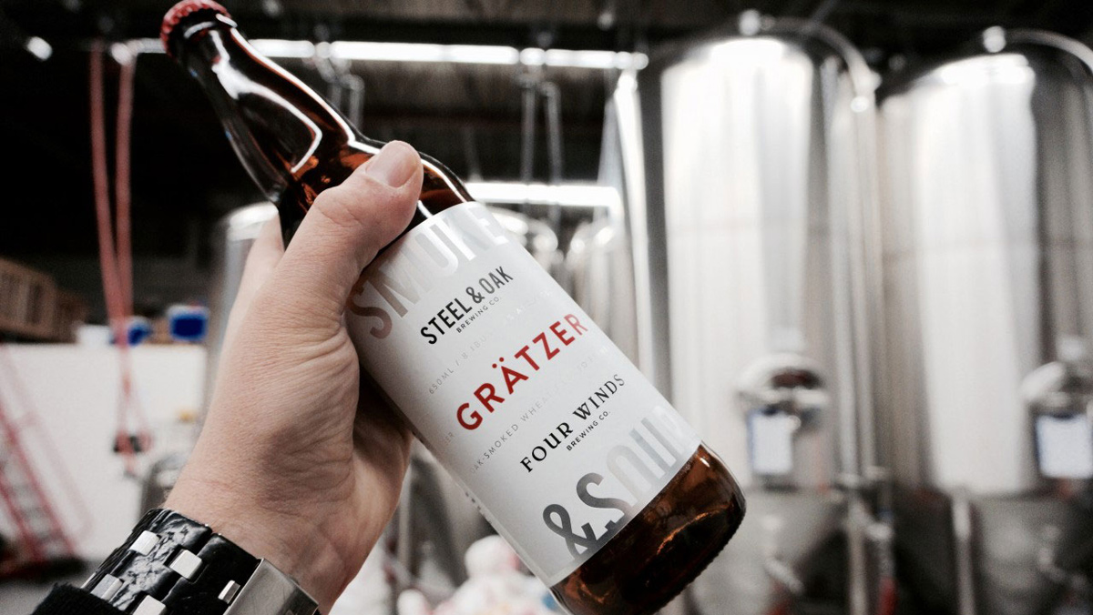
Steel & Oak’s Grätzer
Housed in New Westminster, BC—the oldest city in Western Canada—Steel & Oak Brewing Co produces a stellar series of beers utilizing North American, German and English brewing techniques. Their delicious, well-crafted and thoughtful offerings strike a nice balance between modern and traditional, as does their crisp, font-driven packaging. The highly carbonated Grätzer is robust and smoky, distinct dark beer.
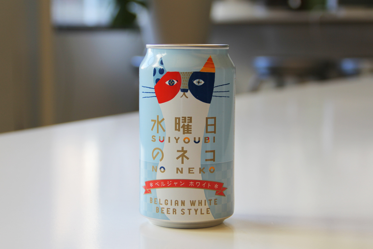
Suiyoubi no Neko Belgian White
On a recent trip to Japan, we picked up a six-pack of Suiyoubi no Neko (which translates to “Wednesday Cat”)—and yes, we did so because of the charming cat branding. This “Belgian White Beer Style” brew from Japan’s Yo-Ho Brewing company is light-bodied and refreshing. The wheat is quite evident, as is the carbonation and there’s a delightful citrus tang throughout. It’s playful, much like the imagery adorning the can.
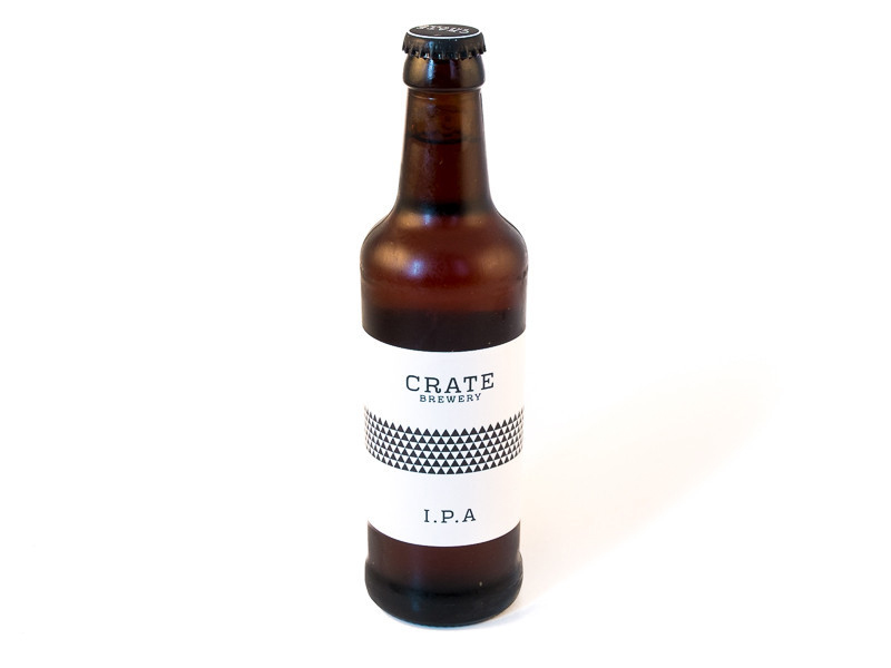
Crate Brewery
Taking minimalism to an impressive level, Hackney Wick, London’s first-ever craft brewery—Crate Brewery—actually produces in a former print factory. Their lovely malt notes are complemented nicely with the balance of sharp text and geometric patterning on their bottles. It’s fitting of their industrial space location—which also houses their own Crate pizzeria and plays host to many events. Their entire range is worth trying, and each label varies in accordance to the product within.
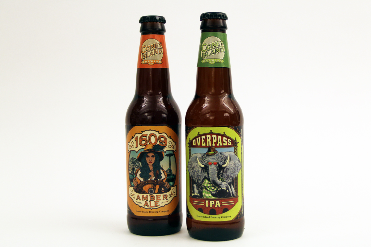
Coney Island Brewing Co
Making reference to the eccentric, exciting location referenced in their name, the illustrations featured on Coney Island Brewing Co‘s bottles carry charm that matches their contents. Impressed by both the Overpass IPA (a citrusy, aromatic iteration) and the 1609 Ale (a rich and nutty amber ale), we were equally smitten with the artwork. These two new beers were released in January 2015 as an homage to Brooklyn’s storied past. The brew reflects that history, as does the art.
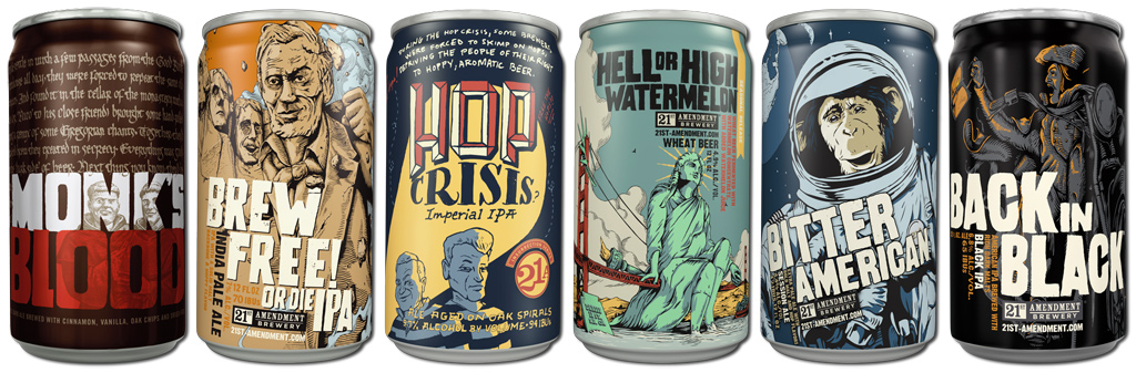
21st Amendment Brewery
San Francisco’s 21st Amendment Brewery adorns their cans with punchy, bold comic book-like illustrations and grand captioning—partnered with rather evocative names. The beer inside happens to be much the same: bold, full and exciting. From Monk’s Blood to the Brew Free! Or Die IPA, the range carries attitude enough to match their visual assets.
No Neko and Coney Island Brewing Co images by Cool Hunting, other images courtesy of respective brands


