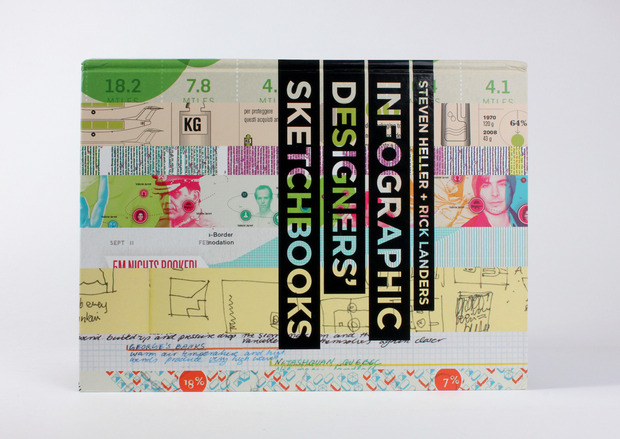
Infographic Designers’ Sketchbooks
A rare look inside the process of data visualizations in this in-depth tome

Designing compelling and informative ways to communicate raw data has never been more pertinent. In light of the ceaseless thirst for information brought on by the digital age (along with the multitude of access points for such information) the wealth of rich infographics produced today is nothing short of astounding. Taking into account the balance of design, art, science and mathematics these graphics demand, the “Infographic Designers’ Skectchbooks” peers into the process behind these oftentimes clever and always informative works. Profiling everyone from stalwart designers like Massimo Vignelli and Deborah Adler to lesser-known designers, the book highlights the beautiful visual displays of data that would otherwise lull most readers to sleep if found in a spreadsheet.

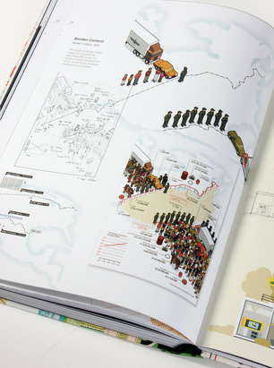
Organized alphabetically by designer, this Princeton Architectural Press release combines both breadth and depth. The 352-page tome spans just about every topic one could imagine—from politics to science to pop culture to finance. One of the (many) beauties of data visualization that readers will come to appreciate, is the communication of complicated information, where data isn’t just visualized but brought to life in story form. Consider Kryzysztof Lenk’s visualization of a composting facility. What is essentially dry, complex scientific information is brought to life by storybook-like imagery embedded with raw data. Still, however polished the final product is and whatever data it represents, the common theme is a good old-fashioned sketch at the start.
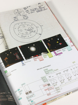
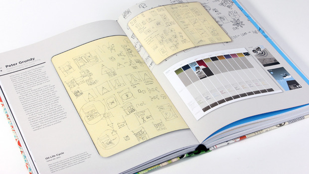
Infographics are all about precision, so it’s enlightening to see the first pass each artist or firm uses alongside the final graphic. Nearly unrecognizable, the foundation of each idea lies in a rough drawing included in each entry of the book. While each designer’s process varies, there is always some level of pen-and-paper involvement that is then translated to a design program. However as German illustrator-turned-infographic designer Stefan Fichtel says, some clients prefer the shaky hand-drawn look from his early sketches. “I prefer the machine hand pen to speed up my work flow as the sketch itself is not the final artwork,” Fichtel says. “Clients will occasionally ask for the style of the handmade sketch to be the final style.”
An essential source of inspiration for graphic designers, publishers, editorial designers and anyone looking to breathe some life into their data presentation, “Infographic Designers’ Sketchbooks” provides an in-depth look at both the creative and production process behind the world’s leading data visualizations. The emerging theme is that there is no single right way to portray a series of data, as long as it’s engaging.
“Infographic Designers’ Sketchbooks” is currently available for pre-order from Amazon ($41) and Princeton Architectural Press ($60). The title hits bookstores 15 October 2014.
Images by Cool Hunting


