Charged: Redesigning an Icon
We speak with Cadillac’s Lead Designer and Design Manager about the intricacies of redesigning the brand’s legendary crest
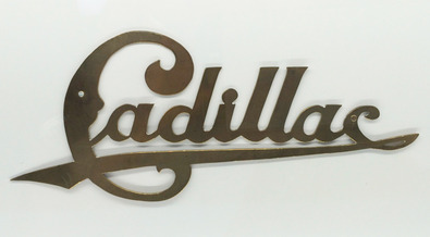
Since its founding in 1902, Cadillac has stood as an American icon of automobile design that hails straight from the heart of Detroit. When the future-facing brand unveiled its sleek, modern new insignia design on the 2015 ATS Coupe earlier last month, it caught the attention of the entire automotive and design industry, ourselves included. As you can imagine, the job of redesigning such a storied badge isn’t one that’s taken lightly. Especially considering it had been nearly a decade and a half since the iconic design had been touched, and some twenty years before that. To learn more about the rigorous—and, as it turns out, highly collaborative—process, we recently had the privilege of speaking with both Cadillac’s Design Manager, Anne-Marie LaVerge-Webb, and Lead Designer Nathan Korkus, the man most responsible for the new look of the Cadillac crest.
![]()
Evan Orensten: The last significant redesign of the Cadillac insignia was in 2000. Did you both work on it?
Anne-Marie LaVerge-Webb: I worked on the 2000 one, and now I manage the [design] department and Nathan [Korkus] works with me. And Nathan has done this one. So I’m old and Nathan is young.
EO: That’s gotta be one of the most exciting assignments that lands on your desk.
Nathan Korkus: It is. We’ve been working on it for more than two years now, and we’ve just been going through the motions of making it, designing it, figuring out how to manufacture it, incorporating all the right details, getting the colors, the grid patterns. And putting everything together, you just kinda do your work without the overall importance of it in a way.
It’s really unique, the way I feel about it. We had to keep it secret for a long time. And then all the sudden comes the day when you’re done, when we can talk about it.
![]()
EO: Tell me about the design brief. Was it from marketing—time for a refresh—or from the design team?
AL: Well, part of our job is always looking at evolving it and keeping it relevant. And you see the architecture move to this longer, leaner proportion—we struggled with the wreath and the crest because it’s a circle. And it just wasn’t feeling right; it didn’t feel like it was evolving with the vehicle.
So we decided to look at what was core and what would maintain the brand recognition that’s so important to us. We didn’t want to just design something new and lose the identity. So taking [the wreath] element away, which we’d done in the ’60s, you can see that’s not an element that was always core to the emblem. So it was conscious what we were going to keep and what we were going to take away. But then also working with the car studio, the designers there, we wanted to make sure that it fully integrates onto the vehicle. So it’s a dual process.
![]()
EO: So would you say this is driven by your design team saying “hey, it’s time for us to revisit this.”
NK: We have a dedicated brand ID studio at General Motors, which helps a lot. It lets us focus more on the branding, including the important things that are heritage for each brand that we do. So that’s the beauty of it. It’s very unique in the industry to have such an advanced branding studio like we have.
EO: Do you want to walk us through the redesigned logo?
NK: You have your gold, your red, your blue and black, which go back to almost everything we see [through the years], except for back to the early 1900s, before they started introducing color on badges. And of course, the crest has always been on there, so that’s the main focus, to have a crest-like look to it.
EO: You lost the ducks.
NK: Martlets. They were legless ducks and they were meant not to land on earth; [they] would be mystical and never land and that gave them the power. That’s the whole meaning behind the martlet.
EO: They’re not ducks, sorry. I stand corrected.
NK: But then the textures were introduced There was a lot of graining in there; it was another important factor we wanted to maintain. And then the coat of arms, the grid work of the bed itself is very important for the function of the crest. It’s always been there as a mainstay for the design.
And then as we try to get the proportions to match the new modern philosophy of Art and Science [design], we tried to change proportions. So we did a bunch of evolutions of proportion changes to get to a good balance that fit well on the vehicle that we could use everywhere.

EO: Do you work with interior and exterior design teams to figure out where the emblem lives on the car in order to make it fit in every situation?
NK: Yeah, mainstay locations that are key—the airbag emblem, the wheels, the front and rear of the vehicle, those are always very important areas.
EO: Are there variations of the design that are specific to those locations?
NK: Actually, [for] every location we have to design a specific manufacturing process. Some of the airbag elements that are chrome-plated are one piece. The exterior badges are two-piece construction. We have electra-form parts, we have backlit samples for the sill plate, in the tail lamps and embroidery. So we have to take all those different manufacturing processes into account, too, when we make this thing. It looks the same no matter how you manufacture it. And that’s a very big part of what we do.
![]()
EO: The insignia is a hugely emotional part of the brand. I’m sure everyone has an opinion about it. What’s that process like of getting the brief, of figuring it out over two years? Who’s in those meetings.
AL: I think when you’re doing your own work, you’re the most critical, so we had a lot of different folks working on it collaboratively. And you know, Nathan is the lead for Cadillac, but that doesn’t mean that just Nathan works on that.
We want to get the best possible product out there, so we do a lot of collaborating with our internal departments—sketching and working off of each other. And we pin everything up and all of us sit down together and start to say, “Oh, I really love that,” or, “What if you did this on that?”
EO: You kind of have a critic.
AL: We do, and we do work with a production studio, the car designers, all that. We have them come in and get a sense of it. And we just started seeing everybody gravitate toward this design that Nathan had. It was just right. You don’t really know until you see it, and I think that’s the only way I can really articulate it because, you know, it wasn’t a matter of, “Take the wreath off and just extend it,” because that’s too simple.
It needed to have a method to it and be very logical. The side is just beautiful. It’s just an extension of the grid work that’s almost an implied wreath combined into one object. So I mean, it was very thoughtful.
NK: Everything is planned. Every surface needs something, and a reason for it to be there, whether it’s a decoration or a highlight or a detail we want to see. Everything is intentional. Nothing is just taken for granted.
EO: Talking about these meetings and collaborating with the design studio, is that kind of a casual thing? Like, “Hey, why don’t you come over and see what we’re up to.” Or is it like having a formal review?
![]()
AL: I think it’s casual because we really want to make sure that what we think is great is what’s going to work with the design of the vehicle. We want their perspective. We need that. So we’ll start talking about some of that stuff before it gets to an executive level. We want to make sure the radar is focused on the right thing—did we take too much out of it or not enough? And sometimes when you look at something too long, it’s hard to be objective.
There’s a lot of camaraderie there and a lot of collaboration, and I think that gets you to strong design in anything.
EO: Tell me about the actual tool you’re using. Are you sketching with a pencil, using a tablet? Do you usually start with paper?
NK: Yeah, a little scribble, a footprint or a shape. I usually write more notes than draw pictures, and then I go from there. And then in the math, I start developing just a slab. You start to pull and extrude the details and find out what you have to do to make these surfaces interact.
![]()
EO: It certainly looks physically larger on the cars than in the past.
AL: That size is dictated by the radar, the adaptive cruise and the long range radar system. That defined the size for us. So there was method to the madness.
Photos by Evan Orensten


