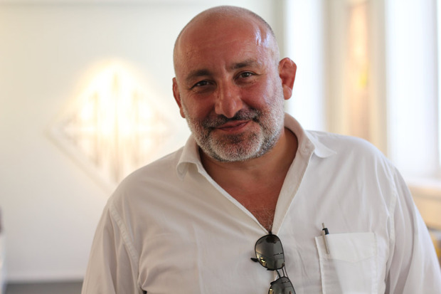
Jean-Marie Massaud for FPM
The renowned French designer creates an affordable luggage line inspired by musical structure and rhythm

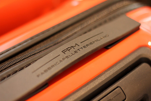
Founded back in 1946, FPM-Fabbrica Pelletterie Milano is a leather goods brand that has come back in recent years with new captivating projects, with the mission to work “in the name of movement”. With the aim to connect with the world of design, the brand has released collaborations with worldwide renowned figures such as Stefano Giovannoni, Marc Sadler and Marcel Wanders.
FPM’s latest collaboration involves French archistar and designer Jean-Marie Massaud, also known for his previous works with B&B Italia, Axor Hansgrohe, Dior, Poltrana Frau
, Foscarini, Lancôme
and Renault
.
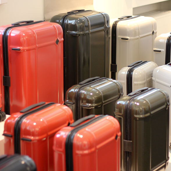
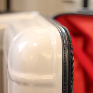
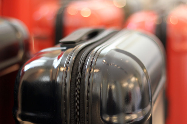
For FPM he has designed a collection of luggage called Globe, due for release in September 2012. The suitcases come in four sizes and are made of 100% pure polycarbonate. The shapes are a synthesis of function and aesthetics, where the technical solutions serve also as visual marks. We had the chance to meet Massaud for an exclusive interview and a preview of the Globe line.
Could you introduce us to Globe?
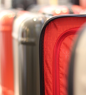
This project is a collection of luggage for every kind of situation: it’s lightweight, solid, resistant, efficient, high level in terms of quality and looks. We tried to reduce instead of adding elements, both functionally and visually. As a result it looks like the archetypal professional luggage for photography equipment and electronic devices, but redefined for common use. However, in order to enjoy it you don’t need to carry complicated electronics or optical products. The shape is just a parallelepiped with smooth edges, with the addition of some ribs (two horizontal and two vertical) that give a bit of structure to the luggage.
How did you define the concept?
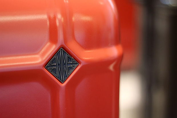
The request from FPM was to have no design, no fashion references, no special attention to fancy colors. That’s why we chose a dark blue that is very close to black, a deep and intense khaki (to stay away from a strong military feel but to give a neat sense of efficiency), a red which recalls Chinese lacquer and a very light and warm grey. There’s also a special edition in white, just because we like white.
FPM wanted to make an affordable product: it’s the less expensive of the collection but not because we sacrificed on quality. For this same reason we also searched for a permanent basic item, meant to stay in the collection for a long time. It didn’t have to look trendy or fashionable—on the contrary, the focus was a simple shape and a large volume, so that we could invest more in the study of details and mechanical fittings. We didn’t want to have a simple basic article without allure or identity, but something meant to be long-lasting as a collection and—from the consumers’ point of view—able to stand the patina of time.
How was the design process developed?
We have designed every single part of the suitcase in the constant quest of efficiency and lightness. We strengthened the structure of the wheels to protect and make them super strong with reinforced plastic and glass fiber. The zipper and the stitches are clearly visible to show how good they are. It’s a strong piece of luggage—efficient and robust—and it has to look like it.
How is the project going to evolve?
We are planning a constant advancement of the project with new materials and innovative production processes, like different fibers for the shell and vacuum-formed neoprene on the inside. This is just a starting point—that’s why we have thought of a very efficient and gimmick-free volume, where the function is the first thing you can read.
At first glance, the surface could recall a sort of monochrome Mondrian painting.
In the future development of the project we foresee adding some pockets, to be placed in the central area defined by ribs. They could be used to place magazines and other flat items, and every customer will have the chance to choose the color, so the suitcase will actually look like an abstract painting. Customization is a clear request from the market—it could be spontaneous (like with souvenir stickers) but we are willing to let people choose some elements of their suitcase.
In this project and in other designs you made sure there’s always a rhythm, a sort of visual melody. Do you have any creative relationship with music?
The first piece I did for an Italian company was the Inout
sofa for Cappellini. When the press saw it they wrote it was “minimalistic and organic”. I thought, “I never care about style, I focus on content. I strive to find a symbolic approach in terms of shape, able to express what’s inside.” I was a little upset with this interpretation, but then I realized this is how my work could be read.
In general I don’t like soft lines and shapes, but at the same time I don’t like a Cartesian way of thinking, where it’s nature against culture. I’m happy when I find a sensual and natural contour, that could be originated by mechanic needs but at the same time could be considered as the link between what’s hidden inside and what is visible outside, between meaning and structure. A simple parallelepiped with smooth edges is boring, unless you read smoothness as a quality. I like to create this kind of dialogue, and in music it’s the same.
I’m not a big connoisseur of contemporary music, but I have studied piano and classical music. In music you need structure and rhythm—if you have complete freedom you get lost but if you only have beat, then it’s boring, the sound becomes artificial and rigid. The combination of these tensions, both in music and design, shouldn’t be a compromise but a constant dialogue.


