Paper Typography
Hand-cut lettering by Australian artist Bianca Chang

By Nestor Bailly
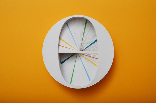
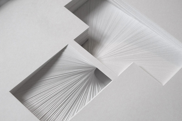
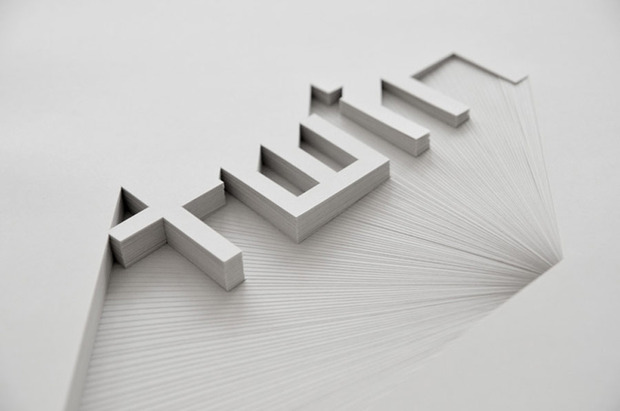
Transforming stacks of paper into something beautiful, Australian designer and paper artist Bianca Chang hand-cuts typographic designs into thick chunks of blank sheets. As she films the process in stop-motion, beautiful patterns emerge in a simple but quite fascinating story of each letter’s creation.
Inspired by tone-on-tone signage and the shadow play of three-dimensional letterforms, the paper sculptures manipulate the medium’s unique properties while exploring purity of form. Chang hand-plots and cuts hundreds of sheets of 80gsm 100% recycled paper using only a pencil, ruler, compass point and blade. Her back-to-basics technique creates work that speaks for itself and turns a normally disposable medium into enduring works of art. We caught up with the artist to learn more about her process.
Why did you decide to work with paper? What motivated you to work exclusively by hand?
Paper is a material that I’ve always worked with since a young age—I think almost everyones’ first experiences of creating images and objects would be with paper—drawing, painting, folding, cutting, pasting. So it wasn’t so much an active decision to use paper, I just never grew out of working with it. My work is a continuation and evolution of very basic techniques. I also loved the idea of transforming something as ubiquitous as paper into something different—by cutting and stacking paper I can manipulate the materiality of the medium and explore form in a very refined way. The push to work exclusively by hand is a product of being a graphic designer. I work all day in front of a screen so it is really therapeutic to practice my fine motor skills for a change. I like slowly working towards a finished artwork—it certainly isn’t an activity of instant gratification and personally it it makes the completion of a piece that much more rewarding.
What do you love about typography? Who/what are your biggest influences, what are you passionate about in the field?
In terms of graphic design, I’m quite interested in the management of type. The work I enjoy most is publication design—using type effectively in a book is quite detail-oriented and rewarding work. I like to look to the work of designers like Bruno Monguzzi, Jost Hochuli, Helmut Schmid and Willi Kunz. In terms of my works in paper, typography is a means to an end. For me, type offers a system by which I can generate new forms. My album cover for Nuojuva’s Valot Kaukaa is an example of this—I created an abstracted alphabet to determine the design. In this way, a typeface offers a set of interrelated forms with elements of repetition, subtle variation and rhythms of positive and negative space.
Chang, who works for Mark Gowing Design in Sydney, showcased recent work at the 2011 A4 Paper Festival there, and we can only hope to see her work travel in the near future. Check out The making of A to see the process play out on video.