Interview: Hector Muelas, RIMOWA’s Chief Brand Officer
We discuss the brand’s new visual identity, product portfolio and collaboration with Off-White
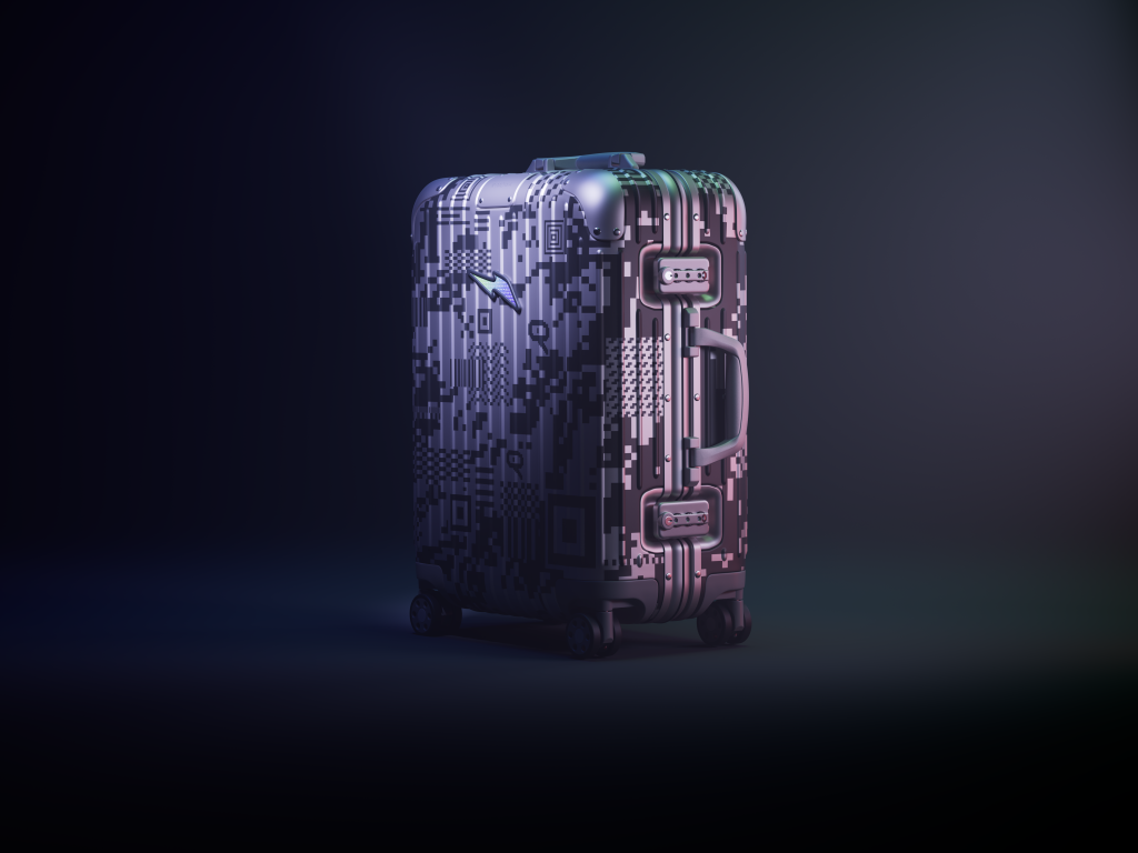
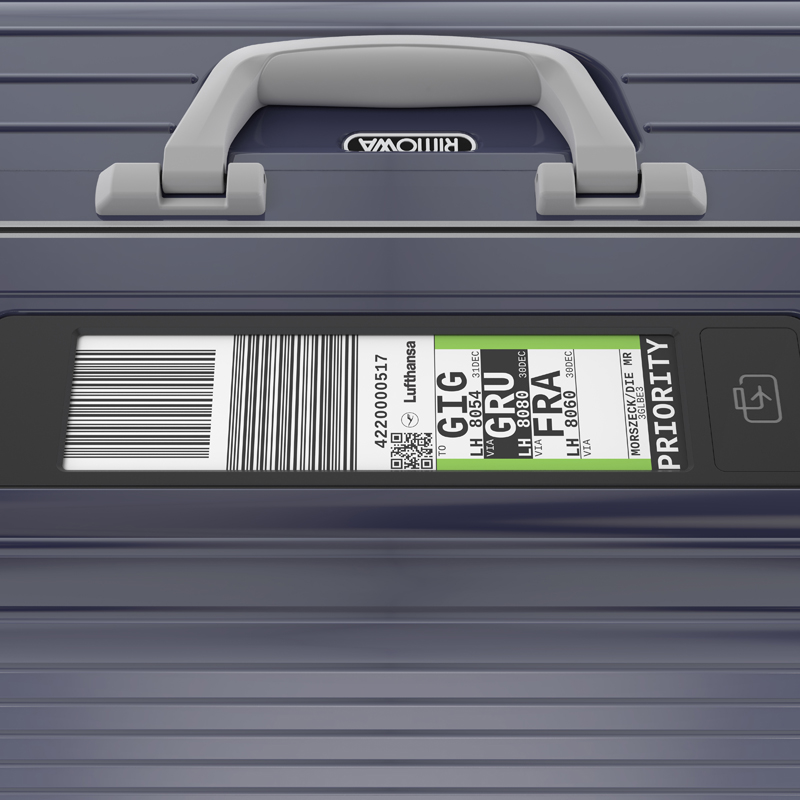
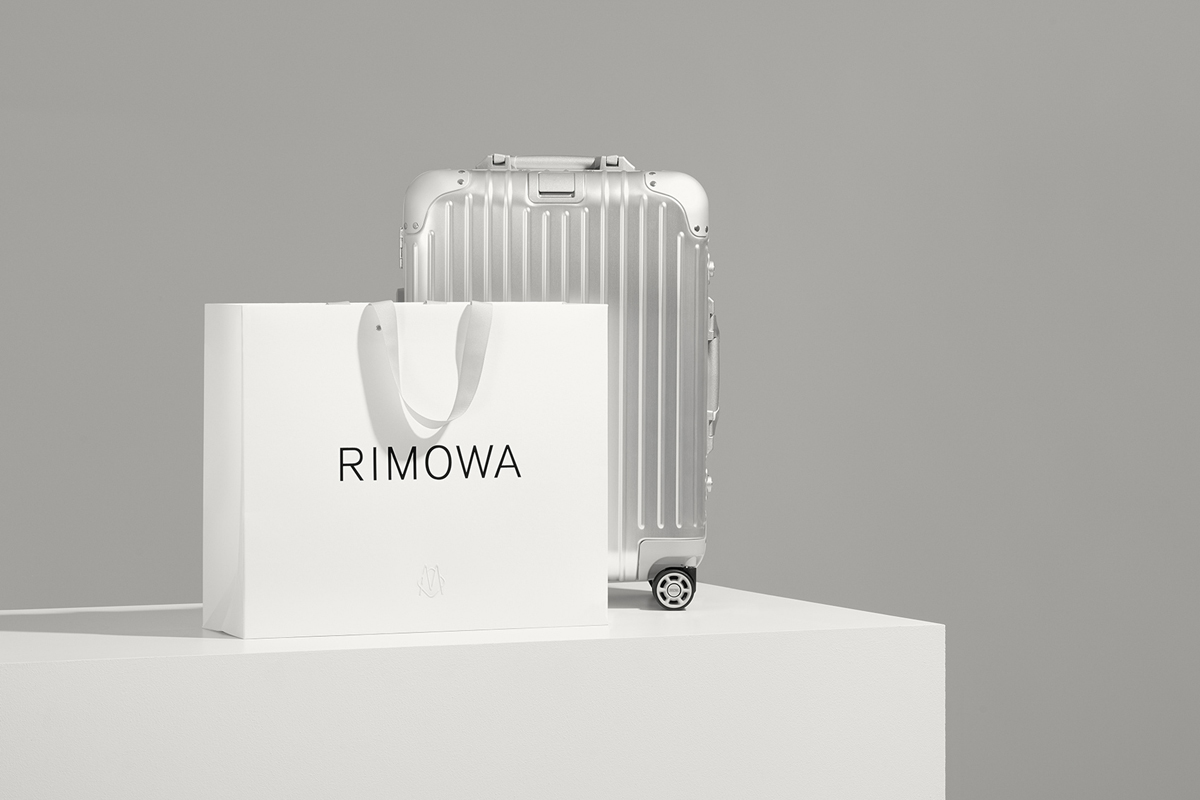
To celebrate its 120th anniversary, luxury luggage brand RIMOWA did something many heritage companies are loathe to do and updated its visual identity. Logically, the refresh harkens back to the brand’s history, but is undeniably contemporary. The rebrand—led by RIMOWA chief executive Alexandre Arnault and chief brand officer Hector Muelas—was executed by Commission Studio, and reflects the brand’s DNA perfectly. Elegant yet utilitarian, fancy yet functional, minimal yet sophisticated, RIMOWA’s comprehensive rebrand includes everything from a monogram to a typeface, packaging suite, pattern motif, rivets on price-tags and more.
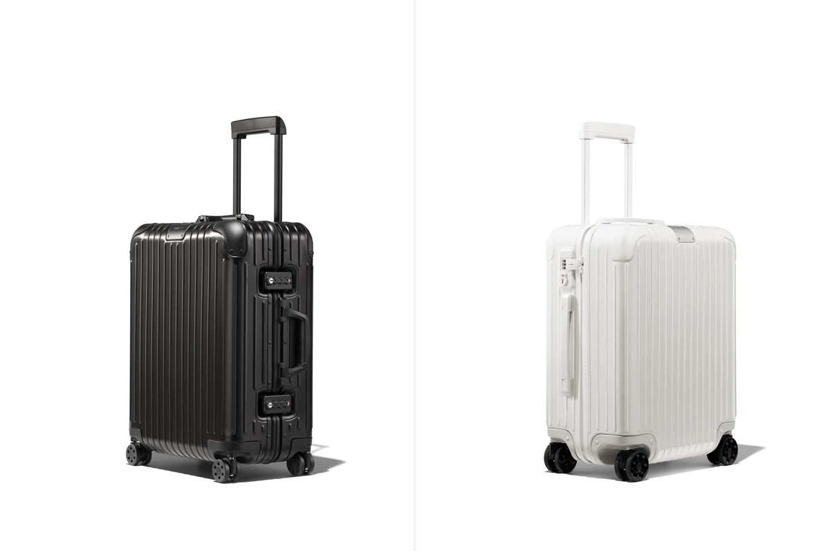
Along with this rebrand comes a new product portfolio that includes advancements on their wheels, handles, and interiors—all while remaining faithful to the brand’s history, including their signature aluminum grooves which was first introduced in the 1950s, and is now a defining feature. To round out the celebration, the LVMH-owned brand tapped newly appointed artistic director of Louis Vuitton menswear, Virgil Abloh for another Off-White collaboration. (Last year, before Abloh’s position at LVMH, the two brands collaborated on two black suitcases—one printed with “Personal” and the other with “Belongings.”)

We spoke with Muelas (who has previously worked at Wieden+Kennedy and as Creative Director of Worldwide Marketing Communications at Apple) about why a rebrand was required and the ways in which tension is both a challenge and a necessity.
Before we get into the rebrand and new collaboration with Off-White, I’d love to just hear a little bit about you. Your background is historically quite broad in reach—working with multiple clients and different categories—and now you’re really focusing in on one specific brand and one specific product set. Now that you’re about a year into your position at RIMOWA, can you tell us a little about the similarities and differences, and maybe some of the challenges you’ve faced?
I think the role that I have and that I’ve had—it might not be an actual consequence of all that journey. I think when you work in advertising, you’re very much focused on solving one very small part of the equation and oftentimes you find that when you’re trying to solve a problem for a brand, it’s analyzed from the lens of the core capabilities of an agency which in most cases it’s just making hats. Apple somehow was a possibility to go in how to own a bigger part of a spectrum, but in a brand where, all the vernacular has already been defined, right? So, RIMOWA is the perfect example of an environment that allows you to, on the one hand be able to tackle all the problems for the brand, and you can identify them as well as to have the entire tool case at my disposal to sort of be able to be strategic about how we solve certain problems and things, so it’s a really exciting opportunity to be able to afford that latitude that maybe previous clear all that, personally I didn’t have to.

What was the brief for the redesign? But also why was it necessary to redesign, when the identity was so—to me at least—timeless?
Well our logic was that, it felt—that’s the key word—it felt outdated. It used a certain type of language, that was used in the ’70s when that logo was made. I think the only reason why people think it’s timeless and it’s iconic might be because of how it was in the ’70s, but that’s not even the original logo. The original logo was actually way closer to where we are, today. And so we felt that it was outdated because it had a design language that was a little bit out of time.
We want have that tension of classic and timeless, while having that stronger conceptual link that embodies the brand
We also felt that it [the old logo] echoed the shape of the suitcase, it had a very sort of first degree, or very literal, interpretation of the brand—rather than a more conceptual one. So the brief was, “How can we create a visual language that is a little bit more contemporary and yet timeless?” Because we want have that tension of classic and timeless, while having that stronger conceptual link that embodies the brand.
Then it started with designing the consumer touch-points, so all sorts of collateral and then it has naturally culminated on the suitcases which had to be updated. And the new visual identity, of course, is an opportunity to also add upgrades—engineering upgrades, not just design, but some engineering upgrades to the actual suitcase case.

Would you say that with this new direction, it opens up more opportunities for product design?
Maybe. It’s definitely much cleaner and more classic and I think hopefully the best kind of “classic.” Also it’s not as overpowering as the previous one, so we also looked at this cover, basically the monogram, which is the original monogram. We made our own, in 1898, that the brand had never used, and we really embraced that monogram, because it’s a foundation of the brand’s heritage, but also an icon that allows us to be really playful.
So you can see how that’s coming to life—for example the new suitcases. If you look at the previous suitcases, the wheel, the little circle in the middle of the wheel had a logo. It’s not a place to put a logo—it’s way too small, nobody’s going to read it. So that’s a place we can put a monogram. A monogram allows us to also create patterns which become more of a decorative element that also adds dimension to the lining of the suitcase where before we just had a repeated logo. So we now have those two elements—the logo and the monogram—that allow us to be more playful and also explore what the world looks like beyond the cases.
RIMOWA has this kind of interesting tension between high-technology and manual handcraft, and between functionality and luxury
What was the biggest challenge along the way, in seeing through this refresh of the branding?
The biggest challenge was—as you said—how do we keep those two values that have always been part of RIMOWA? How do you maintain something that has an element of heritage and classicism, while moving a little bit far away? RIMOWA has this kind of interesting tension between high-technology and manual handcraft, and between functionality and luxury. You have all this really interesting tension among the history of the brand, and how to play both tensions into the design was really difficult.
A logo cannot be everything. When you buy a RIMOWA suitcase—this iconic piece of luggage—you also have a moment where you celebrate that purchase, celebrate that position, that romancing a little bit more of the history of the brand and the manufacturing. Just a tiny example of the way in which the manual was designed, the language you discover the different parts—I think that those elements are the ones that allow us to kind of continue building on that tension. In that, it’s something functional, something luxurious, something that’s handmade and something that’s high-tech.

That word “tension” is perhaps an appropriate segue into the design that Virgil did for the Off-White collaboration. That must create tension—in a good way, in an interesting way, in a conversational way. A clear suitcase, for a brand like RIMOWA, was very unexpected… So why collaborate with Virgil? Or is that the answer—to create tension?
That’s one of the approaches that we have to collaborations—we need to have some sort of organic relationship with this entity that we collaborate with. It always starts from an organic place, and Virgil has been a hardcore RIMOWA user for many many years, and travel has been such and intrinsic part of what he did even before starting Off-White. He’s always been kind of a RIMOWAN and when we [LVMH] started the RIMOWA adventure, he was one of the first people that said, “We need to do something together.”
The piece that we collaborated on has that sort of interesting, as you said, tension. Between it being a hard object, having a touch of the new version, and also being functional because ultimately it’s a suitcase… it’s interesting statement as he often makes with his work. We loved the idea. He was traveling with a prototype for a good couple of months, and he told us that he got so many comments ranging from surprise, to amazement to “What the hell?” It’s gonna be an interesting product to put in the market for sure.
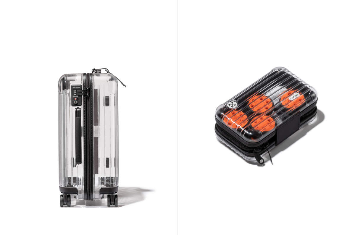
Definitely. Along with the clear suitcase, there are black nylon bags—like packing bags, that also have distinct Off-White marks—is that part of the package you get when you buy one of these?
You get the actual transparent suitcase and then we’ve created the custom bags that are labeled “Miscellaneous.” This means you have different sized bags to pack your things; almost everyone has their own unique piece, the way you pack, the way the fabrics accumulate pressing against the sides. You also get those bags and get what we call a RIMOWA mini, which is a mini suitcase that is also transparent and inside it comes with four orange wheels. This is a little like when you change the wheels on your skateboard—you can actually change the wheels of a RIMOWA. A bit of a DIY vibe that people can put them on if they want to, they can keep the standard black but they have options.
Product images courtesy of RIMOWA, rebrand images courtesy of Bureau Borsche and Commission Studio