Signs of Italy: A Book Exploring 200 Years of Outdoor Lettering
A visually stunning, comprehensive study of typography and more


The true understanding of Italian life only happens in the squares where people love to meet and share, eat and drinkall while observing what happens around them. Its not a stereotype, but Italy and its many contradictions, its grand beauty and its occasional ugliness, meet and reveal themselves best when outside. With that said, designer and calligrapher James Cloughan Englishman in Milanhas undergone a years-long research project on the typography used in the streets of many Italian cities. Therein, he has witnessed the evolution of signs in the last two centuries, shedding insight on much more. This unique collection of images is now a book, Signs of Italy (LItalia Insegna in the Italian version), published by Lazy Dog Press.
I started photographing Italian shop signs about twenty years ago,” he tells CH, “because the most interesting ones were so different from what I had been used to seeing in Britain. I started showing slides to my design students in Milan and after a while other teachers invited me to make presentations in their classes. In 2007, I was asked by Graphicus, an Italian printing magazine, to write a series of short articles on Italian signs and after the experience of writing a piece every month for a year, the idea of a book cropped up quite naturally.

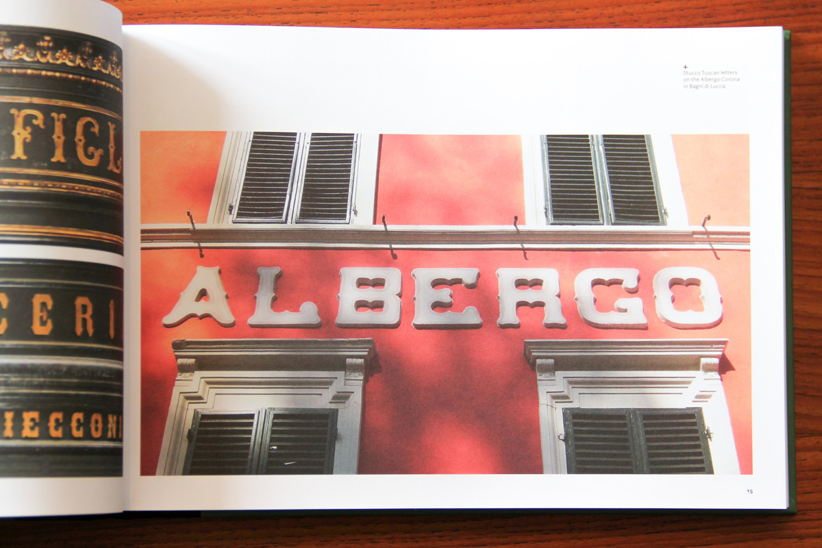
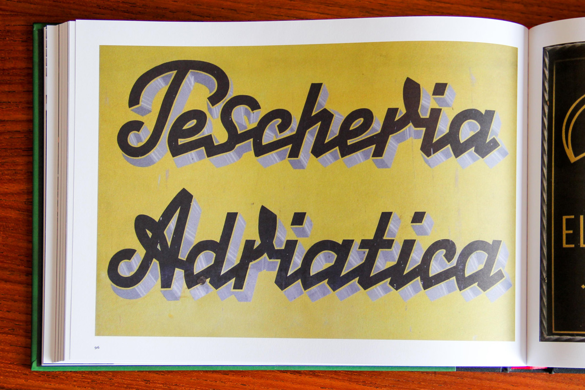
As for what makes Italian signage unique, he shares I love traveling and anywhere you go in Italyeven if its a village or a metropolisyou will find something in the streets that is fascinating either because it is unique or amazingly beautiful or because it is outrageously wronglike a street name sign in three different typefaces and three baselines.” It isn’t always easy, he continues: “you have to hunt for the good stuff, much of it done by the old sign painters, because mediocrity in the shape of dej vu and boring fonts has been taking over street name signs, shop signs and even gravestones for many years.

Clough studied at the London College of Printing and teaches typography and the history of typography in Italy and Switzerland, as well as being a lecturer in the US and UK. This global background allows for a comparative analysis. Sign painting has been a declining trade in Britain for several decades but during its heyday, which covered virtually the whole century, the professionals in this field also adhered to traditional letterforms; unlike their Italian colleagues who were ever so much more inventive and may not have had prescribed models to follow because no sign painters manuals were published in Italy.

While the past plays the central role in his book, Clough is quick to support contemporary Italian graphic design, as well. Yes, the past is a mine of inspiration but it is good to see that some very creative graphic designers occasionally have the opportunity to design shop signs, usually for specialized food retailers or restaurants. Architects are sometimes involved in signs today too but unlike their predecessors of the 1930s, they often have very little understanding of lettering and I show two or three quite outrageous examples in the book.

Regarding what comes next, Clough concludes The book deals with signs and inscriptions dating back to 1815, a time span of exactly 200 years, and therefore including the nineteenth century and Art Nouveau. But several millennia of Phoenician, Etruscan, Roman, medieval and Renaissance inscriptions are absent. And at some point in the future I would like to extend my research in that direction.”
You can purchase Signs of Italy online for 50.
Images by Paolo Ferrarini


