Studio Visit: Crispin Finn
Classic ephemera screen-printed in red, white and blue by a pair of convivial creatives


The fun-loving, low maintenance duo working as London-based design studio Crispin Finn are undoubtedly passionate about red, white and blue. Their signature tricolor formula originally evolved from wanting to simplify a screen-printing process so as to reduce the cost of buying high-quality, super-concentrated ink, but it has since laid an ideal foundation for their graphic and illustration work. As accomplished bowlers, discerning burger enthusiasts, film buffs and collectors of old-school ephemera, Crispin Finn often design around their obsessive interests, and the classic colorway channels an aesthetic that perfectly suits their contour-focused compositions.
While the two designers love to play and take an organic approach to their work, they are meticulous about their process and quality of materials. This likely stems from their respective backgrounds—Roger is an established contemporary artist and Anna is a skilled graphic designer who studied under Milton Glaser. They both enjoy a challenge, and working within a limited color range provides a unique parameter. “The fact that it was just two colors meant we didn’t have to think about stuff—like, let’s just go with red, white and blue—and it lets us concentrate on what it is, as opposed to how it is,” explains Anna.
“And that’s the challenge because you’re like, ‘Oh, if I had just one more color it would make it so much easier,’ but you haven’t, so it’s almost like it makes the work quite a bit better—you’ve had to struggle to make it fit. The movie prints are the hardest because you’re having to use negative space, but layer stuff up, and then you might have a red object in front of another red object and it just blends together. So it’s about composing all those items so that everything still reads.”
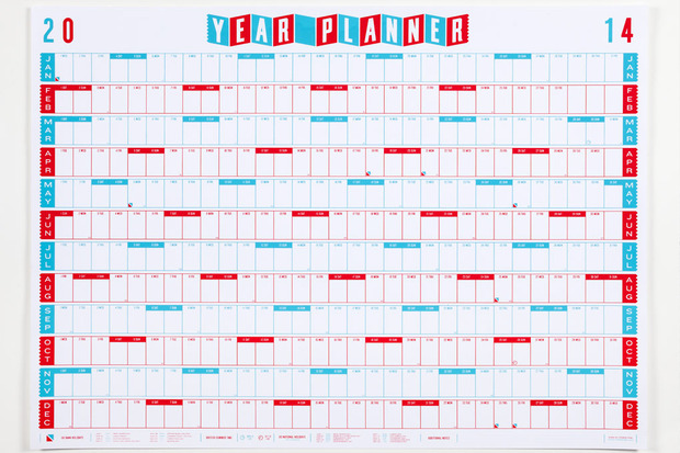
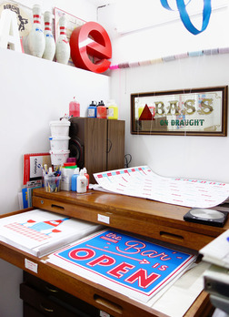
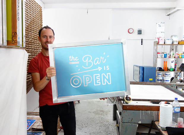
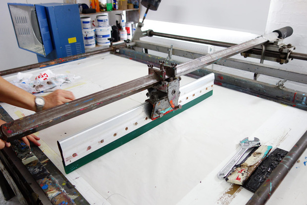
Crispin Finn, whose Dalston studio is home to their own screen-printing equipment, do everything themselves from start to finish, which began when they decided to create a wall calendar at the end of 2008. After selling a dozen to one of their favorite London shops, Present & Correct, the next year they decided to take advice from friends and send one to NYC design blogger Swiss-Miss in hopes a post from her would help sell enough to cover the costs of making another round. They woke up the next day to 200 orders, eventually selling around 1,000. “It was a realization like, ‘Oh, shit!’ Because we only had one screen,” remembers Roger. “We only had 50 spaces on the print drying rack and we had to do each color at a time, so we could just about do 50 prints in one day if everything went to plan, and some days were quite hard too. And then you have to fold it and everything else, so we were always on the back third. Which is great, but not what we were expecting at all. We thought maybe we’d sell 20.”
The pair continued to experiment with their screen-printing, and to “make stuff that we wanted, that we didn’t think was necessarily going to sell,” but their visual playground was not going unnoticed. Requests for their collaborative work began to grow, and they now work on both personal and commercial projects. The newly redesigned website, which launched yesterday, showcases the many ways in which they push their color palette. From tea towels, posters and packing tape, to campaigns for Vodafone, Camden Brewery and London burger chain Byron, as well as Christmas cards for the V&A Museum—their impressive portfolio reflects their mutual desire to create work that has integrity and, despite a nostalgic vibe, feels contemporary and fresh.
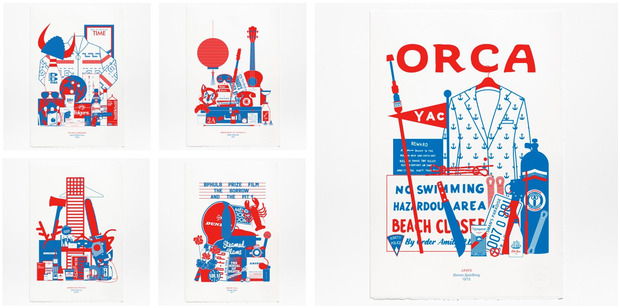
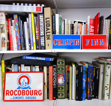
Crispin Finn like to highlight the beauty in “throwaway bits of design” and overlooked vernacular found on common objects. “Some of our work almost becomes like a curatorial homage to stuff that already exists. Obviously, none of that’s our own design. We filtered it through our aesthetic and recreated those things so that they can exist again. When we go to the cinema, we’re always elbowing each other if there’s a sign poster in the background of a scene—that’s the stuff that we’ll be talking about at the end of the film. So part of our work is almost like trying to put all that into one place because that’s what you want to put on the wall.”
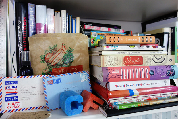
They also aim to make work that is “stealable”; creating work that “you want to slip it into your pocket, that’s what we aspire to,” explains Roger. The pair often do this themselves, bringing back sugar packets with weird pictures, teabags, drinks coasters, panini wrappers and other random memorabilia from their travels (they even ordered the tropical version of the choking sign found in Williamsburg restaurants upon returning home from a Brooklyn holiday). “The things you collected when you’re a kid going on a trip, [our work] all kind of comes from that place. Now it’s just on a much bigger scope.”
Crispin Finn designs can be found in a number of specialty shops around the the UK and beyond, as well as from their website.
Studio photos by Karen Day; website images courtesy of Crispin Finn