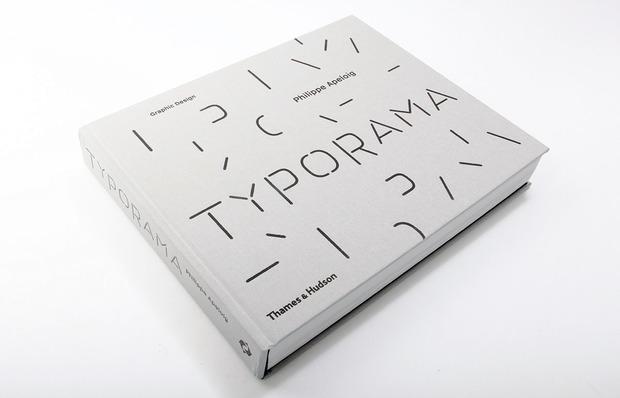
Typorama: The Graphic Work of Philippe Apeloig
A chat with the French graphic designer famous for capturing movement and unpredictability in his work

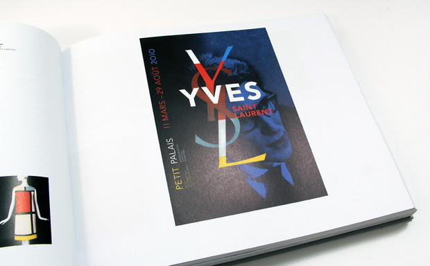
The unofficial French ambassador happens to be a trusted messenger for the cultural powerhouses—museums such as the Louvre and Musée d’Orsay, publishers such as Éditions de La Martinière and Robert Laffont and luxury brands such as Hermès and Yves Saint Laurent. His brilliance has the rest of the world requesting his art, too, including Gagosian Gallery, Design Museum London, Phaidon Press and more. Graphic designer Philippe Apeloig takes lines, letters and shapes and transforms them into captivating structures of movement—which explains why he compares his craft to that of an actor or a dancer. Never one to approach a project the same way, Apeloig captures a lively, impulsive essence in his visual imagery, largely thanks to his bespoke typography and steady consumption of culture.
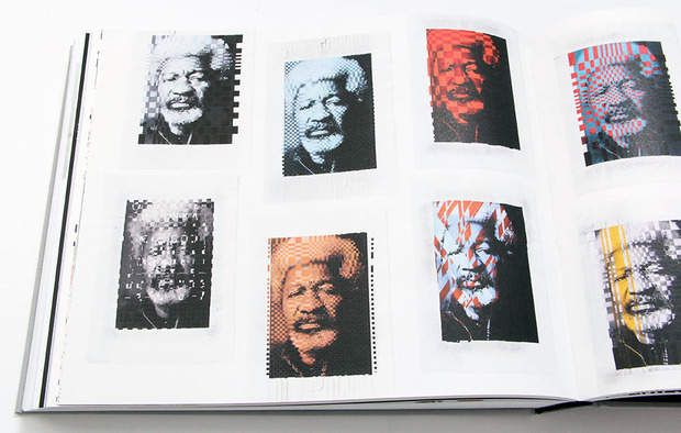
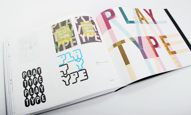
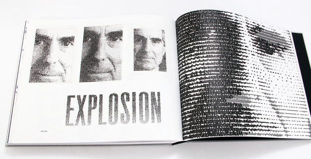
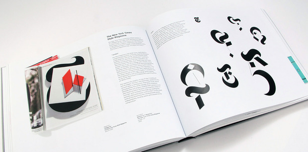
While still only mid-career, Apeloig is already the subject of a retrospective exhibition “Typorama,” at Paris’ Musée des Arts Décoratifs that highlights more than 30 years of work. For those who aren’t able to visit in person, a hardcover book of the same name will soon be hitting stores in North America. The mammoth monograph (384 pages) features a selection of Apeloig’s designs organized by thematic chapters: museums, performing arts, publications, posters and typography, logotypes and visual identities and, at the end, sketches. More than just a collection of images, each project is accompanied by an explanation of the brief, sources of inspiration and how the idea came to realization—a rare look into a distinguished graphic designer’s creative process. The section of sketches is what proves to be most illuminating; the stormy mind of Apeloig unfolds as he brainstorms and experiments on paper and in digital form. We spoke with Apeloig to dig a little deeper.
You’re known for capturing life and movement within your typography and posters. How do you refrain from making the final product overwhelming and finding that balance of energy?
My imagery connects to the human figure in motion.
Originally I wanted to be a painter, a set designer for theater or a choreographer, but I was also attracted by literature and philosophy. While studying art and design, I signed up for modern dance classes and attended many performances. These subjects helped me veer away from a conventional typography approach or severe functionalism into ambiguity and vitality. My imagery connects to the human figure in motion. With type elements, I use repetition and overlapping signs (like kaleidoscopic patterns) to explore synchronicity or de-synchronicity, patterning and rhythm. A poster should sustain visual vitality and richness, which can happen through an unexpected mix of graphic shapes: grids, letters, symbols, photos. I try to give the poster a coherent sensibility and style so that an emotional resonance and tension accrues from its unpredictable formalism.
Can you tell us how your process has changed from 20 years ago to today?
Clearly the technologies have changed our methods of working. The introduction of the computer generation had the impact of electroshock. However, I think that I am loyal to my own creative process, relying on the way I learned design from the beginning. I do research, reading, drawing, sketches, collages and computer tests with typography. We might note how easy it became to use letters—to select a font—in the computer age. The choice is now incredibly huge, without any limit. Most of the time my entire project starts with typographic elements at different stages of development. A project drives me onto a path until I have a fresher eye. All of a sudden I discover connections and mental references that I’ve collected over the years, haunted by my constant desire to invent something new while communicating the subject of the project. I am surrounded by the technology—it attracts me and repulses me.
As someone who works with text daily, have you explored foreign languages with entirely different alphabets, such as Chinese or Korean?
I am now working in collaboration with Atelier Jean Nouvel on the signage for the Louvre Abu Dhabi. All the directional information and the mediation texts are in three languages: Arabic, English and French. I combine the Frutiger Pro for the Latin alphabet and a new font in Arabic which has been designed by Kristyan Sarkis especially for the project. I wanted to juxtapose a universal modernism for the Latin letters with refreshed classical drawings connected with the calligraphic style of the Arabic. Until today, I had no chance to work with Chinese or Japanese alphabets. However, the qualities I like in foreign lettering have little to do with readability. Suddenly the letters appear only for their shapes and qualities, with the emotional and conceptual dimension of art as the typographers originally conceived them.
What was the last book you bought, and why were you compelled to buy it?
Recently, I went to Amsterdam to visit the [Kazimir] Malevich exhibition at the Stedelijk Museum. I bought the catalogue. Along with [Joan] Miró, he is one of my favorite references in modern art. One can find many connections with graphic design and typography in both of them. I go to bookstores in every city that I visit, no matter how short the trip. Whatever the language is, I like looking at books, both the newest ones and the antique ones. I like to have them in my hands, simply because holding them wakes more senses than only the gaze. I enjoy looking at them, at the invention or purity of the typography, and the high qualities of the image reproduction. I like to see both hard- and softcover books and examine the diverse printing or embossing techniques. I also pay attention to the size of the book, the heaviness of the paper, the coated or uncoated surfaces, the almost unspeakable smell of the ink and the palpable noise of the pages as I go through them.
“Typorama,” the retrospective exhibition of Philippe Apeloig, is on view at the Musée des Arts Décoratifs in Paris until 30 March 2014. The accompanying hardcover book, also titled “Typorama,” will be released in North America on 8 April 2014 for $75. The volume was edited by Tino Grass and includes essays by Ellen Lupton, curator at Cooper–Hewitt, National Design Museum, and Alice Morgaine, art director at La Verrière, the hidden art gallery in the back of the Hermès store in Brussels. Project texts in English by Ann Holcomb, based on original concepts by Philippe Apeloig.
Pre-order is available at W.W. Norton and Amazon—or if you really can’t wait, it’s available in Europe through Thames & Hudson now.
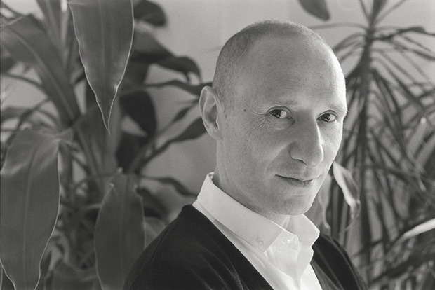
Portrait image courtesy of © Carlos Freire 2013, all other photos by Nara Shin