Best of CH 2014: Data Visualization
An interactive data graphic explores how our content connected last year across categories and keywords
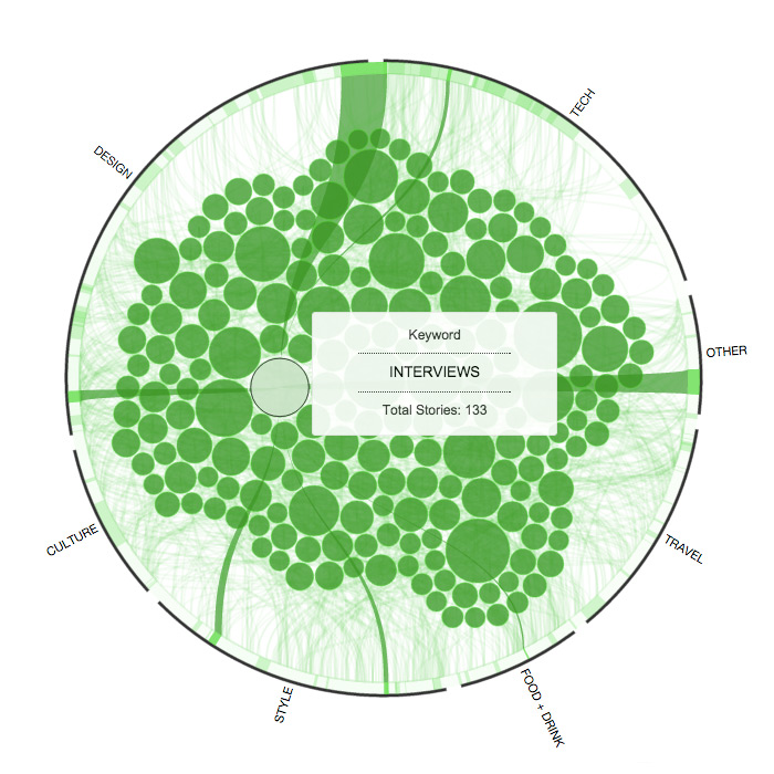
With 2014 complete, we can now take a look back at the year from a quantified point of view. This interactive data map visualizes CH’s most commonly used keywords, which are represented as bubbles within a ring of our main content categories. Each element’s size directly reflects the number of stories associated with it, and moving your cursor throughout the graphic will reveal connections between keywords and categories, showing how this past year’s content stacks up. As with 2013, “NYC” and “interviews” are keyword leaders yet again, while our coverage of the great outdoors more than doubled and collaborations took a top seat as well. We’re looking forward to see what emerges in 2015!