Interview: Ivy Ross, Google’s Head of Hardware Design
How the former head of Glass is turning the company into a product design powerhouse

In her role as VP of Hardware Design at Google, Ivy Ross brings creative expertise in everything from fashion and jewelry to toys and art and even sound healing and Mien Shiang (the Chinese art of face-reading). She dropped out of college right before graduating to open a design concept store in NYC, but still managed to attend Harvard Business School and was recently given an honorary PhD from FIT, her would-be alma matter. Ross is creative yet decisive, sensitive yet bullish. Perhaps, when combined, this has resulted in her untraditional career path which includes brands like Calvin Klein, Mattel, Gap and Swatch in senior positions that toe the line between marketing and design. Though she knows how to navigate the corporate sphere, she’s also an artist whose metalwork is featured in museums around the world. Ross joined Google in 2014 to head up Glass and endured the rollercoaster of that product, ultimately landing it in the enterprise space. She began her current role looking after all hardware design about 16 months ago. This month, the fruits of her labor have come to bear as a new suite of mobile and home products designed and built by Google. Its the companys first cohesive collection of physical product and sets an exciting path forward for the brand.
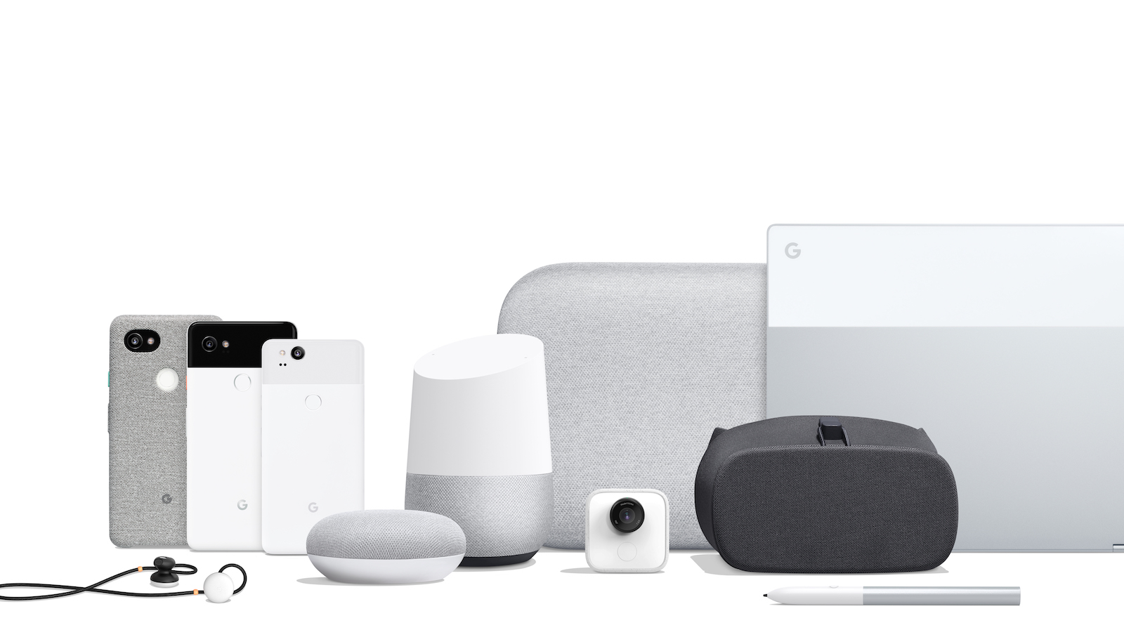
Looking at the new Pixel phones, Mini and Max Home devices, Pixelbook, Pixelbuds and the rest of the product suite, it’s immediately obvious they’re part of a family that grew up under the same roof. They each have a unique purpose, but are aware of each other both technically and aesthetically; they’re warm, textured and share curves and proportions. Color and material choices are sophisticated yet accessible, and include just the right amount of playfulness. Small details like the inset of the Pixelbook’s trackpad or the squeeze-to-activate Assistant on the Pixel phone show a thoughtful collaboration between design and engineering. Building an Industrial Design practice at a software company isn’t easy, but Ivy Ross has done it, and done it really well. As close friends for many years, we recently sat down to talk about this work and her team.

How would you describe the over-arching design direction or design mission for this new set of products?
The mission was to create a design language that reflects something that we believe is very Google and really sets the tone and develops a unique point of viewwe want to be cohesive as a family of products and do whats best for each product, never sacrificing the individual form and function of a singular product.
Its recognizably Google but it feels more elevated than past Google physical design.
Perfect observation! Were really hitting the premium market, so I think the intent was to be sophisticated, but accessible because we’re a brand that’s for everyone, but definitely want to have that optimistic feeling of Google without coming across too playful.
When I think of Google, it’s a very human brand, it has that sensibility of being a little more down to Earth. So the mixing of materials was something that was very intentional to create some of that sensory experience and touchwhereas some of the other things you see in home electronics are very slick or very one noteall plastic or all metal.
Technology is not going away and I think when we stepped back, it was to ask “How do we make it fit into our lives?” and, in some cases, blend in versus stand out
And so the other thing we really took some time to dissect as a team is what we believed our values are and how that translates from Google at large because taking the attributes that Google, with all of its services, asking how that translates into a positioning for hardware starting now and going forward, that delivers on a level that easy to use, but with that wink or sense of optimism that I think represents Google.
![]()
You talked about color and material, I want to add form. What, specifically, in this new set of products in terms of color, material and form that are maintaining the optimism of Google, but also creating this more elevated and sophisticated family?
To me, the sophistication comes through in simple forms that are really pared down to a level of purity and simplicity. Everything has a slight curve to it, and the radiuses are in relation to each other, so even the pixel book, instead of sharp corners, has a curve that relates to the larger curve that’s happening on Max, so all of that was very intentional.
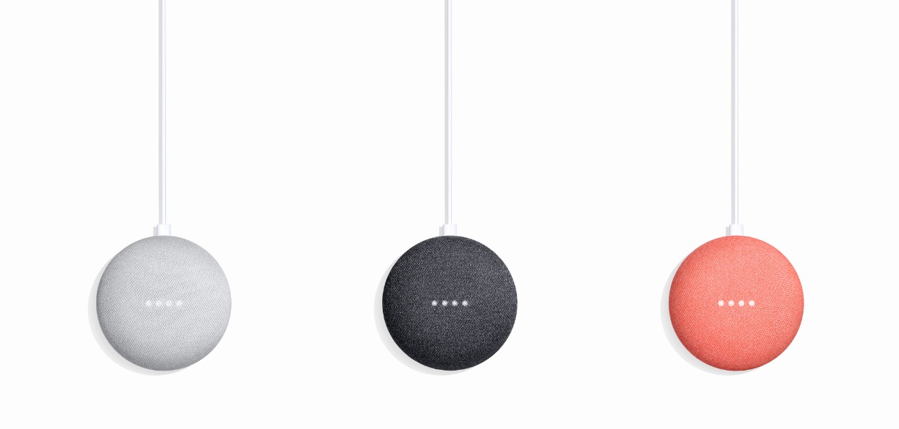
There was an inspiration that things should be almost as soft as snow, so actually in part, Mini was inspired by the way snow forms around a form.

I believe diversity really helps create creativity, so together we’re looking at color, material and finish
But back to your original question, in terms of where are the sophisticated detailsthe break of materials, where appropriate, is done proportionately across products; the use of matte and shiny, as seen in the phones and the Pixelbook is a more sophisticated approach, but still very approachable.
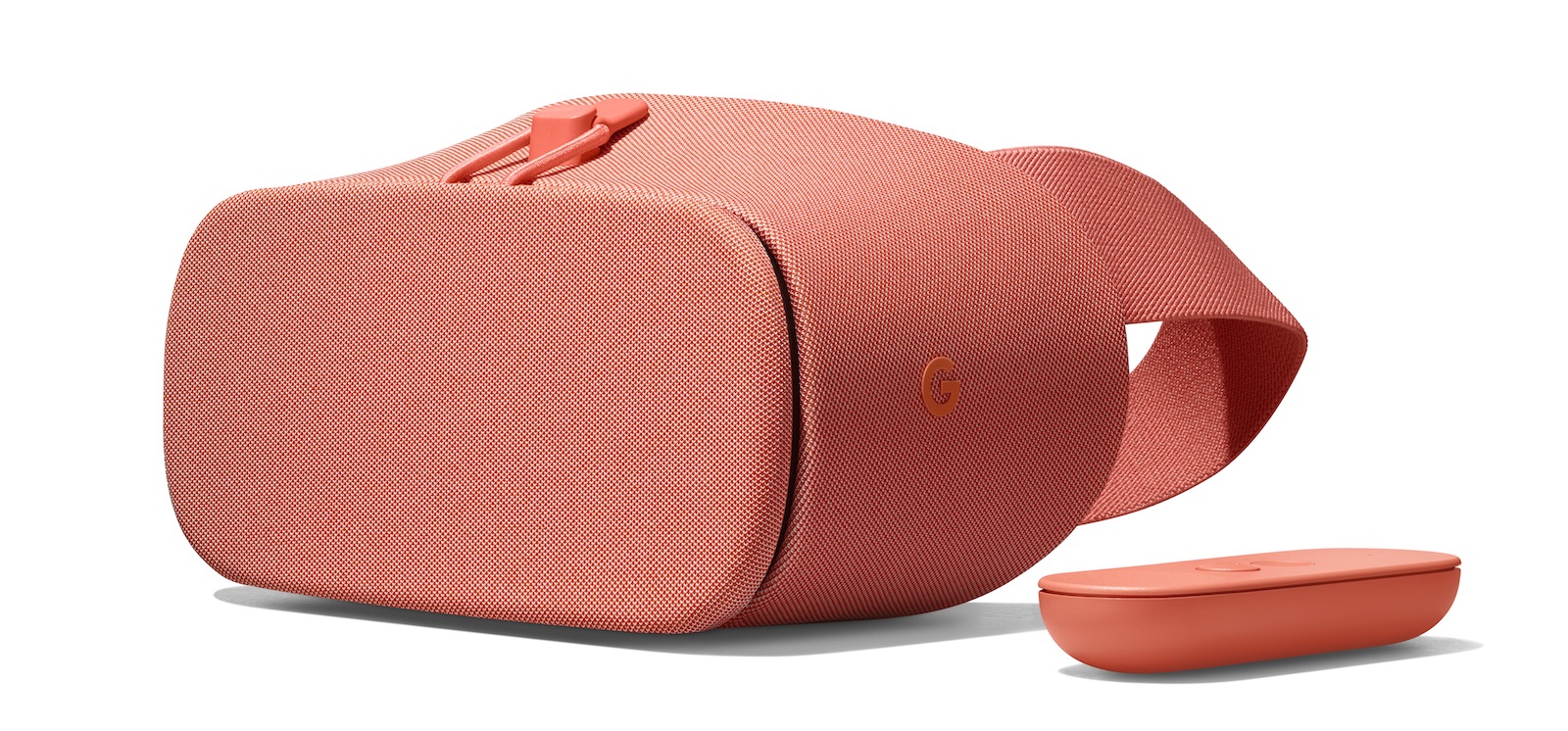
From a color point of view (although it may appear simple in terms of some neutrals and then pops of color), we really took those color trends looking at where the pieces were going to live. We played with many shades of many colors to really find the right balance of neutrals. You know, the white is not a pure white. We call it rock candy. That would sit well with something like a pop of the orange colorcoral. So we really brought a lot of life to the Google headquarters because of our color-material lab. I think it was 160 shades of grey until we found the right grey, and to try and color match as close as possible across many different surfaces and materials was, I think, a task that Google had not seen before.
Some of what Im hearing in your design methodology is not anything Ive heard before from Google, but is very standard in the product design worldwhich is quite different from software design where it’s more a process of build something, put it out there and then iterate. In physical design, youre still iterating, but the nature of or the diameter of that iteration is much larger because youre building a physical product that has to live longer.
So has some of your work been about cultural change, introducing new design methodologies within an organization like Google, which has historically been more software-driven?
Its one of the reasons why there was a hardware Product Area created, because I think the company realized that hardware is a very different proposition than software and youre right, the iteration is probably more internal before it gets released externaly, as opposed to with software, youre constantly iterating, even after you launch.
You know, you can A/B test and continue to iterate, but the commitment to shape, and form, material and colorkind of once you do it, it’s here to stay. So it’s been really fun to be in such a large company like Google, but in some ways, a start-up in being able to model how to do thisbringing the best of what Google has from a software point of view, and creating best practices in hardware.
![]()
The designers and I come from all different disciplinesfurniture designers, phone designers, fashionI mean to have that multidimensional perspective on methodologyand forming it as we go, so to speak, and really yeah, figuring out, because there wasnt a lot of precedent set. Youre absolutely right, it’s an entirely different discipline. And it does take a cultural change when youre doing hardware.
Definitely, but clearly from looking at this new family, it seems you’ve been given the permission to do this rightto think about this product area, as you call it, from a holistic standpoint and think about how are you redefining Googleness within a family of things that people are going to be touching, and carrying, and looking at in their homes in a way that’s very different from pure software design.
Yes, yes! We want it to be a piece of people’s lives for a long time, so it has to be modern and fit into their life, but by no means boring. I dont believe you have to be boring to be able. There were some rules, though. When we did use material, they were all there for a purpose. It wasn’t just frivolous decoration in terms of input and outputall the fabrics were custom, so weaving these custom fabrics that both gave us the look we wanted as well as the performance was really important.
I always say that I am not leaving Google until someday when students get out of product design school and Google is on the top of their list of where to workit’s a legacy that I would love to leave, taking it from a really important company in the world right now, but one that was not necessarily a place you would think of for industrial design
I love that kind of mission, that perspective.
Obviously, the nature of design, some things are easy wins and others, you really have to push for. What are some things you had to fight for? What were you super-passionate about, that you felt was crucial to be part of this family and that might have been a more challenging component to execute?
Things like MiniMini would have been easier just to do in all plastic, but we really pushed to have this sensuous feel to it. If you were going to put it in different places in your house, you wanted it to be something that was beautiful and not just a plastic shape.

Design is not about taking the path of least resistance
So fightingsometimes there’s a path of least resistance and then theres the path that might take more work, but is worth it in the end. And until you see it, and feel it and hold it, thats more than you know, others can appreciate it. Having designed 30 years, I learned, as one has to, when it’s worth pushing and when is it not. I think design is about solving problems, so it’s always within certain timeframes and price range, but I think design is not about taking the path of least resistance. It’s about pushing for something that one has to trust, even though it might take some more effort, is going to pay off in the long run. And I have to say, and the company and my peers, they’ve been terrific about learning, understanding and going on the journey.
![]()
Another example is how many colors things will come in. It was important to design that we have a pop colorand one could say sure, the grey and black might sell better, but the coral, I think, adds the fun and pop in certain rooms. People are actually going to want it. It’s easy to inventory one or two colors, but that wasnt the statement we wanted to makeI think Google should own color, the right colors. And certainly as we create more product, the colors we launch next year will probably be different than the colors we launch this year. What those colors are each season will depend on what’s going on in culture.
A black and white phone with an orange button is bold and iconic
Google is an iconic brand and we wanted to create pieces that were bold and iconic, and of course, again, one could say a black phone probably sells better, but a black and white phone with an orange button is bold and iconic, and iconic for Googleand I have to say the company trusted us and so far it’s been a big seller.
Your design background has a pretty incredible range of brands and categories. To me, the one that’s least Google-ish is fashion. What did you learn from your time in the world of fashion that you brought to this product area at Google?
I think in some ways it’s what I just spoke about, the sense of merchandising, of you use certain colors to sell other colors, and that in fashion, you know when you first walk into the store, what hits you is important, so the context is important. I also learned in fashion that details matter, so that’s another thing we’ve paid a lot of attention to is thoughtful, simple details. But I’d say it’s really just the emotional appeal of things.
The designers and I talk a lot about what we’re feeling, and use ourselves as a gauge, and then of course, also research and test products with others, but we’re craving tactility, texture, so that makes it desirable. So I think, what are we craving now in culture? Usually we crave the opposite of what we have, and for us we have a lot of big flat shiny screens, and so what we’re craving is more form, more dimensionality, more texture, more color. So it’s a natural emotional reaction.
I like to say that we have to mirror, we believe our products are better together and so are we as a team
It’s almost like a painter, you start with one product or a color on the canvas, then you stand back and say, “Now what form or shape would look good juxtaposed with that, and what form makes sense for the function of the product?” So it’s interesting when, I realize now, looking at it, “Wow, together it does have a very unique point of view.” We kind of created this together organically, and really were able to lead with what we felt. I think at the end of the day, we’re excited because we feel it’s thoughtful design and it will be iconic, and it’s something we can play off of, year after year. I mean we are by no means done. We’ve just begun, but we’re keeping “human” and optimistic” and daring” among the words our design department uses to inform the way we think about design.
So we’ve just got to keep moving forward. But where we have seen it in use, it’s been like I said. That’s the reward for meit’s looking at the team’s smile and seeing how proud we all are. And we did it together.
Google’s new hardware products can be purchased online or at their pop-up shops in New York and LA.
Portrait of Ross with her team by Josh Rubin, other images courtesy of Google