Ivy Ross + Suchi Reddy Explain Their Design Process For The First-Ever Google Store
Google’s Head of Design for all Hardware Products and Reddymade’s founder, on a milestone NYC project

Architect and designer Suchi Reddy (founder of the firm Reddymade) worked with Ivy Ross (Google‘s VP of Hardware Design) and Nathan Allen (Google’s Head of Store Design and Special Projects) to realize the technology brand’s first-ever physical retail store. Opened last month in NYC’s Chelsea neighborhood, the first Google Store allows visitors to get hands-on with their devices—be that the Nest, Pixel, FitBit or others—but also lets guests better understand the ethos behind these products and Google’s software, too.
As they developed the milestone destination, Ross and Reddy made sure that it would be certified LEED Platinum, the highest level of qualification, which includes the incorporation of sustainable furniture, fabric, electrical, plumbing and mechanical systems—even the glue used in the flooring. They’ve woven the Google philosophy throughout the entire space, invoking augmented reality-like experiences to invite people into it all.

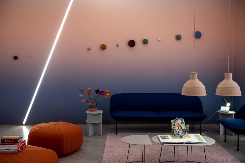
“I see this as a home,” Ross tells us just before we explore the store for the first time. “It’s a home for our products and, of course, if you’re going to be conscious about the products, then the home you put those products in has got to live up to the same standards.” Ross imagined the bright, open space sectioned and nuanced, innovative and timeless, as “part installation, part exploratorium and part informative space. We asked ourselves how we can make all of these things fall together in a beautiful sequence.”
This vision aligns with the mantra guiding Reddymade, “form follows feeling,” and it is an extension of the work Ross and Reddy did for Google during Milan Design Week 2019, which addresses the power of neuroaesthetics. The result in the Google Store is a sense of calm and clarity upon entering.
Regarding the overarching ethos, Ross adds that there is a “sign inside that says ‘here to help,’ and really deep, deep inside, we all wanted to unconsciously send the message through everything we did with the space. We’re here to help you, the customer, and we’re here to help anyone else who is interested in learning more.”

Conversations about the space began internally around 2016. Google then arranged several successful pop-up shops around the US. Ross began to keep track of attributes she’d hope a permanent store would represent. Based on their past work she had a sense that Reddymade may be a good fit for the larger-than-life task.
“Together, we had a brainstorm to note the feelings that the Google teams wanted to evoke in the store. One of them was wonder, another was inspiration,” Reddy tells us. “It was this warm and welcoming idea, but it was also to showcase these products in this really intimate way.” To do so, they knew they needed to work with the long footprint of the store and figure out how to animate its individual areas.

The tall windows were a first step. “We wanted to take that window frontage and make it double-sided retail. I’m a maximizer, so I wanted it to work both from the outside and from the inside; to create this nice boundary of the products,” Reddy says. From outside the store, passersby will see vitrines that tell sequestered vignettes of stories about the products. Inside, they act as another wall of discovery.
“The thinking here was that not everyone knows what Google makes yet, when it comes to physical things,” Ross says. “So we wanted to have these almost Tiffany-like window boxes that you see between.” In total, 18 boxes wrap around the building, each with its own story—including one on sustainability. It shares the story of their fabric, which is made from recycled plastic bottles, and the story around the recycled aluminum in their phones, too.

Inside, they’ve developed contextual spaces that show the products in versions of their at-home environment, but in an abstract manner. There’s a kitchen room, living room and a child’s bedroom—in a way. It’s more a suggestion of these rooms, so that nobody is overwhelmed by the aesthetics. “It was also extremely important,” Ross says, “that we found exactly the right shade of color that would create this very warm envelope so when you walk in you really do exhale [when] you come into the space.”
“Both Ivy and I are so interested in neuroaesthetics and how space makes people feel,” Reddy explains. “and given that this is a very long tunnel [format], it was important to us to create something that could act as a beautiful foil for these products. The driving force behind everything is really Ivy’s vision around what the products actually are—which is something with this warmer human touch.” This led to cork and various types of wood appearing throughout the store.
 These textures and an adherence to sustainability act as guides to a long-term design direction. “This starts restricting the palette of materials that we can work with and the kind of sourcing we can do,” Reddy says, especially if LEED certification is going to be an ongoing desire. “From the beginning, it was, ‘How can we design this so that we’re really addressing how we make people feel?’ Because that’s what my work is about. Ivy’s work has also been about how the products feel, how you hold it, how it fits in your hand. It’s really all about being human-centric. From that angle, we tried to push into the DNA of neuroaesthetics. It is embedded in the way that we think about space and material.”
Reddy nods to the gentle curves found within the space, and how they round against the rigid rectilinear footprint. “There is a lot of research about how curves make people feel more comfortable,” she says. “And when you get this very long, narrow space, we had to ask, ‘How do you introduce a curve into the space to make it feel softer?'”
From the Bolon flooring, which is gentle underfoot and aesthetically appealing, to the cork furniture by Daniel Michalik (a professor at Parsons), the diverse, disparate components come together with an undeniable cohesion, both visual and spiritual. Guests will also find that the space is not dominated by screens, which often distract more than educate in retail settings.

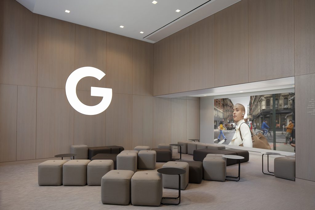
This kind of critical thinking connected conversations about merchandising and the results set a new standard. “We have Nest products that are vertical,” Ross says. “They can’t just sit on a table. We knew we should have them on a wall.” For those, Reddy developed jewel boxes that highlight all of the Google products at a glance, so that “someone could walk in and say, I’m here to set up my ecosystem, my home, and they can see all the products,” Ross explains. The installation space looks simple, but controlling cords, power, lighting and making it look invisible wasn’t easy.

“I hate the way that pegs start out organized, but then by the end of the day consumers have picked through them, and it’s always a mess,” Ross continues. “and so Suchi built this really nice way to have the Pixel cases on the outside of a little box, [where] consumers can see and touch and feel them, but when they want to buy, they touch this door that pops open so that they can take one of the packaged cases out,” Ross says.
It’s all on an angle that makes the entire physical experience easier. “There’s so much technology and thinking that went into all this, [working] with the Google retail marketing team to really think about how to make it convey the information it needs,” Reddy adds.

Some experiential rooms—developed with Deeplocal—allow for deeper dives into select products and capabilities, like Stadia. One larger “Workshop” room will host “talks and community events, but also serve as a space for associates to sit one on one with customers, and in a more intimate way,” Ross explains.
This room also boasts a screen. “We knew we needed a screen, so we found a place to tuck it away, where it’s not in your face,” Ross says. It could also act as the backdrop for a stage. Prior to the COVID-19 pandemic, the team imagined it as a destination for YouTube performances or other gatherings.

For Stadia, Google’s streaming game platform, they developed another dedicated space bound by fun and functionality. “The idea was to make it feel like an environment you might have in your home, in a game room,” Ross says, “and—from a functional perspective—the trick was to make sure that the sound is all directed so that no one overlaps. That’s what those bubbles over each chair are, because you can have three or four people in there playing different games.” In many ways, it looks like the game room of the future; textured and playful.

All of these parts work together to profess a love for design that only attention to detail reveals (the suspended glass tube feature, which showcases Google’s software design, for example). In total, is a nuanced, multi-sensory invitation into the brand. “Since this is Google’s first retail store, we wanted to have a place where we could showcase some of the magic of Google, that isn’t always visible around us,” Ross concludes. “The product experience here is not just the hardware, but the hardware and the software together. This makes it whole.”
What we’re perhaps most excited by is that we are witnessing, first through Ross’s product design, and now through retail, the DNA of Google’s physical design come to life.
Images courtesy of Google