Unraveling Stories

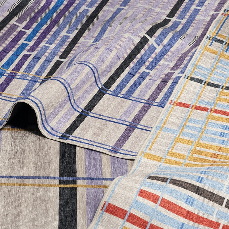
Giorgia Lupi and her team at Pentagram, in collaboration with Well Woven, have created a unique rug collection titled “Unraveling Stories,” which is a data-driven representation of lost and endangered textile traditions …
Find all stories on Data Visualization in this tag archive.

Giorgia Lupi and her team at Pentagram, in collaboration with Well Woven, have created a unique rug collection titled “Unraveling Stories,” which is a data-driven representation of lost and endangered textile traditions …

A hand-drawn personal data visualization correspondence exchange between artists Giorgia Lupi and Stefanie Posavec

Using data from the American Time Use survey of 2014, statistician Nathan Yau developed a fascinating data visualization depicting the average day for Americans. Resembling a Hungry Hungry Hippos game, the simulation …

The latest interactive data visualization by researcher Randal Olson offers some intriguing facts about popular American names. After selecting a gender and entering a search item, Olson’s experiment combs through Social Security …

Martin Bellander, a PhD psychology student at the Karolinska Institutet, created a data visualization that illustrates the use of various colors in paintings over the past 200 years. Bellander pulled the data …

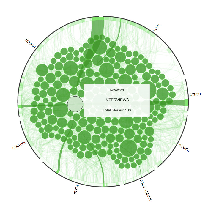
An interactive data graphic explores how our content connected last year across categories and keywords

A heads-up display that streams live data for quick decision-making on the high seas

The data visualization master's new work gives a history and analysis of leafy diagrams

A Ken Burns iPad app, touchscreen subway maps, swapping sexism and more in our weekly look at the web

A Ken Burns iPad app, touchscreen subway maps, swapping sexism and more in our weekly look at the web