Mapping Power: Calculating Empires at the Venice Biennale
Kate Crawford and Vladan Joler’s sprawling visual work reclaims design as a tool for critique—mapping five centuries of power, technology and control

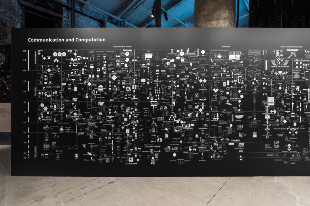
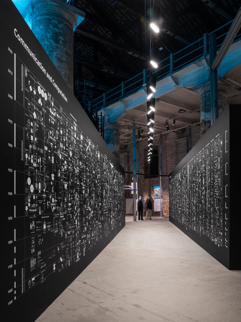
Calculating Empires—an expansive visual essay by Kate Crawford and Vladan Joler—recasts the diagram as both artifact and argument. Premiering at Fondazione Prada and now reimagined inside the cavernous Arsenale at the 19th Venice Architecture Biennale, the work fuses five centuries of technological evolution into a 24-meter wall installation that reads less like an infographic and more like a cinematic timeline of power. This is cartography as critique, where design itself becomes the story.
Unfolded as a dual-channel diagram—“Communication and Computation” on one side, “Control and Classification” on the other—the piece positions viewers between two facing walls, each dense with timelines, icons, satellites, biometric borders and military apparatus. It’s not a linear journey but a lateral one. Instead of telling you what to think, the work invites associative leaps—drawing connections between colonial ship logs and machine vision, submarine cables and predictive policing.
Here, design isn’t illustrative. It’s investigative. Every layer of visual language—type weight, iconography, layout—is deliberately tuned to pull apart the illusion of neutrality that diagrams often carry. The structure’s scale demands movement; to read the work, you have to walk with it. That motion becomes part of the experience, as if you’re physically traversing centuries of geopolitical architecture. It’s archival and ambient, dense yet highly legible—turning visual complexity into a kind of embodied clarity.
Installed in the Arsenale, once a hub of Venetian naval supremacy, the piece gains another dimension. This site of historic empire becomes a canvas for dissecting empire’s digital descendants. That resonance didn’t go unnoticed—the project was awarded the Silver Lion for “rendering the invisible visible,” a nod to its capacity to translate sprawling infrastructures into accessible insight without reducing their complexity.
Calculating Empires isn’t just content. It’s a case study in how design can unmask systems, weaponize aesthetics and act as a form of counter-mapping. It turns the language of control into a language of critique—visualizing the mechanisms behind today’s so-called intelligent systems and reframing them through the lens of human histories, biases and decisions.
Though the work is most powerful when experienced in physical space, it’s also accessible in a digital form at calculatingempires.net, where the diagrams, timelines and interactive maps unfold with a quieter but still compelling intensity.
In an age of AI opacity and data-driven governance, the installation shows that who draws the map still defines the territory. And sometimes, the most radical act is to redraw it.


What are your thoughts?