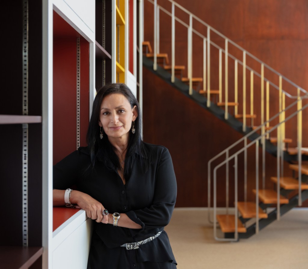
Interview: Sharon Gauci, Executive Director of Global Design for Buick and GMC
Insight on the pragmatic strategy behind Buick’s design language
While the term “design language” is often deployed casually, it refers specifically to a rather concrete set of rules and principles that guide the visual identity and continuity of a brand. Take Buick, one of the strongest brands, from a heritage perspective, in parent company General Motors’ portfolio. Over the past number of years, it is not difficult to see how GM assigned focus elsewhere; on Chevrolet and GMC trucks and SUVs, on Cadillac’s battery-electric portfolio and luxury positioning. Buick’s design language, from the badging to the lines and proportions of the vehicles, grew unclear.
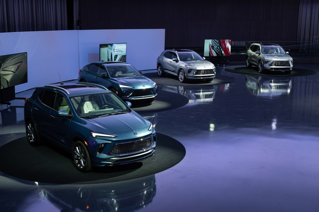
“We’re bringing life back to Buick design,” said GM President Mark Reuss, while walking around the newly redesigned Michigan campus. “I’m excited about what the brand is becoming again.” With a fresh four-vehicle portfolio—the Encore GX, Envista, Envision, and Enclave—not to mention a new tri-shield logo (which hasn’t been touched since 1990), Buick is ready to debut their new look as well as the space they use to create it.

“It takes a long time, so it’s tough to place your bets and predict where the market’s going to be three years down the road, four years down the road. And that’s why design is so important. Designers need to have a point of view,” added Bob Boniface, Buick’s global design director.
Earlier this spring, Buick opened the doors to Design West, a purpose built studio space that now houses all four GM brands (Buick, Chevrolet, GMC and Cadillac) under one roof. At 300 yards long (that’s three football fields), the idea was to “enable greater collaboration, not only within our design function but also with our cross-GM partners, like Engineering. We moved from closed-off siloed studios to an open, collaborative studio environment. For example, exterior and interior studios are now working side by side,” explained Sharon Gauci, executive director of global design for Buick and GMC.

While at HQ, COOL HUNTING sat down in the fabled General Motors Design Dome to speak with Gauci further about the romantic but also pragmatic strategy behind design language and how sometimes the best part of design is what you don’t notice.
As a brand, Buick is currently telling many stories. There’s the debuts of the three-row Enclave and the new compact Envista and then the larger design story. That’s a lot for consumers to digest. How do you distill it?
There is such a rich history for the brand itself, but also a rich history in Buick design. I would say from back then to now it’s still an important piece for the brand. We lean into design, as you’ve seen today, for everything we do, whether it’s designing the new logo or assisting with what the look and feel could be for a campaign to the product itself.
Tell us about the logo evolution.
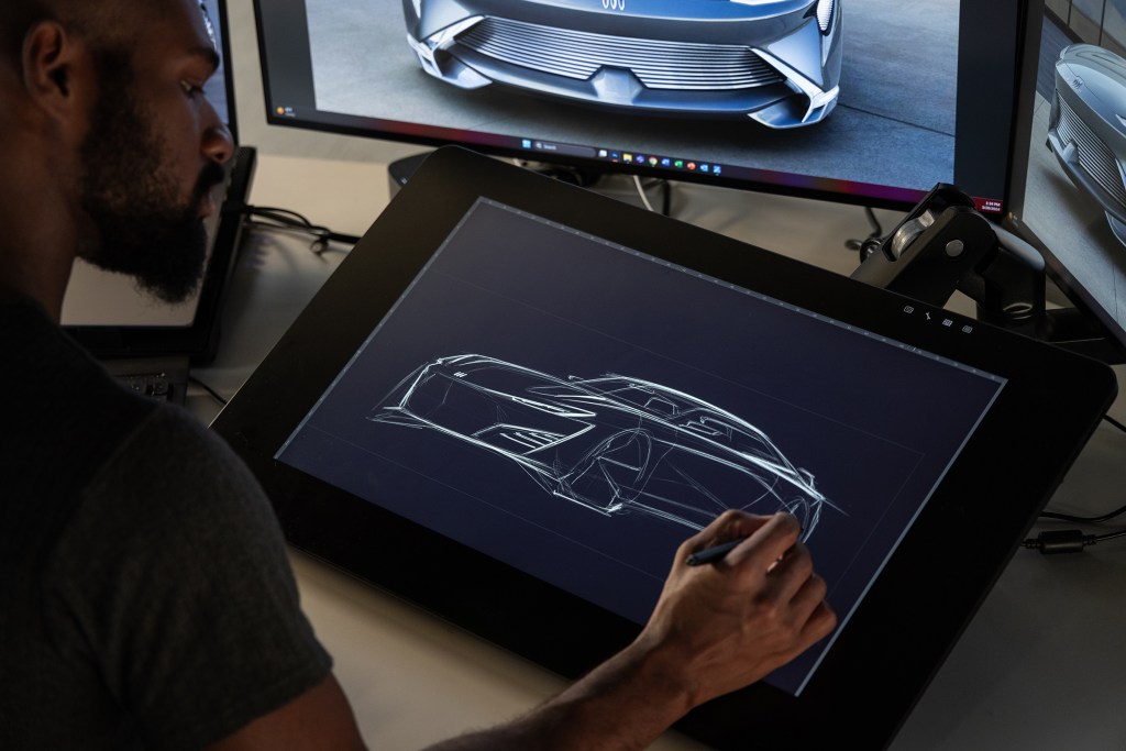
I think in enabling the brand to pivot at this moment in time, understanding how we would redesign the logo was happening at the same time as we were designing the Wildcat EV so we were doing this as a parallel path. It really started with a designer’s sketch who penned the tri-shield with an alignment and had taken the circular element of the logo away. And actually, when we when we looked at it, it was an opportunity to stop and question that while we’re designing the Wildcat EV, should we also be looking at this as an opportunity to redesign the logo? We did both simultaneously; freeing up the tri-shield from the circular element not only modernized it but gave the brand the opportunity to talk about Buick a little differently from a design point of view. It also allowed the logo to be placed on the body of Buicks versus the grille. Prior to this generation, the Buick logo had always been centered in the grille with some grille elements on either side of it, really framing it. Now we have the opportunity to put the logo body mounted on the front and rear of the vehicle. It really gave more design freedom, in addition to a more modern approach for the logo itself.

How did you make sure not to go too far? As we’ve seen, sometimes when a brand changes a logo too much people get disorientated.
I think one of the principles for Buick design is that it’s timeless. We talk about Buick design not being trendy not being a thing of the time. We do have a sense of timelessness as one of our core fundamentals. Could we have completely gone right and done something that needed to be discovered and reinvented? Yes. But I think we have such a rich history with Buick and design, it’s nice to pay homage and make it an evolution.
Many Buick executives have talked about how Buick is a design-led brand. How does that sentiment guide you from the largest overarching part of this dome to the smallest minutiae of decisions within your vehicles?
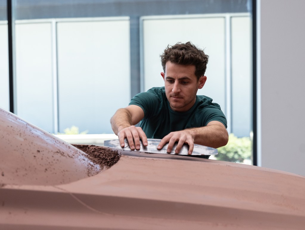
In everything we do, whether it’s exterior or interior, there is attention to detail that’s labored. It’s a discussion and a collaboration to make those elements happen. There’s such an importance placed on what makes a Buick, through design, through conversation, that I think if we weren’t a design-led brand, some of those basic elements wouldn’t end up coming to life. For example, registered perforation, we could cut corners—we could just put a standard perforation in the seat, but we’ve taken the time to make sure that besides the perforation, we’ve included the registration. That’s a little bit more detail. That’s a little bit more expense. Because we are design-led, because design is important for the brand, discovering those details is important. We pay special attention to what myths must be true for that to manifest itself into product.
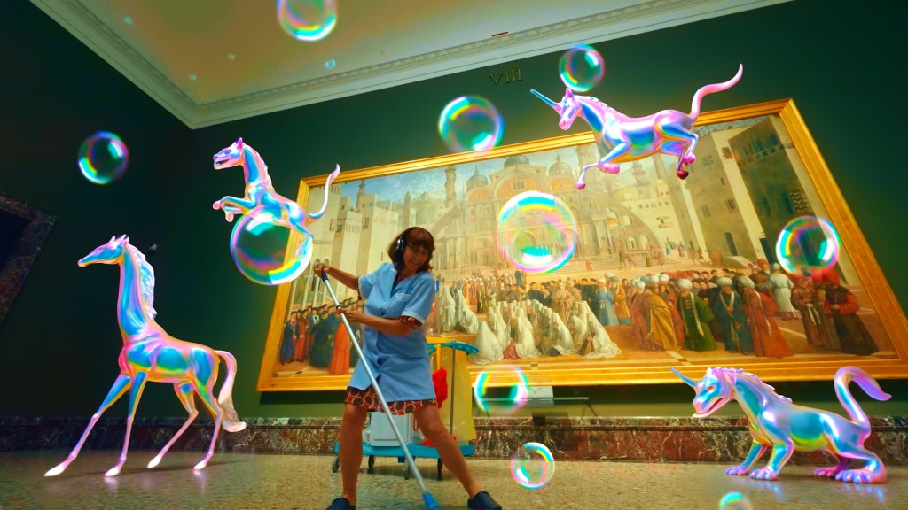
As we were walking through the halls of Design West, you pointed out that all of the artwork on the walls is created by current or former employees.
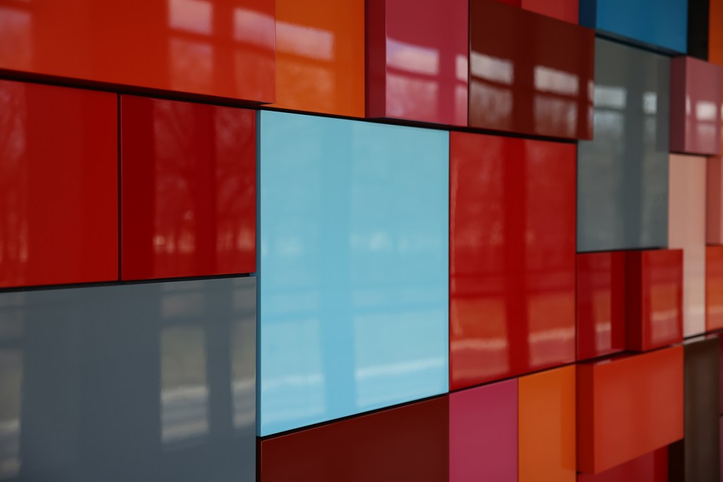
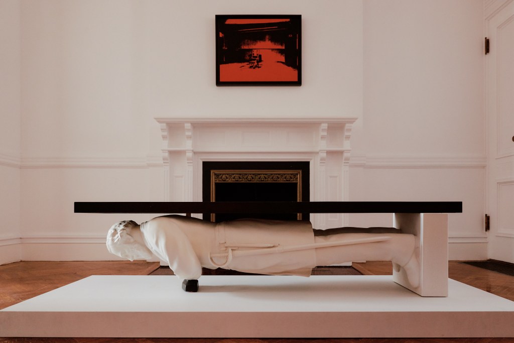
There are about 40 art installations throughout Design West that were created by current and past GM designers, creatives, sculptors and fabrication shop employees. These installations highlight the breadth of creative talent across GM Design. It’s also worth noting that, although all of GM is under one roof, each of the brand studio entrances are differentiated with their own terrazzo tile color scheme. GMC is orange; Chevrolet Trucks, red; Chevrolet, purple; Buick, blue; and Cadillac, green. The tile colors themselves are brand agnostic to allow for future flexibility within the studio spaces.


What are your thoughts?