The Field Guide to Typography
A visual encyclopedia for sign geeks

In “The Field Guide to Typography,” Peter Dawson, co-founder of London-based Grade Design, leads the journey through 125 different typefaces (which is not to be confused with fonts). From the start, the book compares itself to a birdwatching handbook, as both cater to an obsessed minority “who can’t help but observe, classify and identify them.” And Dawson is such an engaging narrator that even typeface newbies will feel warmly welcome upon entering the complex world of serif and sans serif. A note of caution, however: Once you flip through these pages, you’ll never look at a sign the same way again.
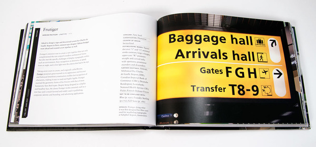
Each typeface is accompanied by its own narrative. Why does Frutiger look so familiar? It’s the typeface favored by major international airports today; Adrian Frutiger designed it specifically for Charles de Gaulle Airport in 1976. It took seven years to develop a typeface that was easily recognizable at distances, at speed, from an angle, as well as in low light—and complemented the modern architecture of the new airport. Frutiger is often confused with Myriad, the “generic and friendly” typeface that Apple uses.
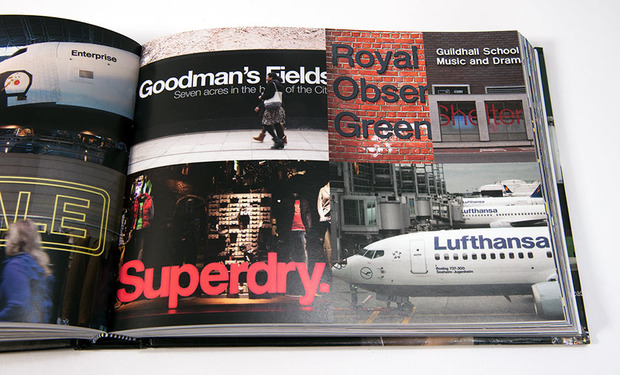
The universal font Helvetica (shared by Crate & Barrel, American Apparel, the New York subway, Lufthansa Air, the list goes on), which is as loathed as it is loved, is the only typeface to have its own film. Dawson also unveils the mystery behind Wingdings and other Dingbats, those pictorial typefaces that somehow sneak their way onto word processing applications.
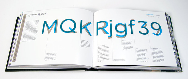
Dawson also created helpful “Typeface Comparisons” sections, where two similar typefaces are overlaid on one another, such as Arial vs Helvetica or Avenir vs Gotham. “The book acts as a field guide so it’s important for the reader to be able to study and identify the nuances between typefaces of similar appearance,” Dawson tells CH. “That’s one of the reasons we also feature the typeface comparison spreads so the readers can really get to grips and understand the differences in the design and construction of the letterforms.” Interviews with type designers are interspersed throughout the book as well, providing some personal insight and wise advice.
The overall lesson is, of course, that the smallest details—which can be a difference of just a human hair—can have a powerful impact. Crack open the book and try your hand at font-spotting—no binoculars necessary.
“The Field Guide to Typography” is available for $24 from Amazon.
Photos by Nara Shin