The Art + Science of Biophile Skincare
Design Army’s Pum Lefebure teams up with scientist Alison Cutlan to create the visual story for the sustainable line
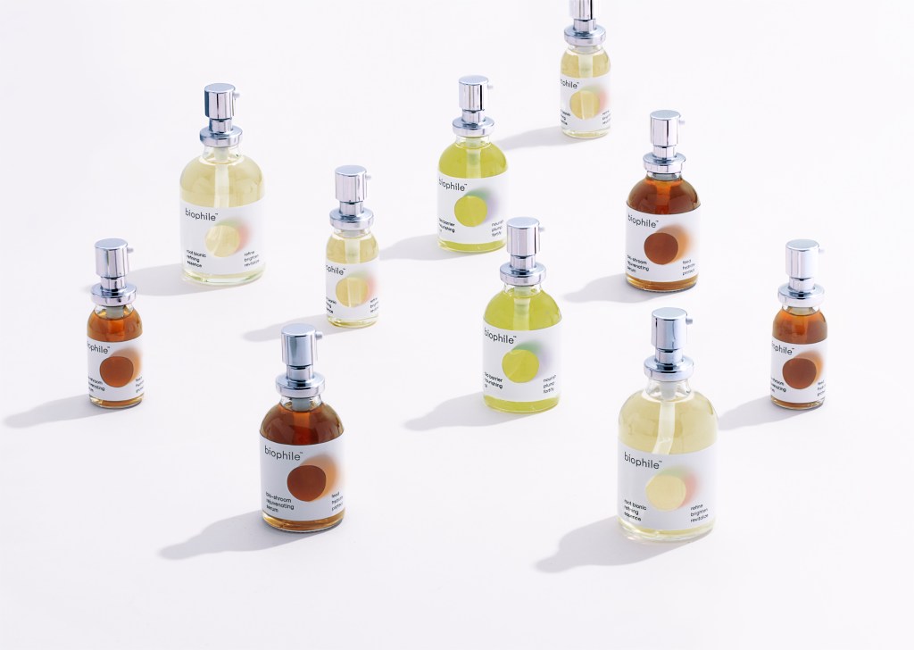
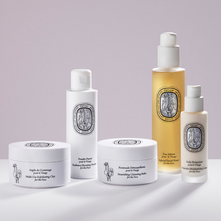
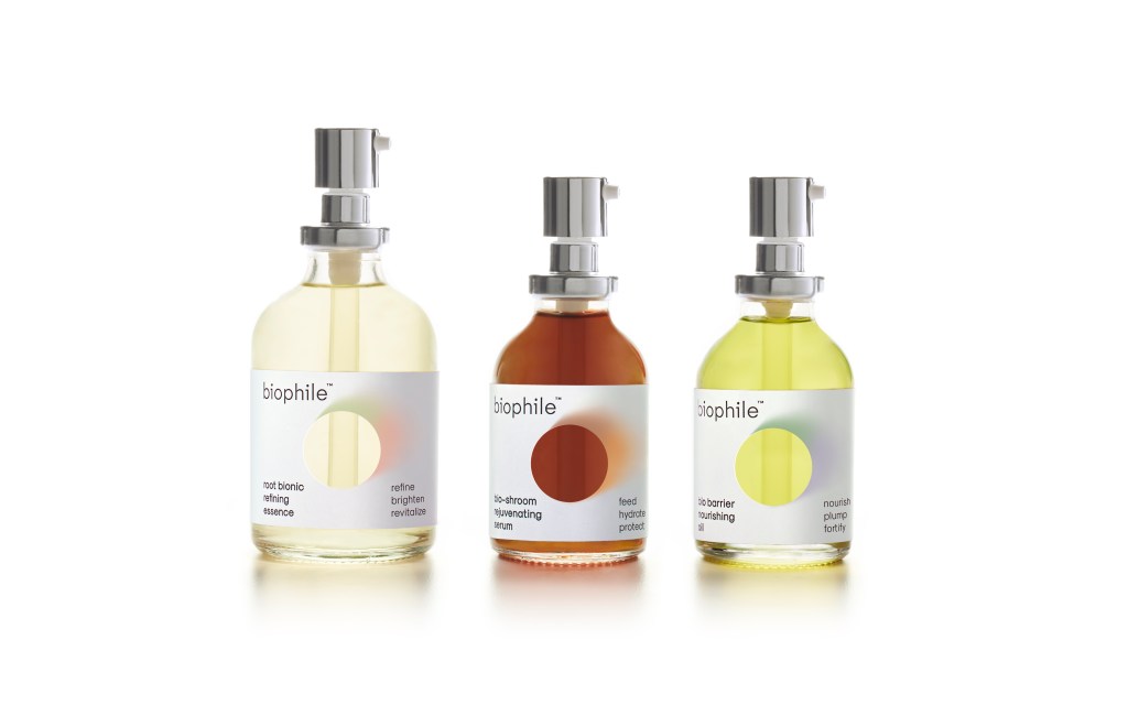
Alison Cutlan, an expert in green chemistry, experimented with fermented ingredients that she combined with botanicals and superfood extracts to create her own skin care line, Biophile. Cutlan (who previously developed products for Kiehl’s and other major brands) developed three products for her new company: the Root Bionic Refining Essence preps the skin, the Bio-shroom Rejuvenating Serum follows, and then a nourishing Bio Barrier green tea oil completes the routine. Biophile is vegan, gluten-free, and certified cruelty-free.
Cutlan named the line to represent how her creations—microorganisms in Biophile’s “biotic broths”—work with a person’s own microbiome. Once the idea for three-product system was in place, she needed to find a way to translate her ideas into the branding and packaging to ensure that customers would understand the expertise with which it was developed and her intentions for skin care innovation. She reached out to branding, graphic design and package design powerhouse Design Army in Washington DC with the hope that they would be the right team to help tell her story.

Pum Lefebure, co-founder and Chief Creative Officer of Design Army, remembers the first day she visited Cutlan. “I went to her lab in Brooklyn and spent the whole day learning about her work and ingredients,” she tells us. The intersection of science and art at the Biophile lab impressed her. “She has very artistic side,” Lefebure adds.
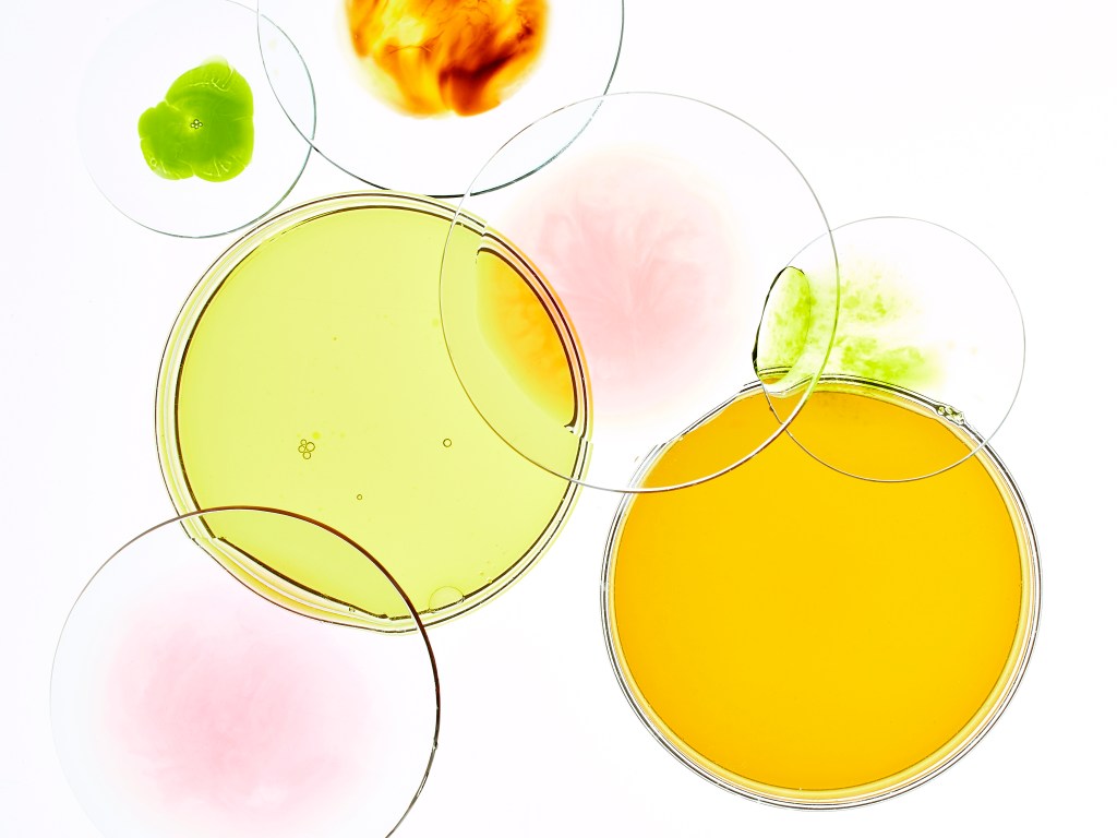
Lefebure was fascinated by the beauty of the science in the lab, and Cutlan invited her to look into some of the microscopes at ingredients in petri dishes. “When you look at it. You see color blending together and seeping through,” Lefebure says. “That it is not really geometric shapes, but much more organic.”
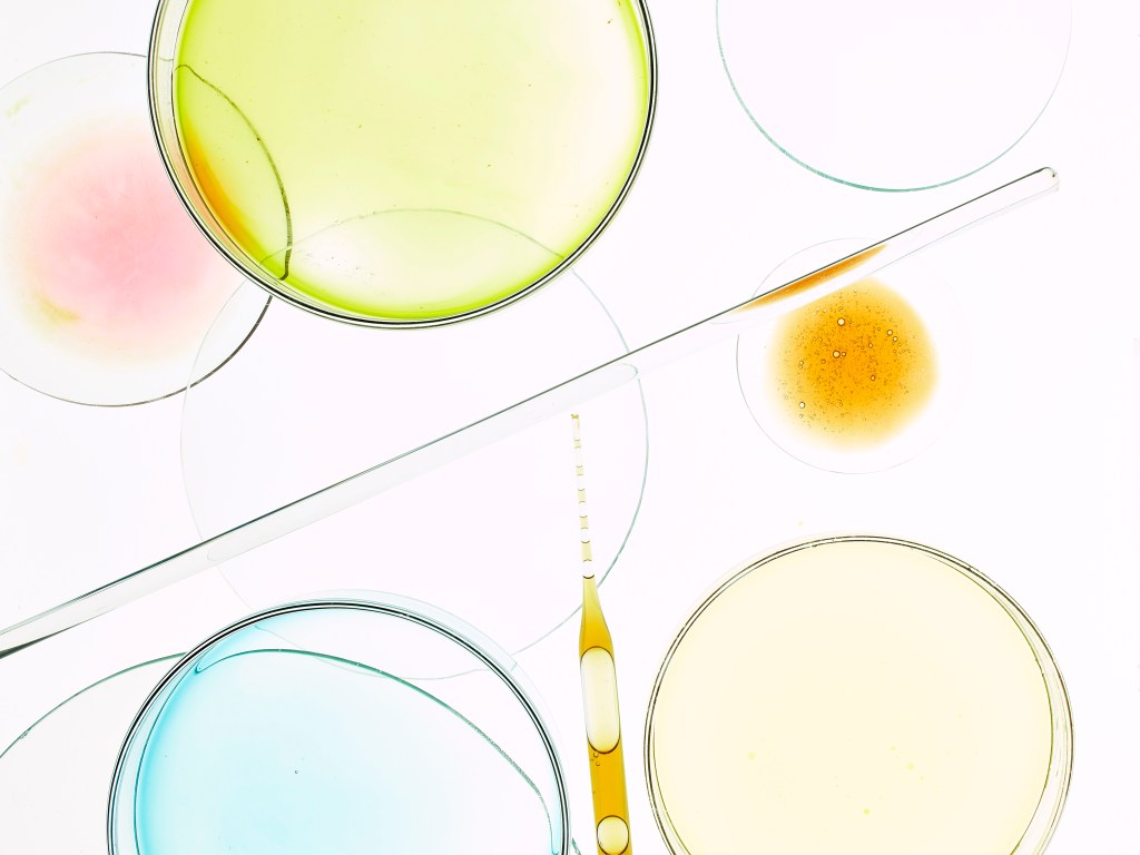
Back in DC, Lefebure, along with her team, developed several ideas for Cutlan, and kept coming back to the circular petri dishes. For the branding, the Design Army team then experimented with typography. They were inspired by the labeling in the lab and looked for a sans serif font with symmetrical rounded letters to echo the petri dish shape. They found one where the B and the O in Biophile would be round and chose to go with all lowercase letters. “We wanted to make sure that this doesn’t feel so clinical and cold,” explains Lefebure—aiming for approachable design.
Everyone involved agreed that the packaging must be sustainable and designed using durable recycled paper boxes. The product would be bottled in clear glass, with a silver tone pump. “Glass is much more special and more recyclable,” says Lefebure.

For the labels, she looked back at her photos from the lab and imagined a way to translate her experience peering into microscopes and petri dishes onto the bottle and boxes. This was possible by also focusing on the product’s color: the pale yellow of the root bionic, the mushrooms in the rejuvenating serum, and the green tea in the oil. “I wanted the color to come through,” she says.

So she cut a circle with scissors in her prototype. “I thought this is cool because the light is coming through. The liquid color gives a visual cue of the natural ingredients,” she explains. Minimal and sophisticated, the appearance looks as much like a museum exhibit as it does a skincare line—which was the aim.

Lefebure’s team also chose to skip foil stamping and other luxury tropes. “I kept going back to the Japanese idea that you don’t need to shout and scream to be the best,” she says. “You can shout quietly.” The result sees a color story for Biophile that is minimal, dynamic, and effective—like the ingredients within.
Images courtesy of Design Army