Nerdy Details from the Redesign of Apple’s watchOS
In its tenth iteration the user experience design gets a major update
Apple Watch was launched in 2014 and in the nearly ten years since we’ve seen significant updates to the screen, case materials, sensors and accessories. The watchOS user experience, however, is only now getting its first significant redesign. watchOS 10, now in public beta and releasing to everyone this fall, introduces a new user interaction model grounded by the Smart Stack, new watch faces, new features for cyclists and hikers, tools to support mental health and significant user interface improvements across almost every screen in every app on the device. We spoke to Gary Butcher from the watchOS Human Interface team to learn about watchOS 10 and some of its more nuanced design details with a focus on Smart Stack and the new Snoopy watch face.

“The unique constraints of a device on the wrist—which is obviously a comparatively small display, limited input capabilities and typically a generally short interaction time—required us to create new methods of interacting,” Butcher shared, reflecting on the first watchOS designs and their need to be “glanceable, actionable and responsive.” Those core principals haven’t changed but now with larger and brighter displays, more sensors and a wider range of available apps it was time for a more significant update.

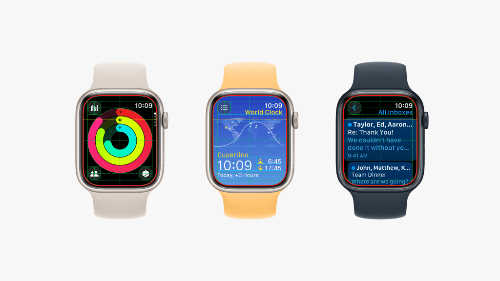
watchOS 10 delivers more information and utility at a glance through the new Smart Stack. Accessed by simply swiping up on the screen or rolling the digital crown upward while viewing the watch face, it contains widgets that display relevant and timely information based on the user’s context—time of day, location, activity or app usage. In the morning it might offer a weather forecast, calendar overview and daily reminders. When traveling it will show boarding passes from Wallet or directions from Maps. When listening to music or a podcast the playback controls will be forefront. We’ve always had a dilemma between the clean look of a minimal watch face and the utility of one with lots of data shown in complications. Smart Stack aims to solve this elegantly. “It was important to us that it felt like an extension of the watch face so the time still features prominently. Be it digital or analog and the color comes from the watch face and is a background for the widgets to sit upon,” Butcher pointed out.
“You’ll notice a little nerdy design detail that we like—the clock and the date are perfectly aligned with the center axis of the digital crown,” he shared as an example of how digital and physical designers sitting alongside one another at Apple foster tight collaborations and integrations. “That isn’t something that happens in many other design studios, but we like to leverage those opportunities where we can.” Further to this, the Smart Stack’s widgets hug the corner radius of the watch screen, regardless of which watch model and size they’re on. “Now that spline hugging, it’s actually accomplished by stacking those widgets in three dimensions, even though you only see them face on. That’s actually something we do a fair bit—it’s quite common for us to think about two dimensional user interfaces in three dimensions.”
Smart Stack uses context to predict which widgets might be most useful but we’re not always predictable. For these cases there’s a simple way to find, select and add other widgets or pin one you want to always be on top. There’s also a widget to hold app shortcuts. We’re loving the Smart Stack so far and find that it has fully solved that dilemma mentioned earlier, enabling us to use watch faces that don’t have complications—like the new Snoopy watch face.
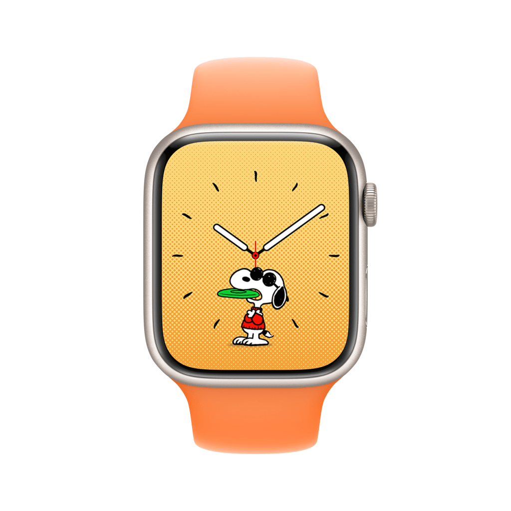
Snoopy is no stranger to watches in the analog world (like this recent Bamford collab) using his arms to tell time or his friend Woodstock flying in circles on the second hand, but being on a screen really brings the Peanuts characters to life. “It started with a deep collaboration with the Peanuts creative team. We had some really productive sketching sessions and great meetings with them thinking about all the different ways that Snoopy could show up on a watch face,” Butcher reflected. One of the first decisions was to choose which style of Snoopy to work with given how he’s evolved since first appearing in the Peanuts comic strip in 1950. “We really liked the look of the Charles Schultz original one,” he noted, also calling out that it’s “the harder one to draw.”
The team created 148 unique animations featuring Snoopy and often Woodstock. Every time you raise your wrist to see the time a new animation appears. Of course, the animation played is often based on context. Around meal times Snoopy might be carrying his bowl or late at night he might howl at the moon. If it’s raining outside it might be raining on Snoopy as well. And if it’s your birthday, he will bring you balloons. Sometimes the animations aren’t contextual and are just playful interactions with the hour and minute hands. “We’ve been really clever with our engineering partners. We’ve been able to figure out how to take one animation and apply it to so many different times of the day. The minute hand rotates six degrees every minute, we figured out how to map an animation to the minute hand so it’s always aligned with it,” Butcher explained, as another lovely, nerdy detail. For watches with an always-on display, Snoopy will nap on his dog house when the screen is dimmed. There are several color background options for the Snoopy watch face, but if you choose “Sunday Surprise” the background will be newspaper gray six days a week and will rotate colors on Sundays as an homage to the comic strip only being printed in color in Sunday newspapers. “And this palette just happens to be the same palette that Charles Schultz used back in the day.”
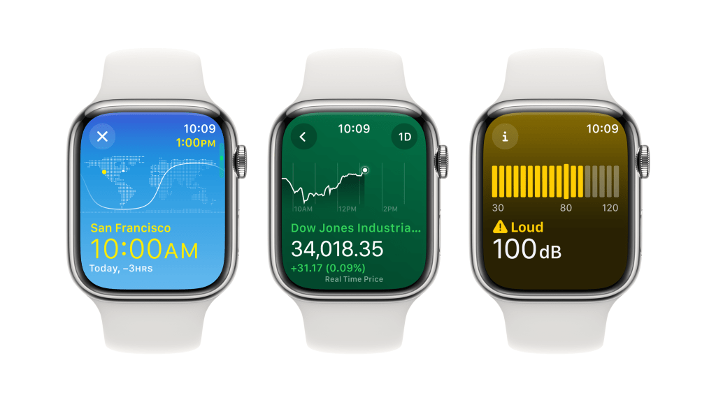
Beyond Smart Stack and Snoopy there are more subtle yet highly impactful changes to the user interface including an increased use of color by making backgrounds in apps like Weather, Stocks and World Clock informative and glanceable. The background of a stock trending upward will be green or the time in a different part of the world dark if it’s night. Screens that previously would have been scrolling, like in the Activity app, are now paginated when the information you’re looking at has meaningful segmentation points. Scrolling with the Digital Crown, as previously, uses haptic feedback and now there’s a noticeable difference between pagination and scrolling a longer screen; in the latter, there’s also a small visual indicator of the length of screen being scrolled that’s shown adjacent to the Digital Crown. watchOS 10 also simplifies navigation and improves accessibility by allowing users to access Control Center from any app by pressing the side button. Control Center now includes more toggles and shortcuts, such as flashlight, camera remote, walkie-talkie and noise level. Users can also customize Control Center by adding or removing toggles or rearranging them.
watchOS 10 is available now as a public beta and will be fully released this fall.


What are your thoughts?