CH 2013 Visualized
An interactive data graphic that breaks down last year’s stories from an analytical angle
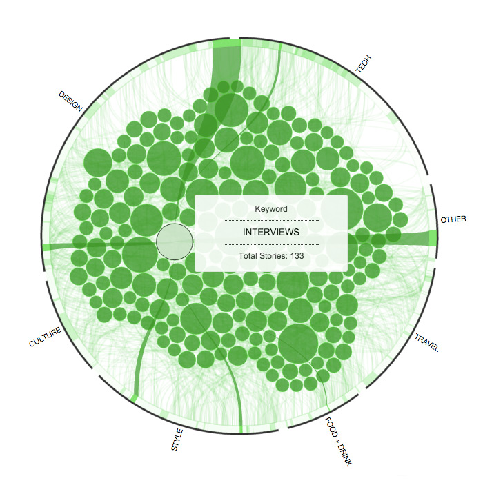
For our final look back at 2013 we wanted to take a more quantified view. This interactive data visualization shows CH’s most commonly used keywords as bubbles inside a ring of our main content categories. The sizes of each element reflect the number of stories associated with them and by moving your cursor around, you can see how keywords and categories connect. For example, last year we conducted 122 interviews that ranged across all of our categories except for Travel. So get your cursor fingers ready and take a leap into the year that was 2013 on Cool Hunting.
COOL HUNTING always gets permission to use the images we publish; however, as an independent publication, we cannot afford to continue fighting unfair claims of copyright infringement, so the images have been removed from this post.