A Look Inside the Cadillac F1 Team’s Vegas Livery
The team goes big with its fourth and final special livery for the 2026 season
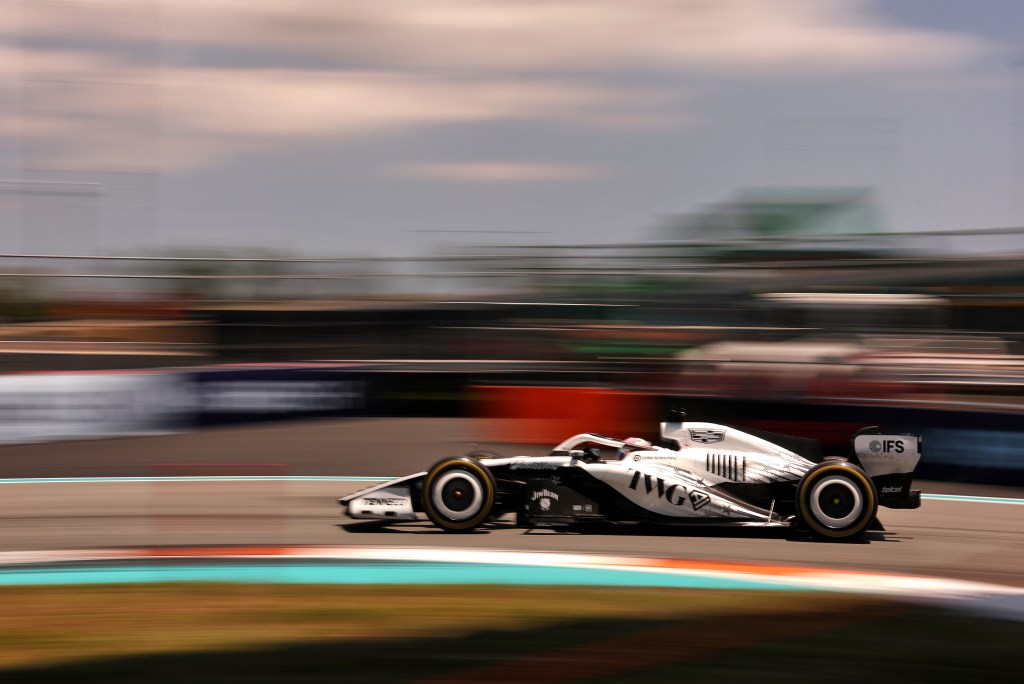
Las Vegas has never rewarded subtlety, so it would have been easy for the Cadillac Formula 1 Team to dip its car in neon for the final American race of its first season and call it a night. Thankfully, that’s not the way this team operates on any level, as we learned first hand when we joined them at the Miami Grand Prix back in May.
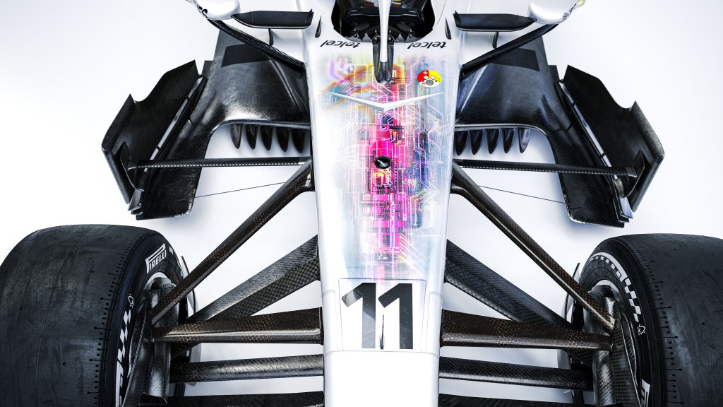
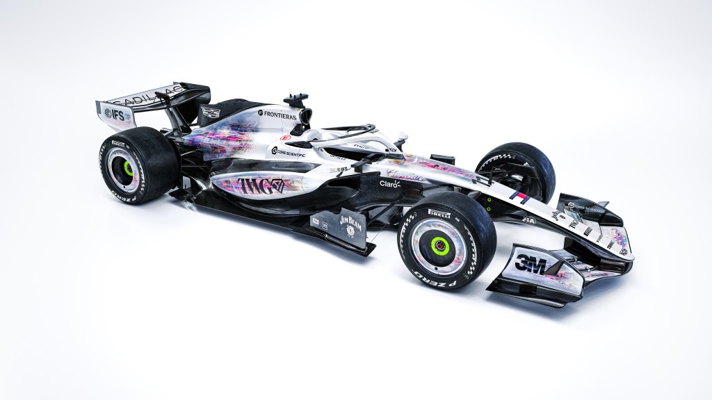
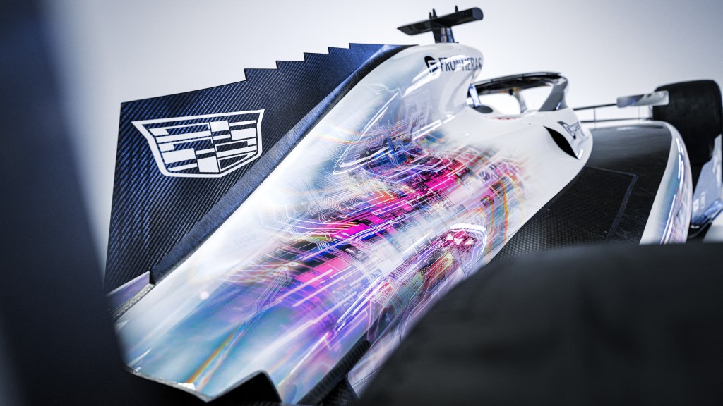
The team’s fourth and final special livery for the 2026 season does something far more interesting than a bold color wash. It asks you to look closer. It asks you to consider the many levels on which an F1 team must work. To grab your eye and stop you in your tracks, an iridescent finish washes over the bodywork in softened, almost rainbow tones, and running through it is a dense web of fine lines that reads like a circuit board. The car appears translucent, as if the paint has been scrubbed off to expose the wiring underneath. It is a hard-won optical illusion, one with a great deal of meaning to the entire Cadillac F1 team.
“It’s a very dual-hatted livery,” says Cassidy Towriss, the team’s chief brand advisor. On one level it’s exactly what a night race on the Strip calls for: techie, bright and built to pop under the lights. On another, it’s a portrait of the organization itself. Cadillac F1 started from what Towriss calls a blank piece of paper, and every department had to be built at the same time to put two cars on the grid. “Each one of those circuitries represents a work stream that had to be created in parallel, from HR to technical, creative, to commercial, to engineering,” Towriss says.
It’s also the last line of a story the team has been telling all year. Cadillac unveiled its black, white and chrome race colors during the Super Bowl, then gave each American-flavored stop on the calendar an idea of its own. “In Miami, we had American symbols. In Silverstone, we had American colors. In Austin, we had American character. And for Vegas, we have this American ingenuity,” Towriss says.
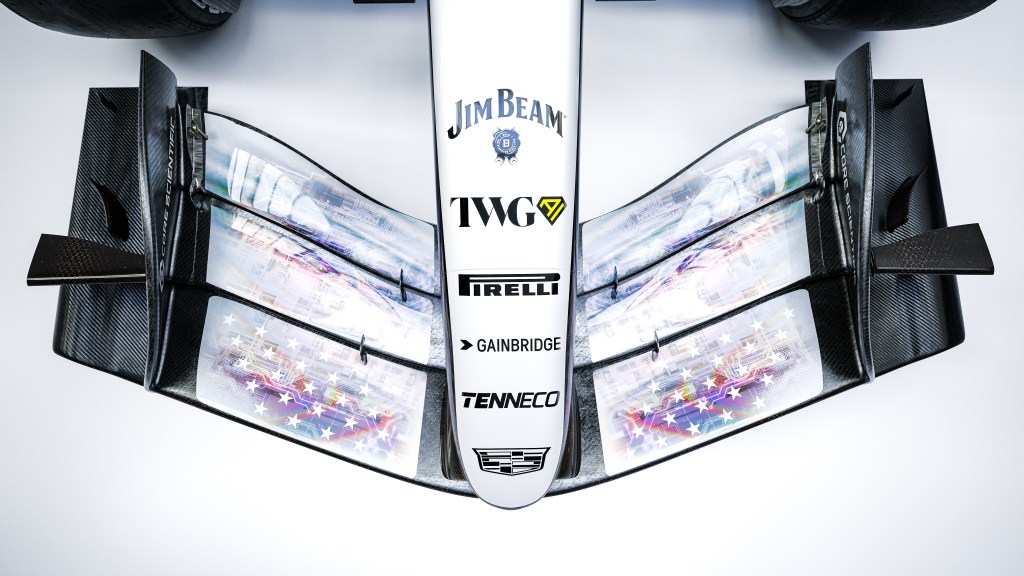
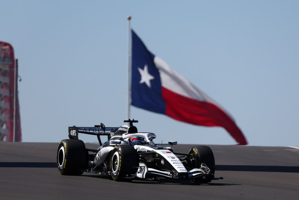
For the Miami Grand Prix, the team’s first race in the United States, the car wore a monochromatic version of the stars and stripes. Silverstone fell on Fourth of July weekend, so an American team racing in England showed up in red, white and blue. Austin went Western, with stitch-like graphics and ornate scrollwork developed closely with General Motors‘ design team, and Towriss counts it among the team’s best work to date. The plan was sketched early. “That roadmap drew itself,” Towriss says. One detail ties all four together: 50 stars on the front wing. Four special liveries is a lot for a debut season, and Towriss knows it. The thinking was that a team only gets one first year, so go big.
For Vegas, a primary reference the creative team kept coming back to actually wasn’t automotive at all. It was the translucent hardware that gained popularity in the mid to late ‘90s. Think Apple’s iMac G3, Sony’s PS1 controllers or Nintendo’s Game Boy Pocket. With nostalgia for the late ‘90s and early-2000s running hot at the moment—Sony also just opened pre-orders of the re-released clear controllers with the PS5 Prism collection—it seems this livery couldn’t be more on trend. Bringing the effect of clear plastics to a race car that’s nearly as complicated as a fighter jet is quite a feat. Towriss says the finish that the team arrived at with its paint partner, SPT, “makes it really seem like there is some transparency to it” when there is in fact none whatsoever.
Color is the other half of the story. Cadillac F1’s standard palette is black, white and chrome, and Vegas marks only the second time the team has stepped outside of it, following the aforementioned red, white and blue they ran at Silverstone. A night race under the lights of Las Vegas begged the team to stray from the monochrome once again and Towriss wanted more than “okay, we’ve added color.” The hues went through round after round of revisions, dialed down from fully saturated to something Towriss hesitates to definitively name. “I don’t know that pastel neon is a correct term,” he says. “It’s kind of contradictory in a way.” The softness does real work, though. Faded color reads as something you look through rather than at, and the car still registers instantly as Cadillac’s entry on the grid, which matters a great deal to a team that’s still introducing itself to a global audience.
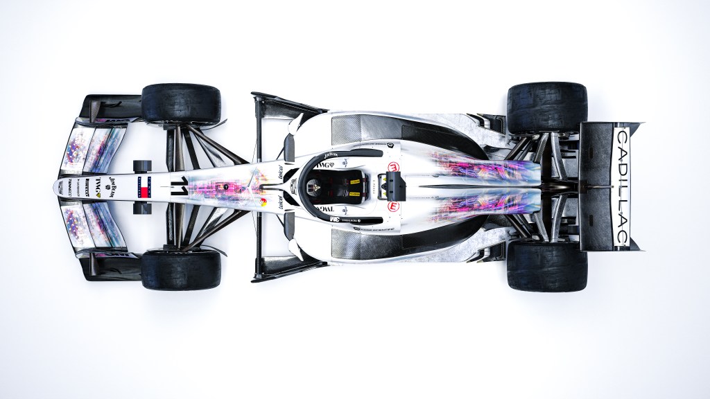
Much of the detail will be invisible once the car is moving. Towriss is fine with that. The team designs for the pit lane walk and the grid, the moments when fans get close enough to pull out a phone and study the small things. “There’s always going to be details that won’t be seen at speed that you’ll appreciate when it’s static,” Towriss says.
Getting it onto the car is its own exercise in secrecy. Every piece is liveried individually and covered as it goes on, a habit the team picked up guarding its 2026 Super Bowl commercial reveal. Impressive as the livery is, it all comes off after the race. Vegas opens a season-ending tripleheader, and the car has to be back in its regular colors for Qatar. “A lot goes into one thing for one weekend,” Towriss says. That’s also a fair summary of what the livery is about: the people nobody sees, working toward presenting something that everybody does. In a city that puts everything on the surface, the most interesting thing on the Strip this weekend may be an F1 car doing its best to show you what’s inside.


What are your thoughts?