Interview: Month of Sundays
Inspired by nature and timelessness, the Kettunen sisters’ brand harmonizes with Finland’s scenic backdrop
by Ikechukwu Onyewuenyi
With three impeccable collections under wraps, Finland’s talented Kettunen sisters continue to showcase their design prowess and creative independence with their clothing and accessories line, Month of Sundays. Working in tandem, Milla and Iina Kettunen use nature as an explorative backdrop to communicate their intelligible yet detail-orientated ethos that is sensitive to seasonal transitions.
The collective vibe of Month of Sundays’ SS13 line hints at one hanging on to the frigid remnants of winter; with dusky, pastel hues and autumnal greens. It’s kind of a meeting of the winter and summer solstice—on an aesthetic level. Understated and composed, the sisters’ designs provide the senses subtle invitations to explore and become lost within their reinterpretations of nature. The collection reflects the label’s astuteness for fashioning femininity through uniqueness, versatility and character. We spoke with one half of Month of Sundays, Milla Kettunen, to get her thoughts on working as sisters, the brand’s recent collections and the enduring theme of nature in their lives.
A sibling pairing must be a special experience to navigate professionally. How did you decide to work together?
We share the sense of aesthetics and style. I am a fashion designer and Iina studied textile design, so our knowledge complements each other. We though it would be very inspiring to work together and ask each other’s opinion about each other’s work. Although we work under the same label, we also have independence of our own in many ways. In design we have our own ideas, tasks and we are responsible of our own items in our collection. We need to find the balance of the level of cooperation and independence.
The name, A Month of Sundays—how does it relate or tie-in to your brand? With an emphasis on nature, it seems your designs could be reworked season after season, which alludes to the timeless phrase.
Finding the right name came through brainstorming. From the start, it was clear that we wanted a phrase instead of a single word. The label’s name should already set the mood and give a little preview of the collections. We went through Finnish ones, but soon switched to old English phrases that had a surprising meaning behind the words. We also wanted to have a label name that is appealing, understandable and interesting—not only for Finnish but also for an international audience.
Besides the original meaning, the name Month of Sundays is also reflected in the ambiance that the brand would like to create with its products—casual Sundays in the company of great people. I think this is how most of the people see the brand’s name without knowing more about its background.
Timeless and everlasting design is definitely our aim. As you said, something that you can wear and “can be reworked season after season.” Timeless design with interesting details and excellent quality…I think our label name is reflecting that idea very well.
Nature appears to be an enduring theme for Month of Sundays. What were your earliest and fondest memories with nature and did that influence the start of the brand?
We are often inspired by nature, especially Finnish nature. Growing up in the ’80s in Lahti (100km north of Helsinki), the woods were our playground. My parents rented a simple but lovely summer cottage far away from the city with no running water or electricity. I think the energy from these places reflects in our work. You can always find a quiet place with no car noise or other people; there’s more than enough room to concentrate to the design and your ideas.
Being Finnish has major influence on our material and color choice. We use materials like reindeer leather along with vegetable-tanned cowhide leather, linen, wool and wood shingles. As a Finn, you also want to blend into your surroundings rather than stand out with bright colors. The idea in our work is to create something that has some “silent intelligence” behind it—whether it’s in the cut or details.
Since nature and seasonal shifts are so central to the brand, how do you deal with how the fashion calendar encompasses two seasons?
When we design we take both seasons into account equally. This, again, leads back to where we are from. In Finland you have four completely different seasons with huge temperature differences, so it’s challenging to include all of those into two collections. The variety of layers is essential in building the collection.
Was there a particular inspiration behind the recent SS13 collection?
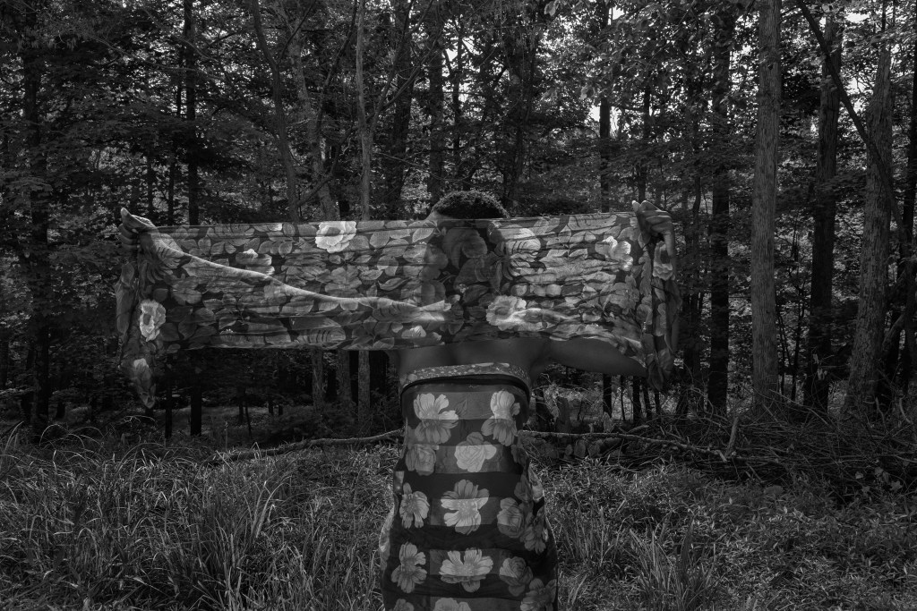
In the SS13 collection the color is there to assist the textures, shapes and details. That is why we chose strong and ageless solid colors that give the collection its frame and let the materials tell the story. The idea was to use “sun-dried,” matte materials in natural fibers—like linen and cotton—that look like they are covered with dust from the spring streets. As the season turns into the summer, and the sky is getting clearer, the sun gets out and the woman is allured closer to the cooling water on the lake site.
Images courtesy of Month of Sundays
COOL HUNTING always gets permission to use the images we publish; however, as an independent publication, we cannot afford to continue fighting unfair claims of copyright infringement, so the images have been removed from this post.
