Visual Complexity: Mapping Patterns of Information
Visually harnessing the power of digital information in Manuel Lima’s new book

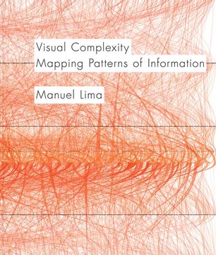
In our multimedia-saturated times, the way we experience information constantly shifts. Using Google to instantly settle a debate or Facebook-stalking exes are just a couple common examples of the type of purely contemporary phenomena resulting from the ways digital formats have replaced traditional platforms. Another natural offshoot, the wash of infographics and meme-driven charts, also reflects growing obsessions with these vast quantities of facts and figures, and the tremendous potential for shaping how we understand our world. Manuel Lima‘s new book, Visual Complexity: Mapping Patterns of Information, explores the history of visually representing information and how imagery can interpret data.
Born from his MFA thesis work at Parsons on mapping internal structures and transmission of links across the blogosphere, Lima returned to his passion for visually mapping networks and information during weekend downtime after graduating. Lima started the site Visual Complexity in the Summer of 2005, bringing his academic research back into play. What started with 80 projects, the curated collection (an attempt to increase understanding of network visualization) has grown to over 700. Some studies, from fields ranging from economics to neuroscience to political analysis, serve a dynamic purpose for portraying information, while others are passion projects for the curious seeking to explore the visual beauty of data sets.
The book, a platform for preserving these projects, offers a historical perspective on the evolution of our natural human instinct to visually organize information. These systems, setting up hierarchies of spirit, heritage and society (like the ancient ontologies the Tree of Life or Kaballah’s HaShem) have deep roots as methods for finding meaning while also incorporating our connections to one another.
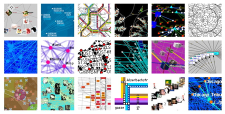
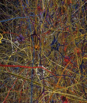
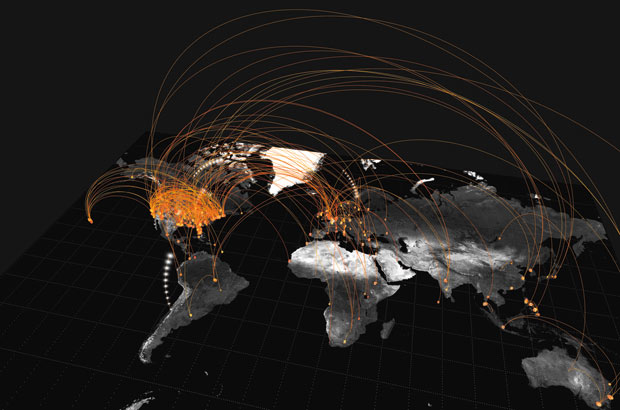
Beyond the historical context, the book’s fantastic imagery of visualized information and data sets spans a range of subjects—from the interconnectedness of one person’s email network to a map of five million links across millions of IP addresses circa 2003. Each project dissects information in unique and at times extraordinarily intricate ways. Simple line connections explain a political campaign, while projects like intricate protein maps make bridges linking a dataset clear, giving a better understanding of complex relationships. Resulting images and ideas fascinatingly condense large amounts of information into manageable formats, suggesting great potential uses in economics, science and social research.
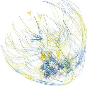

Lima goes into great detail to classify the different manifestations of how to map these networks. Addressing several theories on methodology and practices gives insight on how you personally can start to look at and process information with visual maps. These webs of knowledge at times enable readers to clearly understand vast quantities of information in aesthetically pleasing ways, though some simply astound, creating visual representations of unimaginably enormous amounts of data.
The author’s efforts extend beyond mere interpretations, crossing into artistic analysis. The transformation of data into graphics has a profound affect on the senses. Shapes, colors and patterns lend enchanting insight into individual curiosity and our inherent connectedness. Perusing the pages makes patterns become increasingly clear, exposing the purpose of this methodology—to find meaningful connections within complex networks of data. This goal goes back to this methodology’s origins, early in human history.

The Tree of Life appears in many forms throughout almost every culture and religion on the planet. As a metaphor, the tree, with its roots in the Earth and branches reaching to the heavens, was one of the original symbols for visually conveying interconnected information and meaning. Transforming into systems for mapping genealogy, social hierarchy and spiritual stages, at its core the discipline affirms our connected nature as humans to one another as well as to the planet. Original charts, like those in the book, combine data with intricate details to create something that engages on both intellectual and fundamentally imaginative levels.
Browsing the book, I became easily become immersed in what promises to be an integral part of our technological experience in the future. As these kind of data sets become increasingly important for tracking and understanding information—whether it’s Microsoft tracking search histories, cell phone carriers monitoring data usage or as artistic expressions of the structure of online social interaction—the ability to create and access comprehensive visualizations presents a novel method for digesting data. The historical section alone makes the book worth purchasing, while the exploration of the concepts and visually impressive layout will keep you engaged throughout. If you are the type who obsesses on Google Analytics or just feel the need to nerd out for a bit, pick up a copy on Amazon or from Princeton Architectural Press.
