Designing The Royal Enfield Scram 411
This accessible adventurer is pared-back but offers plenty

Royal Enfield, a 121-year-old company with roots in England, has been making bikes in India since the 1960s, and the past five years—with managing director Siddhartha Lal at the helm—has seen the company’s sales skyrocket. Most of that success has been within India, but North America is now the company’s biggest export market and, as such, the brand is focusing more on designs that will appeal to a customer who wants a motorcycle for leisure rather than for commuting.
The $5,099 Scram 411, therefore, makes perfect sense. The bike is based on the platform of Royal Enfield’s wildly successful Himalayan, a model that debuted in 2016 when the dual-sport segment—hybrids between off-road dirt bikes and on-pavement touring motos—began gaining popularity. With few exceptions (perhaps until Royal Enfield pushed the envelope with their single-cylinder Himalayan), the majority of bigger bikes in the segment cost upward of $20,000 and have heavy chassis, and 1,200cc or larger engines. As for the smaller dual-sports, too many brands were making warmed over dirt-bikes with turn signals and painfully hard suspensions. The Himalayan was evidence that a smaller bike could be more manageable off-road with an all-day comfortable chassis, but less bulk and weight.
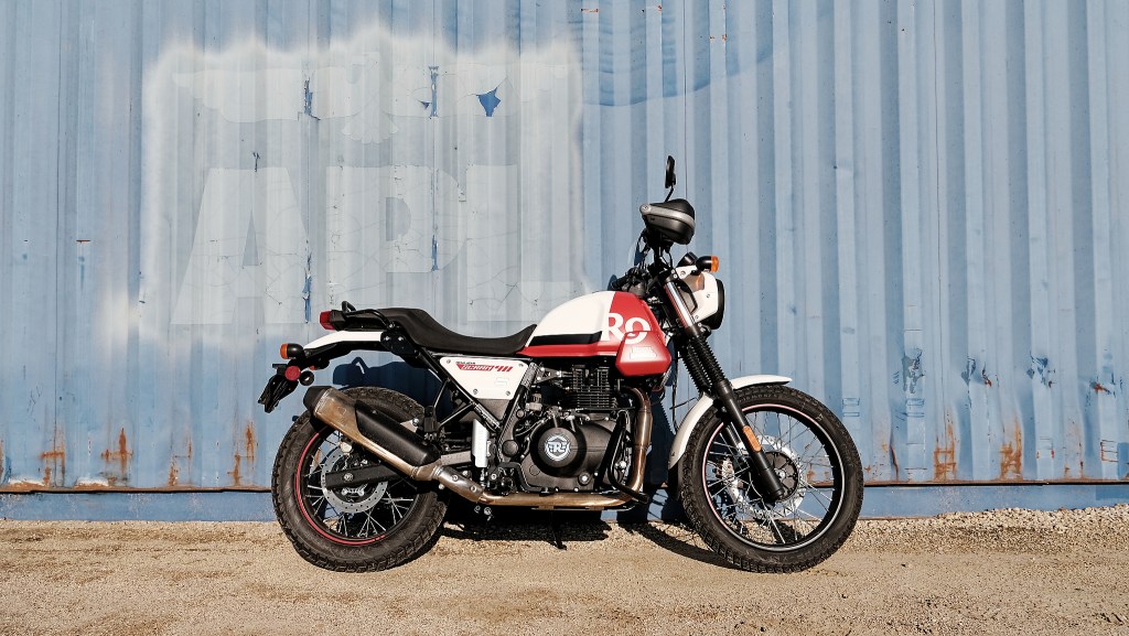
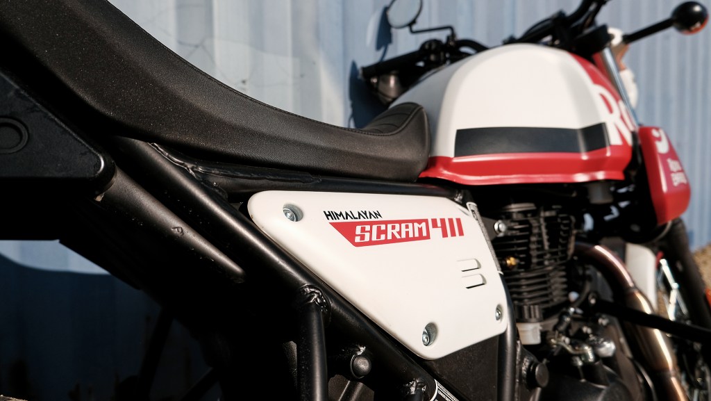
The Scram 411 and the Himalayan share plenty of elements: the frame; the air-cooled 411cc fuel-injected, single-cylinder engine; and the four-gallon tank. However the Scram 411 has a single seat (unlike the Himalayan’s two-piece seat) and different wheels, among other changes. Essentially, Royal Enfield’s chief of design, Mark Wells, and creative lead for product strategy and design, Darline Vogel, wanted to take the Himalayan’s friendly chassis and flexible, low-stress engine and pare back all the burly armor and cladding for the Scram 411. We spoke with them to find out more.
The Scram name is a double entendre. It’s short for Scrambler, but also it’s a verb. Can you unpack this?
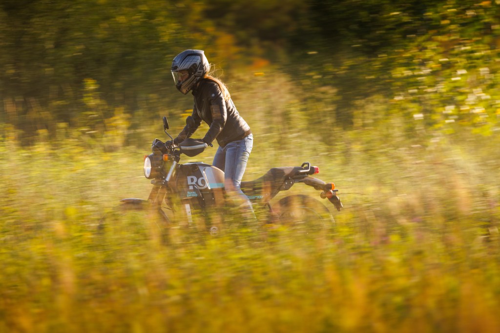
Mark Wells: There’s still that Himalayan DNA, that connection. But we wanted to do something a bit more approachable, a bit less focused. The Scram is less about planning and more about whims. That idea of just jumping on a bike and getting out into the country.
The Scram is available in seven colorways, with different graphical interpretations, and either gloss or matte finishes, which is a massive distinction from the rest of the industry. Tell us about offering so many options at a more accessible price.
MW: This causes all kinds of headaches. The two-tone of a tank adds cost. All these color choices add tremendous complexity. But we’re a brand that stands for desirability. You walk into a showroom, you look at this, it’s achingly cool. Also, it’s accessible and by that we don’t just mean price; we mean it doesn’t look scary. It looks fun. It’s not going to bite you.
What about the application of color, fonts and graphics and how they’re used?
Darline Vogel: We’re balancing the classic appearance but we also want to be a bit younger. The 1990s, and neon and bright colors are really in right now, but you know, to do something like split the tank with color, to use hard contrast ratios, we’re using the form but sometimes we fight it, too.
MW: We’re abstracting the brand and the logo. We can go somewhere new. The way we use 411 in bold graphics on some of the models, it’s sort of two-fingers to the “establishment.” It’s a very anti-corporate idea.

That becomes especially clear when you look at the winglets beside the tank. These replace the engine guards of the Himalayan, but they have an entirely different job too, right?
MW: The initial thought was taken from looking at number boards on motocross competition bikes. Visually, this space is filled up on the Himalayan, but on the Scram—with its smaller front wheel—the winglet pulls the visual weight forward so it feels like it’s moving. In the past there’s been this ask to bring in outside design firms so that we can merchandise, but we’re very protective over whatever we do visually. It has to start on the bike so that you get the right shape, script, proportion, aspect ratio.
Finally, there’s the half-circle painted on the wheel rims, ending in this double dash. In motion, it makes the bike look almost like the way a child would draw it. Why not go all the way around?
DV: Having it all around, it’s almost too boring. And the wheel turns anyway, so you’re going to see red or turquoise [or another color] spinning. This way was more exciting. Then those two dashes, they’re like this wink to the 1s in the 411.
Hero image courtesy of Royal Enfield