Swatch Creative Director Carlo Giordanetti Outlines the Omega Speedmaster MoonSwatch Collaboration
Translating an iconic design to bioceramic, the fever for the watches, the future of the collection and more

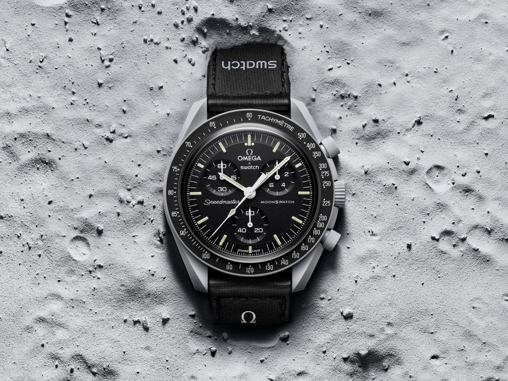
For Carlo Giordanetti—creative director of Biel, Switzerland-based Swatch—the last few weeks have been momentous. On 26 March, the playful watch brand debuted an unexpected collaboration with luxury watchmaker Omega. It was a loyal translation of Omega’s Speedmaster, specifically the beloved Moonwatch model, whose fourth generation was worn by the Apollo 11 astronauts during the first moon landing. Dubbed the MoonSwatch, the collaborative collection featured 11 models that expanded the Moonwatch aesthetic across the solar system from the Sun to Pluto. Audiences went wild for the release, which was available only at select stores. Even though it was clearly communicated that this was not a limited edition item, lines formed overnight and secondary prices soared for the $260 timepiece. It had been a long time since the watch world had seen such far-reaching excitement.
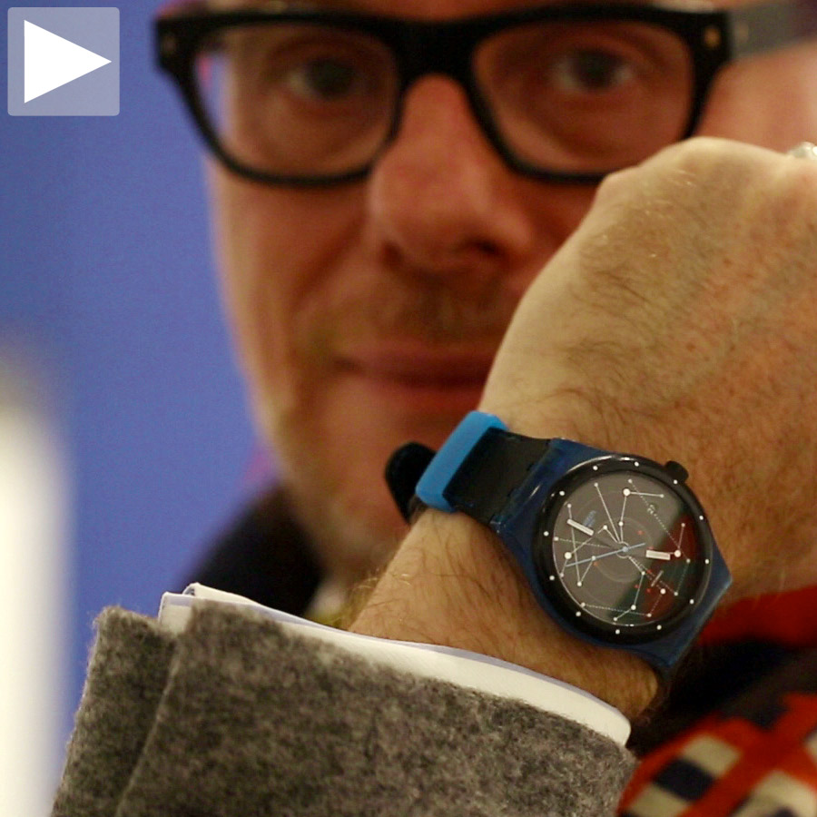
“It involved very few people because I wanted it to be a very secret project until two days before the launch,” Giordanetti tells COOL HUNTING. “Those very few people involved felt that they had a mission.” As creative director, Giordanetti was actively involved in the product development and design. He also oversees the overall marketing strategy. “It’s a moment where Swatch is very much managed by a group of people,” he says. “It’s kind of a new thing for the last two years and we are enjoying having very different personalities around the table defining the strategy.”
On a more granular level, Giordanetti also handles all projects that are related to the world of art (a big element of the Swatch DNA) and The Swatch Art Peace Hotel in Shanghai, the brand’s residency for artists.

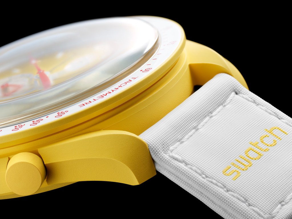
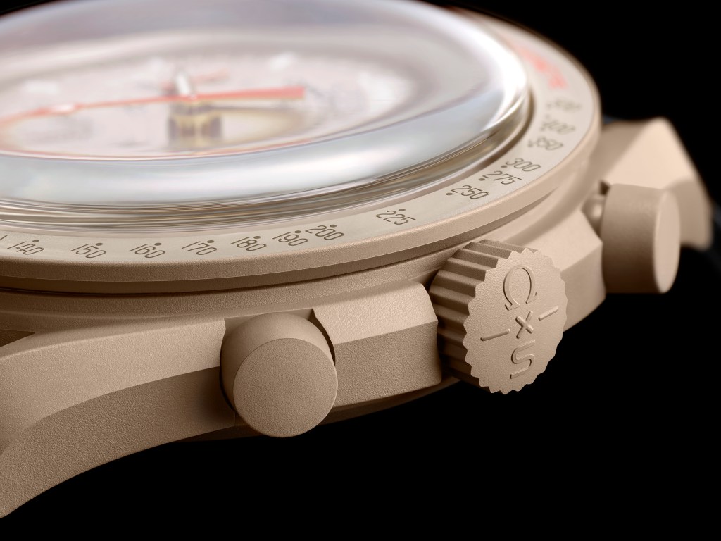
“Two elements ignited the project,” Giordanetti continues. “The first one is that Swatch has a material for the next generation: bioceramic. First of all, it’s a big step for Swatch toward sustainable materials in place of plastic. It’s made from 60% ceramic powder and 40% bio-sourced synthetic material, derived from the seeds of the castor plant.” As a watch material, ceramic is scratch-resistant and can offer deep color. It’s also often associated with luxury brands. Swatch’s version brings it into a more affordable price point; and the bio-source blend lends it softness.
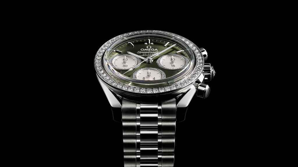
“On the other hand, there was this opportunity to celebrate the Omega Speedmaster on this important anniversary—its 65th,” Giordanetti says. “This is where the thinking process started. We wanted to know what we could do to celebrate the Speedmaster in an unexpected way.” And so the concept was born. The creative director approached it with care, however. “You can look into iconic brands like Omega if you do it with the right spirit, and you take the risk—when you touch an icon there’s always a risk—it can still work.”

Giordanetti’s next task came down to designing something that was harmonious with the Swatch brand and aligned with Omega—and then expanding it appropriately. “The Speedmaster is associated with the moon,” he notes, “but we couldn’t have done just another interpretation of the Moonwatch. It would not have been interesting. It was almost natural to expand outward through the solar system. The idea became, ‘Why don’t we do the moon and the sun’ and then someone said, ‘We should probably also do the Earth.’ Finally, someone else suggested the other planets and the collection was born. This established our story.”

To Giordanetti’s delight, this allowed them to explore color. “Planets are associated with colors,” he says. “We also learned in the process how they’re often associated with personalities. It was an ideal project for Swatch to approach because of the potential to link the story with emotions and colors. For Swatch, color is a must. We are a brand associated with the idea of color, both in a physical way and in a mental way.” Giordanetti’s team worked with the technical department to incorporate pigment into the bioceramic and find the exact colorways.

“The idea was to reproduce the Speedmaster one-to-one in bioceramic,” he says. “That’s in terms of volume and symmetry. What is fantastic is that through this collection you understand the potential of the material. If you look at the edges of the lugs and their angles, they are much sharper than the Moonwatch.” He adds that although this is a loyal reproduction, specifically the Mission to the Moon MoonSwatch, it’s almost as if the material allows them to improve the original design.
Of course there are differences. “The way the counters are positioned is different because the movement is a Swatch quartz chronograph, but the degrees of finesse in the definition of the elements and the printing of dials is absolutely Omega quality. It became a hand-in-hand project and we at Swatch learned so much from the Omega people,” Giordanetti says. Omega’s design team helped Swatch develop the immense number of details.

Mars and Pluto in particular have specific nuance. The Mission to Mars watch incorporates the hands from Omega’s Alaska mission designs. Pluto’s colorway references the burgundy of the Gemini mission. Each watch has a reason to be different, even if it’s as obvious as the sun-ray dial on the Mission to the Sun watch.
“When you turn the watch around, you have the planetary body printed on the back of the case” Giordanetti adds. “All the images you see on the back of the watch are translated from photographs that we received from NASA. They belong to the archives. We got them thanks to relationship that Omega has had with NASA for many years.”

There aren’t many collaborations like this in the watch world. “Spontaneously, you look at collaboration as an idea to merge two different industries—fashion and sports, cars and watches,” Giordanetti explains. “These are things that don’t belong to the same universe. With this project, what we have experienced is that provided that the two components of the collaboration each have a strong identity in the same industry, it could work. For us, it works because Swatch is very approachable, affordable and democratic. Omega is aspirational and legendary. Within the same industry, they are very different segments. This created a provocation. It was unexpected. If a collaboration doesn’t give you an emotional shock, it isn’t effective.”
If a collaboration doesn’t give you an emotional shock, it isn’t effective
As for the ravenous reception, Giordanetti says that it comes from the unexpected announcement, but also, “The courage, somehow, to have Omega say, ‘Go to Swatch.’ It hit a soft spot of many people. There was so much speculation that week. It was fun to read the comments on social media. We were very open from the beginning that this was not a limited edition product. That this was not your one shot. It will be here for a while! Still, everyone wanted to be the first to have it.”
“That’s how this Saturday happened,” he continues. “In 110 Swatch stores around the world, we were seeing lines. People convinced themselves that this was something they had to have.” Giordanetti went to Milan’s three Swatch stores and talked to people in line. “This is where I observed the idea of connection. There are 11 references. People in the lines were talking about which one they wanted. Then they released, because of the crowd, the customers might have to take whatever was available.”
Ultimately, it comes back to the tactile. “In a moment where so many people are speaking about NFTs and digital projects and immaterial ownership, this is so physical that it’s not even for sale online,” Giordanetti concludes. “We wanted to recreate the connection between our brand and the people. It’s these emotional connections that are very Swatch.” He’s curious to see, in a few months when more watches are out there, who is wearing one. He suspects, as do we, that it will be hardcore Omega collectors and lovers of Swatch, too.
Images courtesy of Swatch and Omega