Giorgia Lupi on Joining Pentagram, Data and Finding Inspiration Everywhere
The information designer is the first new partner at the NYC studio in seven years
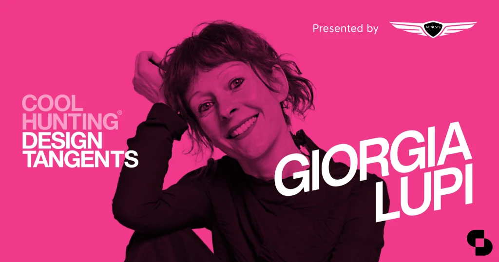
As one of the most respected design studios in the world, Pentagram selects their partners incredibly carefully. There’s no surprise then that somebody as talented as Giorgia Lupi is the company’s first new NYC partner in some seven years. From installations to brand identities, architecture and advertising, Pentagram’s disciplines are vast. Unlike other studios, the owners also create the work—meaning everybody in the company must have both unique and remarkable skills. We spoke with Lupi about the new position and how she hopes to share her perspective and practice.
Can you tell us a little about why you made the decision to join Pentagram?
I don’t come from a traditional graphic design background, but I’ve always been incredibly fascinated by how, over the years, Pentagram partners’ and teams’ work has shaped and is shaping our visual culture.
I have run my own company for eight years and I’ve always been very clear with myself on what works and what doesn’t for me: I would never work full-time for a corporation because most of all I value variety and to see my work applied to different worlds and fields, and I also love to have the freedom to make my own calls on what [work] to take on and which risks to take.
With this premise, the Pentagram platform is really exciting for me because of the scale and the potential impact of projects that Pentagram can take in is unmatched. I join Pentagram to expand and further my practice and explore how data visualization can be integrated as part of our daily experiences, in the things that we use, consume, wear, see.
You have a very specific perspective—using data for design—how do you hope to add your unique skills to the company?
I think I complement Pentagram’s already unique offering with a new sensibility, proposing a different point of view based on the analysis and processing of information to approach branding, editorial, exhibition, experiential, digital, and environmental design projects.
If you think about it—and if you see data the way I see data—data can be a lens, a filter to parse the stories of a brand, of an institution, of a community of people, and then as a design material for communication design projects of different kinds. In this sense, I will work with data that clients might have already gathered, as well as exploring new types of data that can be unearthed to tell more hand-crafted stories.
I will be building on the experience I developed over the years working on data-driven projects with international clients including IBM, MoMA, Google, United Nations, TED, Starbucks, among many others – further exploring how to blend visual design with a sensibility towards soft and hard data into new ways of communicating visually.
It’s been a long time since there was a new addition to the NYC studio. Can you tell us a little about that? What does it mean to you?
You are right, the last partners in the New York office were made in 2012: Natasha Jen and Emily Oberman, and I feel incredibly honored to join after such a long time! I was quite surprised in the beginning when Michael Bierut—the partner I knew best before these conversations started—asked me if I would consider becoming a partner, since (as I mentioned) my background is not in traditional graphic design. But then it all made sense, as I feel that Pentagram has always been forward-looking in expanding in areas that can be interesting new focuses for design. So, what to say—I am really excited!
Is there somebody there that you’re especially excited to work with? Or a project that you’ve admired for a long time?
To be honest I am very excited to possibly collaborate with any of the partners: all the type of work that they do can potentially be “injected” with data: in fact, in my experimentations, I often question how data visualization has been used so far, primarily in functional and “lifeless” business contexts, and I welcome any opportunity to play with materials and contexts that are normally not associated with this discipline. How would we change our relationship with data if we could wear it or have them as interactive experiences in our phones and apartments?
Can you tell us a little about clarity and/or bias within data? Do you come across issues in your work with that?
What I always like to say is that “data-driven” doesn’t mean unmistakably true, and it never did. Data is primarily human-made, because even if it comes from a sensor, a human being designed that sensor and decided what to collect and what to leave out: a process that informs the nature of the dataset and its supposed “objectivity.” I believe it’s time to leave behind any presumption of universal truth and embrace an informed depiction of the big numbers and small imperfections that work together to describe reality. And the way we represent data visually should embrace imperfection and approximation.
And this is where Data Humanism comes in?
This goes under the wider umbrella of what I call Data Humanism—a different approach to the data world, to ultimately reconnect data to what they stand for. I always like to remind my designers and clients that—as banal as it sounds—data does not exist: data is an instrument that we (human beings) created to record reality. It is one of the tools we have to represent reality, but it is always a placeholder for something else and never the real thing, and sometimes this can get lost.
So instead of focusing on the numbers and the technologies and algorithms around data, we must always focus on what data represents: people, stories, ideas. Only then data can become a powerful tool, to abstract our realities according to different—relevant factors—every time, to analyze ideas and context we normally can’t grasp, and really a tool to start new conversations as opposed to the ultimate answer to our questions.
And this is why we have to reclaim a personal approach to how data is captured, analyzed and displayed, proving that subjectivity and context play a big role in understanding even big events and social changes—especially when data is about people.
Considering your magic for blending data and design—when you were studying (or otherwise) was there a moment or a person, or some catalyst, that helped you realize you could blend math and art so seamlessly?
I have a masters in Architecture, but I have never built any houses! During my M.Arch studies, I’ve always been drawn to the scale of the city and urban mapping projects and fascinated to represent the many information layers underlying any architecture project so I would say that already there I was blending “math and art” in my own way.
After my graduation, I worked for two different interaction design firms in Italy, primarily working on information mapping projects and interactive installations displaying complex systems of knowledge.
Naturally, I progressively discovered that data can be an incredible lens to find and build stories and ideas, and at the same time a creative material we can use to visually narrate it, I simply fell in love with this world and the realms of possibilities it opens.
I see data visualization design as the combination of my artistic side and my extremely rational one
I see data visualization design as the combination of my artistic side and my extremely rational one, I enjoy the overlapping space between analysis and intuition, between logic and beauty, between numbers and images.
In terms of influence, when I started it was a small community that now is expanding and flourishing. But in the beginning, I felt that in a sense we all knew each other among dataviz practitioners. Among the first pioneers (and friends!) who has made seminal work that defined the discipline itself, my favorite are surely Jer Thorp and Moritz Stefaner, mostly because of their exceptional sensibility and ability to capture the very nature of the data they are working with, with simple, elegant and effective design.
One of the most talented practitioners I know, is my frequent collaborator Stefanie Posavec: her work influenced my practice even before we started collaborating. She is the person in the community who I feel closer to, and she is a constant source of the type of inspiration that pushes me forward every day.
You’re influenced by all kinds of people in all fields, right?
My inspiration and references over the years have been writers such as Georges Perec (whose analytical mind and poetic language made me look at people and places in a new and fresh way), conceptual artists like On Kawara (with his obsessive recording of the minutiae of his days) and the instruction-based art field pioneered by Sol LeWitt (who pushed me to understand how rules can create poetry), but also composer John Cage (who with his visual scores helped me understand how to create powerful synesthesias). On the more visual side, my aesthetics is deeply influenced by abstract artists, among which Kandinsky, Malevich, and Mondrian. In general, I have always been influenced mostly by other fields.
COOL HUNTING always gets permission to use the images we publish; however, as an independent publication, we cannot afford to continue fighting unfair claims of copyright infringement, so the images have been removed from this post.
